How to change the color of radio button using css (code attached)
The content of this article is about the method of changing the color of the radio button using css (with code). It has certain reference value. Friends in need can refer to it. I hope it will be helpful to you.
Have you ever been asked by the salesperson, "Can you change the color of this radio button! Let it match the theme color!", and then you suffered from the fact that the native does not support changing the color, and finally you were forced to make a makeshift one by yourself. use. If we abandon input[type=radio] and develop a new one, we find that it is very cumbersome to simulate selected, unselected, unavailable and other states, and it is even more annoying when it involves radio button groups. In fact, we can use label, ::before, : checked and tabindex, and then adding a small amount of JavaScript script can simulate a richer style "native" radio button. Let’s try it together!
Understand the radio button box
Since our goal is to change the color of the radio button box and other appearance features and behaviors are consistent with the original radio button box, then we You must first understand the original appearance characteristics and behaviors of the radio button.
1.Appearance features
1.1.Normal style
margin: 3px 3px 0px 5px;
border: none 0;
padding: 0;
box-sizing: border-box;
display: inline-block;
line-height: normal;
position: static;
Note: We must ensure that the layout characteristics are consistent with the original appearance, otherwise there is a high chance that the replacement with a custom radio button will affect The overall layout eventually resulted in being forced to adjust the layout characteristics of other elements to achieve overall coordination, thereby expanding the scope of modification.
1.2. Styles that get focus
outline-offset: 0px;
outline: -webkit-focu-ring-color auto 5px;
Note: The style that gets focus here only takes effect through the Tab key on the keyboard. If you click with the mouse, although the radio button has gained focus, the above style will not work. will not take effect.
1.3. Set to disabled style
color: rgb(84, 84, 84);
2. Behavioral characteristics
The behavioral characteristics of the radio button are obviously selected or not, and the change event of the selected state, so we must Keep providing change events externally.
It is also worth noting that when the radio button gets focus through the Tab key on the keyboard, and then presses the Space key, the radio button will be selected.
With the above understanding, we can start coding!
Stop talking nonsense and code

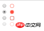
unselected, selected, focused and disabled.
CSS partlabel.radio {
/* 保证布局特性保持一致 */
margin: 3px 3px 0px 5px;
display: inline-block;
box-sizing: border-box;
width: 12px;
height: 12px;
}
.radio__appearance{
display: block; /* 设置为block则不受vertical-align影响,从而不会意外影响到.radio的linebox高度 */
position: relative;
box-shadow: 0 0 0 1px tomato; /* box-shadow不像border那样会影响盒子的框高 */
border-radius: 50%;
height: 90%;
width: 90%;
text-align: center;
}
label.radio [type=radio] + .radio__appearance::before{
content: "";
display: block;
border-radius: 50%;
width: 85%;
height: 85%;
position: absolute;
top: 50%;
left: 50%;
transform: translate(-50%, -50%);
transition: background .3s;
}
label.radio [type=radio]:checked + .radio__appearance::before{
background: tomato;
}
label.radio [type=radio][disabled] + .radio__appearance{
opacity: .5;
}
label.radio:focus{
outline-offset: 0px;
outline: #999 auto 5px;
}
/* 通过鼠标单击获得焦点时,outline效果不生效 */
label.radio.clicked{
outline: none 0;
}
/* 自定义单选框的行为主要是基于原生单选框的,因此先将原生单选框隐藏 */
label.radio input {
display: none;
}<!-- 未选中状态 --> <label> <input> <i></i> </label> <br> <!-- 选中状态 --> <label> <input> <i></i> </label> <br> <!-- disabled状态 --> <label> <input> <i></i> </label>
var radios = document.querySelectorAll(".radio")
radios.forEach(radio => {
  // 模拟鼠标点击后:focus样式无效
  radio.addEventListener("mousedown", e => {
    var tar = e.currentTarget
    tar.classList.add("clicked")
    var fp = setInterval(function(){
      if (document.activeElement != tar){
        tar.classList.remove("clicked")
        clearInterval(fp)
      }
    }, 400)
  })
  // 模拟通过键盘获得焦点后,按`Space`键执行选中操作
  radio.addEventListener("keydown", e => {
    if (e.keyCode === 32){
      e.target.click()
    }
  })
})Achieved through opacity:0
Above we associate the input[type=radio] of display:none with label to simplify the custom order using input[type=radio] The implementation of the selection box, but still requires handwriting JS to implement the behavioral characteristics of pressing the Space key to select. Is there another way that can save trouble? We just want users not to see the native radio button, so can we just set it to opacity:0? ! CSS part.radio {
/* 保证布局特性保持一致 */
margin: 3px 3px 0px 5px;
display: inline-block;
box-sizing: border-box;
width: 13px;
height: 13px;
}
/* 自定义单选框的行为主要是基于原生单选框的,因此先将原生单选框透明,且沾满整个父元素 */
.radio input {
opacity: 0;
position: absolute;
z-index: 1; /* 必须覆盖在.radio__appearance上才能响应鼠标事件 */
width: 100%;
height: 100%;
}
.radio__container-box{
position: relative;
width: 100%;
height: 100%;
}
.radio__appearance{
display: block; /* 设置为block则不受vertical-align影响,从而不会意外影响到.radio的linebox高度 */
position: relative;
box-shadow: 0 0 0 1px tomato; /* box-shadow不像border那样会影响盒子的框高 */
border-radius: 50%;
height: 90%;
width: 90%;
text-align: center;
}
.radio [type=radio] + .radio__appearance::before{
content: "";
display: block;
border-radius: 50%;
width: 85%;
height: 85%;
position: absolute;
top: 50%;
left: 50%;
transform: translate(-50%, -50%);
transition: background .3s;
}
.radio [type=radio]:checked + .radio__appearance::before{
background: tomato;
}
.radio [type=radio][disabled] + .radio__appearance{
opacity: .5;
}
.radio:focus-within .radio__appearance{
outline-offset: 0px;
outline: #999 auto 5px;
}
/* 通过鼠标单击获得焦点时,outline效果不生效 */
.radio.clicked .radio_appearance{
outline: none 0;
}<!-- 未选中状态 --> <span> <span> <input> <i></i> </span> </span> <br> <!-- 选中状态 --> <span> <span> <input> <i></i> </span> </span> <br> <!-- disabled状态 --> <span> <span> <input> <i></i> </span> </span>
var radios = document.querySelectorAll(".radio")
radios.forEach(radio => {
  // 模拟鼠标点击后:focus样式无效
  radio.addEventListener("mousedown", e => {
    var tar = e.currentTarget
    tar.classList.add("clicked")
    var fp = setInterval(function(){
      if (!tar.contains(document.activeElement){
        tar.classList.remove("clicked")
        clearInterval(fp)
      }
    }, 400)
  })
})The above is the detailed content of How to change the color of radio button using css (code attached). For more information, please follow other related articles on the PHP Chinese website!

Hot AI Tools

Undresser.AI Undress
AI-powered app for creating realistic nude photos

AI Clothes Remover
Online AI tool for removing clothes from photos.

Undress AI Tool
Undress images for free

Clothoff.io
AI clothes remover

AI Hentai Generator
Generate AI Hentai for free.

Hot Article

Hot Tools

Notepad++7.3.1
Easy-to-use and free code editor

SublimeText3 Chinese version
Chinese version, very easy to use

Zend Studio 13.0.1
Powerful PHP integrated development environment

Dreamweaver CS6
Visual web development tools

SublimeText3 Mac version
God-level code editing software (SublimeText3)

Hot Topics
 How to make progress bar with h5
Apr 06, 2025 pm 12:09 PM
Create a progress bar using HTML5 or CSS: Create a progress bar container. Set the progress bar width. Create internal elements of the progress bar. Sets the internal element width of the progress bar. Use JavaScript, CSS, or progress bar library to display progress.
 How to set h5 table border
Apr 06, 2025 pm 12:18 PM
In HTML, set H5 table borders through CSS: Introduce a CSS style sheet, style the border using border attributes (including border-width, border-style, and border-color sub-properties), and apply the style to the table elements. In addition, specific border styles can be set, such as border-top, border-right, border-bottom, and border-left.
 How to make h5 click icon
Apr 06, 2025 pm 12:15 PM
The steps to create an H5 click icon include: preparing a square source image in the image editing software. Add interactivity in the H5 editor and set the click event. Create a hotspot that covers the entire icon. Set the action of click events, such as jumping to the page or triggering animation. Export H5 documents as HTML, CSS, and JavaScript files. Deploy the exported files to a website or other platform.
 How to run the h5 project
Apr 06, 2025 pm 12:21 PM
Running the H5 project requires the following steps: installing necessary tools such as web server, Node.js, development tools, etc. Build a development environment, create project folders, initialize projects, and write code. Start the development server and run the command using the command line. Preview the project in your browser and enter the development server URL. Publish projects, optimize code, deploy projects, and set up web server configuration.
 How to make pop-up windows with h5
Apr 06, 2025 pm 12:12 PM
H5 pop-up window creation steps: 1. Determine the triggering method (click, time, exit, scroll); 2. Design content (title, text, action button); 3. Set style (size, color, font, background); 4. Implement code (HTML, CSS, JavaScript); 5. Test and deployment.
 How to solve the h5 compatibility problem
Apr 06, 2025 pm 12:36 PM
Solutions to H5 compatibility issues include: using responsive design that allows web pages to adjust layouts according to screen size. Use cross-browser testing tools to test compatibility before release. Use Polyfill to provide support for new APIs for older browsers. Follow web standards and use effective code and best practices. Use CSS preprocessors to simplify CSS code and improve readability. Optimize images, reduce web page size and speed up loading. Enable HTTPS to ensure the security of the website.
 How to make the h5 drop-down menu
Apr 06, 2025 pm 12:24 PM
The Create H5 drop-down menu includes the following steps: Create a drop-down list, apply a CSS style, add toggle effects, and handle user selections. The specific steps are as follows: Use HTML to create a drop-down list. Use CSS to adjust the appearance of the drop-down menu. Use JavaScript or CSS to achieve the switching effect. Listen to change events to handle user selections.
 How to do the h5 progress bar
Apr 06, 2025 am 11:54 AM
There are two ways to make an H5 progress bar: using HTML progress bar elements and using JavaScript to create a progress bar. The HTML progress bar element method involves creating a progress bar element and setting its maximum and current value, while the JavaScript method includes creating a progress bar container and a function that updates the progress bar.


