Analysis of outline in css (with examples)
The content of this article is about the analysis of outline in CSS (with examples). It has certain reference value. Friends in need can refer to it. I hope it will be helpful to you.
In the implementation of css method of changing the color of the radio button box we want to simulate the effect of the native radio button box gaining focus through the Tab key. This involves an attribute that is often ignored. ——Outline, since the previous impression of it was indeed a bit vague, this article intends to conduct a slightly in-depth study of it^_^
Spec describes it like this
Function
Used to create the outline of visual objects (border-box of elements), such as form button outlines, etc.
Different from border
1. Outline does not occupy document space;
2. Outline is not necessarily a rectangle.
Specific attribute description
/* 轮廓线颜色
 * invert表示为颜色反转,即使轮廓在不同的背景颜色中都可见
 */
outline-color: invert | <color_name> | <hex_number> | <rgb_number> | inherit
/* 轮廓线样式 */
outline-style: none | dotted | dashed | solid | double | groove | ridge | inset | outset | inherit
/* 轮廓线宽度 */
outline-width: medium | thin | thick | <length> | inherit
/* 一次性设置轮廓线的颜色、样式 和 宽度 */
outline: <outline-color> <outline-style> <outline-width>;
/* 轮廓线的偏移量,大于0则轮廓扩大,小于0则轮廓缩小 */
outline-offset: 0px;</outline-width></outline-style></outline-color></length></rgb_number></hex_number></color_name>
The devil is in the details
Compatibility
Outline is a CSS2.1 specification, so IE6/7 /8(Q) is not supported. Writing the correct DOCTYPE under IE8 supports the outline attribute.
Outline-offset is not supported in IE.
Hide outline under IE6/7/8(Q)
To hide the outline effect under IE6/7/8(Q), just add the hideFocus attribute to the element.
The difference between outline:0 and outline:none
Execute the following code under Chrome
<style>
 .outline0{
   outline: 0;
 }
 .outline-none{
   outline: none;
 }
</style>
<a>outline: 0</a>
<a>outline: none</a>
<script>
  const $ = document.querySelector.bind(document)
  const print = console.log.bind(console)
  const cssProps = ["outline-width", "outline-style", "outline-color"]
  const slctrs = [".outline0", ".outline-none"]

  slctrs.forEach(slctr => {
    styles = window.getComputedStyle($(slctr))
      cssProps.forEach(cssProp => {
        print("%s, %s is %s", slctr, cssProp, styles[cssProp])
      })
    })
</script>Result:
.outline0, outline-width is 0px
.outline0, outline-style is none
.outline0, outline-color is rgb(0, 0, 238)
.outline-none, outline-width is 0px
.outline-none, outline-style is none
.outline-none, outline-color is rgb(0, 0, 238)
outline is only for setting single or multiple A specific outline attribute only provides a more convenient API, so outline:0 and outline:none have essentially the same effect.
I really can’t make rounded corners
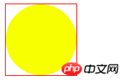
Since we have border-radius, we can use CSS to create rounded rectangles, circles and other graphics, and even even Box-shadow is also affected by border-radius to achieve the effect of element shadows and rounded corners. So can outline also create rounded corners? the answer is negative. That's because the function of outline is to outline the space occupied by the element. Although the graphic visual rounding is achieved through border-radius, the position and space occupied by the element has not changed at all, and it is still angular. Angular square.
<style>
  .round{
    width: 100px;
    height: 100px;
    background: yellow;
    border-radius: 50%;
    outline: solid 1px red;
  }
</style>
Differences in outline
Under Chrome, outline is limited to identifying the area occupied by the current element itself. Position space (border-box), but under FireFox it includes the position space occupied by descendant elements.
<style>
  .outline{
    width: 13px;
    height: 13px;
    outline: 1px solid red;
  }
</style>
<p></p>
<script>
  const el = document.querySelector(".outline")
  el.textContent = !!~navigator.appVersion.indexOf("Chrome") ? "Chrome" : "FireFox"
</script>
The above is the detailed content of Analysis of outline in css (with examples). For more information, please follow other related articles on the PHP Chinese website!

Hot AI Tools

Undresser.AI Undress
AI-powered app for creating realistic nude photos

AI Clothes Remover
Online AI tool for removing clothes from photos.

Undress AI Tool
Undress images for free

Clothoff.io
AI clothes remover

AI Hentai Generator
Generate AI Hentai for free.

Hot Article

Hot Tools

Notepad++7.3.1
Easy-to-use and free code editor

SublimeText3 Chinese version
Chinese version, very easy to use

Zend Studio 13.0.1
Powerful PHP integrated development environment

Dreamweaver CS6
Visual web development tools

SublimeText3 Mac version
God-level code editing software (SublimeText3)

Hot Topics
 1369
1369
 52
52
 How to remove the default style in Bootstrap list?
Apr 07, 2025 am 10:18 AM
The default style of the Bootstrap list can be removed with CSS override. Use more specific CSS rules and selectors, follow the "proximity principle" and "weight principle", overriding the Bootstrap default style. To avoid style conflicts, more targeted selectors can be used. If the override is unsuccessful, adjust the weight of the custom CSS. At the same time, pay attention to performance optimization, avoid overuse of !important, and write concise and efficient CSS code.
 How to upload files on bootstrap
Apr 07, 2025 pm 01:09 PM
The file upload function can be implemented through Bootstrap. The steps are as follows: introduce Bootstrap CSS and JavaScript files; create file input fields; create file upload buttons; handle file uploads (using FormData to collect data and then send to the server); custom style (optional).
 How to use bootstrap button
Apr 07, 2025 pm 03:09 PM
How to use the Bootstrap button? Introduce Bootstrap CSS to create button elements and add Bootstrap button class to add button text
 How to resize bootstrap
Apr 07, 2025 pm 03:18 PM
To adjust the size of elements in Bootstrap, you can use the dimension class, which includes: adjusting width: .col-, .w-, .mw-adjust height: .h-, .min-h-, .max-h-
 How to change the size of a Bootstrap list?
Apr 07, 2025 am 10:45 AM
The size of a Bootstrap list depends on the size of the container that contains the list, not the list itself. Using Bootstrap's grid system or Flexbox can control the size of the container, thereby indirectly resizing the list items.
 How to insert pictures on bootstrap
Apr 07, 2025 pm 03:30 PM
There are several ways to insert images in Bootstrap: insert images directly, using the HTML img tag. With the Bootstrap image component, you can provide responsive images and more styles. Set the image size, use the img-fluid class to make the image adaptable. Set the border, using the img-bordered class. Set the rounded corners and use the img-rounded class. Set the shadow, use the shadow class. Resize and position the image, using CSS style. Using the background image, use the background-image CSS property.
 How to implement nesting of Bootstrap lists?
Apr 07, 2025 am 10:27 AM
Nested lists in Bootstrap require the use of Bootstrap's grid system to control the style. First, use the outer layer <ul> and <li> to create a list, then wrap the inner layer list in <div class="row> and add <div class="col-md-6"> to the inner layer list to specify that the inner layer list occupies half the width of a row. In this way, the inner list can have the right one
 How to layout bootstrap
Apr 07, 2025 pm 02:24 PM
To use Bootstrap to layout a website, you need to use a grid system to divide the page into containers, rows, and columns. First add the container, then add the rows in it, add the columns within the row, and finally add the content in the column. Bootstrap's responsive layout function automatically adjusts the layout according to breakpoints (xs, sm, md, lg, xl). Different layouts under different screen sizes can be achieved by using responsive classes.


