

Introduction to CSS length unit em

This article brings you an introduction to the CSS length unit em. It has certain reference value. Friends in need can refer to it. I hope it will be helpful to you.
1. Why use em
em is also a unit in CSS, similar to px. Many people will wonder why em is still used after having px, and em is more troublesome to use than px.
em is mainly used in flexible layout. Here is a small chestnut to illustrate the power of em
<!DOCTYPE html><html lang="en"><head>
    <meta charset="UTF-8">
    <meta name="viewport" content="width=device-width, initial-scale=1.0">
    <meta http-equiv="X-UA-Compatible" content="ie=edge">
    <title>Document</title>
    <style>
        * {
            margin: 0;
            padding: 0;
        }

        ul {
            list-style: none;
        }

        .top {
            height: 80px;
            background-color: black;
        }

        .main {
            width: 960px;
            background-color: #ccc;
            margin: 0 auto;
            overflow: hidden;
        }

        .left {
            width: 30%;
            height: 100%;
            background-color: aqua;
            border: 1px solid red;
            float: left;
            font-size: 16px;
            line-height: 18px;
        }

        .right {
            width: 60%;
            height: 100%;
            font-size: 1em;
            line-height: 1.125em;
            background-color: deeppink;
            border: 1px solid red;
            float: right;
        }
    </style></head><body>
    <p class="top"></p>
    <p class="main">
        <p class="left">
            <ul>
                <li>em测试用例,没有em的情况</li>
                <li>em测试用例,没有em的情况</li>
                <li>em测试用例,没有em的情况</li>
                <li>em测试用例,没有em的情况</li>
                <li>em测试用例,没有em的情况</li>
                <li>em测试用例,没有em的情况</li>
                <li>em测试用例,没有em的情况</li>
                <li>em测试用例,没有em的情况</li>
                <li>em测试用例,没有em的情况</li>
                <li>em测试用例,没有em的情况</li>
                <li>em测试用例,没有em的情况</li>
                <li>em测试用例,没有em的情况</li>
                <li>em测试用例,没有em的情况</li>
                <li>em测试用例,没有em的情况</li>
                <li>em测试用例,没有em的情况</li>
                <li>em测试用例,没有em的情况</li>
                <li>em测试用例,没有em的情况</li>
                <li>em测试用例,没有em的情况</li>
                <li>em测试用例,没有em的情况</li>
                <li>em测试用例,没有em的情况</li>
            </ul>
        </p>
        <p class="right">
            <ul>
                <li>em测试用例有em的强大之处</li>
                <li>em测试用例有em的强大之处</li>
                <li>em测试用例有em的强大之处</li>
                <li>em测试用例有em的强大之处</li>
                <li>em测试用例有em的强大之处</li>
                <li>em测试用例有em的强大之处</li>
                <li>em测试用例有em的强大之处</li>
                <li>em测试用例有em的强大之处</li>
                <li>em测试用例有em的强大之处</li>
                <li>em测试用例有em的强大之处</li>
                <li>em测试用例有em的强大之处</li>
                <li>em测试用例有em的强大之处</li>
                <li>em测试用例有em的强大之处</li>
                <li>em测试用例有em的强大之处</li>
                <li>em测试用例有em的强大之处</li>
                <li>em测试用例有em的强大之处</li>
                <li>em测试用例有em的强大之处</li>
                <li>em测试用例有em的强大之处</li>
                <li>em测试用例有em的强大之处</li>
                <li>em测试用例有em的强大之处</li>
            </ul>
        </p>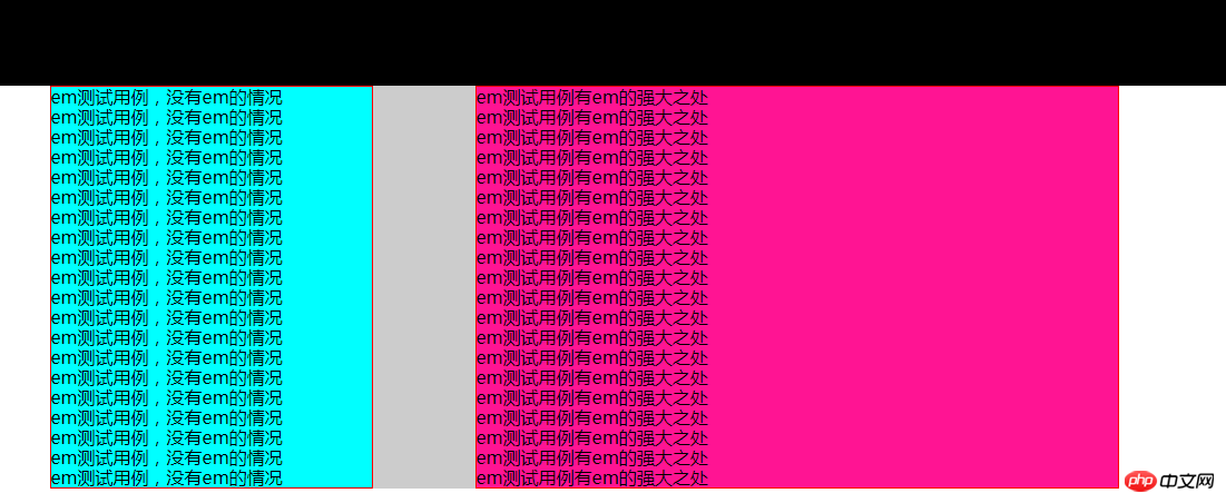
</p></body></html>This imitates the general layout of a web page and gives the difference between using em and px. .
Under normal circumstances, em and px look no different. As shown below
Next, hold down the ctrl key and continuously press the ‘-’ (minus sign) key to continuously reduce the page size. There will be a very obvious difference when the size is reduced to 25% (the Chrome browser is used here. If other browsers do not have this situation, you can manually change the font size in the browser. You can see it when increasing the font size. A similar situation occurs) As shown in the figure below
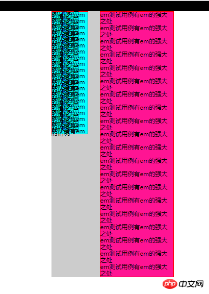
You can see that the left side using px has completely collapsed, and the specific text cannot be seen. The text on the right using em can still be clearly seen. The main reason for this phenomenon is that em is a relative size, and using em will not have much impact on the page's enlargement or reduction.
Since it is a relative size, there will be a reference size. The reference size of em is the font size of the current element. This will raise another question. Since the font size of the current element is used as a reference, what is used as a reference when the current font is in em units? At this time, the font size of its parent element is used as a reference.
So when the entire page uses em as the font size, 1em in the page is the browser’s default font size of 16px;
2. em Specific usage:
1. Set body{font-size: 1em}
After setting the font size of the body, Since the body font inherits the browser's default 16px, then as long as em is used on all web pages, then 1em=16px;
2. Start calculating the specific size of the element
(1) If the font size of the element is inherited from the upper layer, that is, 16px, then 1em=16px inside the element; therefore, the calculation method is as follows
Required em value = current element The px value/the font size value px of the parent element (usually 16px)
For example: 1px=1/16=0.0625em, 18px=18/16=1.125em
(2) If the font size of the element is set by yourself
The em value of the font size of the current element = the font size of the current element px/the font size of the parent element px
Other em values required by the current element = px value of the current element/font size of the element itself px
The following is passed a Example for detailed explanation
<!DOCTYPE html><html lang="en"><head>
<meta charset="UTF-8">
<meta name="viewport" content="width=device-width, initial-scale=1.0">
<meta http-equiv="X-UA-Compatible" content="ie=edge">
<title>Document</title>
<style>
body {
font-size: 1em;
}
.son1 {
font-size: 2em;
height: 5em;
width: 5em;
border: 0.0625em solid red;
background-color: aqua;
margin: 0 auto;
}
.son2 {
font-size: 32px;
height: 160px;
width: 160px;
border: 2px solid red;
background-color: aqua;
margin: 100px auto;
}
</style></head><body>
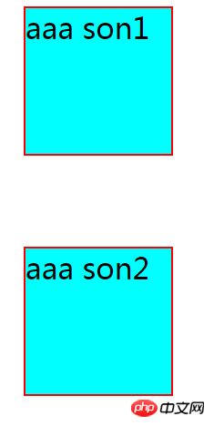
<p class="fa">
<p class="son1">aaa son1</p>
<p class="son2">aaa son2</p>
</p>
</body>
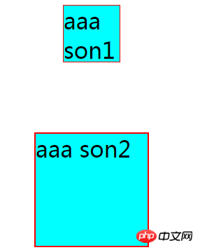
</html>Open the box model of the .son1 box displayed in the browser, and the detailed web page result diagram is as follows
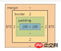
It can be found that .son1 and .son2 are exactly the same. The font size of
.son1 is 2em and the corresponding px is 2*16=32px; (In turn, you can verify the formula The em value of the font size of the current element (2) = Current element font size px (32)/parent element font size px (16) )
height and width are 5em corresponding px is 5*32=160px; (In turn, you can verify the formula Other em values required by the current element(5)=px value of the current element(160)/ The font size of the element itself px(32))
Note: In ie5/6, you need to add html { font-size: 100%} to ensure elastic layout (but currently ie5/6 basically does not have it, and this is based on the article 《The Incredible Em & Elastic Layouts with CSS》 As I learned, I haven’t tried to find out what the specific problem is. Write it down first and use it when encountering similar situations in the future)
3、rem的使用
rem使用方法和em类似,不过rem是相对于根元素的大小(即html的字体大小),而不是自身的大小。2中的栗子中的.son1 的相关带em的属性全改为rem 代码如下
<!DOCTYPE html><html lang="en"><head>
    <meta charset="UTF-8">
    <meta name="viewport" content="width=\, initial-scale=1.0">
    <meta http-equiv="X-UA-Compatible" content="ie=edge">
    <title>Document</title>
    <style>
        .son1 {
            font-size: 2rem;
            height: 5rem;
            width: 5rem;
            border: 0.0625rem solid red;
            background-color: aqua;
            margin: 0 auto;
        }

        .son2 {
            font-size: 32px;
            height: 160px;
            width: 160px;
            border: 2px solid red;
            background-color: aqua;
            margin: 100px auto;
        }
    </style></head><body>
    <p class="fa">
        <p class="son1">aaa son1</p>
        <p class="son2">aaa son2</p>
</p></body></html>结果图为:
因为.son1 中的单位全改为rem,参考对象为html字体的大小即为16px,所以.son1字体大小为2*16=32px ,宽度和高度为5*16=80px,边框为1px
总结:以上就是本篇文的全部内容,希望能对大家的学习有所帮助。更多相关教程请访问 CSS基础视频教程!
相关推荐:
The above is the detailed content of Introduction to CSS length unit em. For more information, please follow other related articles on the PHP Chinese website!

Hot AI Tools

Undresser.AI Undress
AI-powered app for creating realistic nude photos

AI Clothes Remover
Online AI tool for removing clothes from photos.

Undress AI Tool
Undress images for free

Clothoff.io
AI clothes remover

AI Hentai Generator
Generate AI Hentai for free.

Hot Article
Hot Tools

Notepad++7.3.1
Easy-to-use and free code editor

SublimeText3 Chinese version
Chinese version, very easy to use

Zend Studio 13.0.1
Powerful PHP integrated development environment

Dreamweaver CS6
Visual web development tools

SublimeText3 Mac version
God-level code editing software (SublimeText3)
Hot Topics
 1378
1378
 52
52

 How to write split lines on bootstrap
Apr 07, 2025 pm 03:12 PM
How to write split lines on bootstrap
Apr 07, 2025 pm 03:12 PM
There are two ways to create a Bootstrap split line: using the tag, which creates a horizontal split line. Use the CSS border property to create custom style split lines.
 How to insert pictures on bootstrap
Apr 07, 2025 pm 03:30 PM
How to insert pictures on bootstrap
Apr 07, 2025 pm 03:30 PM
There are several ways to insert images in Bootstrap: insert images directly, using the HTML img tag. With the Bootstrap image component, you can provide responsive images and more styles. Set the image size, use the img-fluid class to make the image adaptable. Set the border, using the img-bordered class. Set the rounded corners and use the img-rounded class. Set the shadow, use the shadow class. Resize and position the image, using CSS style. Using the background image, use the background-image CSS property.
 How to resize bootstrap
Apr 07, 2025 pm 03:18 PM
How to resize bootstrap
Apr 07, 2025 pm 03:18 PM
To adjust the size of elements in Bootstrap, you can use the dimension class, which includes: adjusting width: .col-, .w-, .mw-adjust height: .h-, .min-h-, .max-h-
 The Roles of HTML, CSS, and JavaScript: Core Responsibilities
Apr 08, 2025 pm 07:05 PM
The Roles of HTML, CSS, and JavaScript: Core Responsibilities
Apr 08, 2025 pm 07:05 PM
HTML defines the web structure, CSS is responsible for style and layout, and JavaScript gives dynamic interaction. The three perform their duties in web development and jointly build a colorful website.
 How to set up the framework for bootstrap
Apr 07, 2025 pm 03:27 PM
How to set up the framework for bootstrap
Apr 07, 2025 pm 03:27 PM
To set up the Bootstrap framework, you need to follow these steps: 1. Reference the Bootstrap file via CDN; 2. Download and host the file on your own server; 3. Include the Bootstrap file in HTML; 4. Compile Sass/Less as needed; 5. Import a custom file (optional). Once setup is complete, you can use Bootstrap's grid systems, components, and styles to create responsive websites and applications.
 How to use bootstrap in vue
Apr 07, 2025 pm 11:33 PM
How to use bootstrap in vue
Apr 07, 2025 pm 11:33 PM
Using Bootstrap in Vue.js is divided into five steps: Install Bootstrap. Import Bootstrap in main.js. Use the Bootstrap component directly in the template. Optional: Custom style. Optional: Use plug-ins.
 How to use bootstrap button
Apr 07, 2025 pm 03:09 PM
How to use bootstrap button
Apr 07, 2025 pm 03:09 PM
How to use the Bootstrap button? Introduce Bootstrap CSS to create button elements and add Bootstrap button class to add button text
 How to view the date of bootstrap
Apr 07, 2025 pm 03:03 PM
How to view the date of bootstrap
Apr 07, 2025 pm 03:03 PM
Answer: You can use the date picker component of Bootstrap to view dates in the page. Steps: Introduce the Bootstrap framework. Create a date selector input box in HTML. Bootstrap will automatically add styles to the selector. Use JavaScript to get the selected date.
