 Web Front-end
 JS Tutorial
 How to use bootstrap framework? Introduction to the usage of bootstrap framework
How to use bootstrap framework? Introduction to the usage of bootstrap framework
Bootstrap is one of the most popular front-end frameworks from Twitter. The Bootstrap framework is based on HTML, CSS, and javascript. It is simple and flexible, making Web development faster, but many friends don’t know How to use the bootstrap framework, the following article will introduce to you how to use the bootstrap framework.
Without further ado, let’s go straight to the text~ (Free course recommendation: bootstrap tutorial)
The (paragraph) element is also set with a bottom margin equal to 1/2 the line height (i.e. 10px).
Basic style
Typesetting:
Body text: The .lead class allows paragraphs to be highlighted.
at the end of the line to retain the required style.
to display the quote style. For direct quotes, it is recommended to use thetag.
8. List, list-unstyled class removes the default list-style A set of elements with styles and left margins (direct children only). The list-inline class sets display: inline-block; And add a small amount of padding to place all elements on the same line. The dl-horizontal class arranges the phrases and their descriptions within
in one line.
Code:
##tag wraps inline style code snippet
Label marks content entered by the user through the keyboard
 Display code block. The pre-scrollable class can be used to set up to 350px with vertical scrollbar. </p>
<p><br><var> Label tag variable</p>
<p><br><samp> Tag tag content output by the program. </p>
<p><br></p>Table: <p><strong></strong><br>.table class specifies the basic style, </p>
<p><br>.table-striped striped style, </p>
<p><br>.table-bordered class has border style, </p>
<p><br>.table-hover class has mouse hover style, </p>
<p><br>.table-condensed Class compact style. </p>
<p><br>Status class (row or cell setting color): active, success, info, warning, info. </p>
<p><br>Wrap any .table element in a .table-responsive element to create a responsive table, which will scroll horizontally on small screen devices (less than 768px). The horizontal scrollbar disappears when the screen is larger than 768px width.
</p>
<p><strong><br></strong></p>Form: <p><strong></strong><br>1. Basic example: </p>
<p> All settings are .form-control Classes <input>, <textarea> and
<select> elements will have their width attribute set to width: 100%; by default. </p>
<p><br>Wrap the label element and the previously mentioned controls in
The best arrangement can be obtained in .form-group. </p>
<p><br>Do not mix the form group and the input box group directly. It is recommended to nest the input box group into the form group. </p>
<p><br>form-group, input-group, control-group, </p>
<p><br>2. Inline form: </p>
<p><form> element is added.form The -inline class causes its content to be left-aligned and behave as an inline-block level control. Only applies when the viewport is at least 768px wide (any smaller viewport width will cause the form to collapse). </p>
<p></p>
<p>The width of the radio/multi-select box control in the inline form is set to width: auto; <br></p>
<p>If you do not set the label label for each input control, the screen reader will not be able to correctly Identify. For these inline forms, you can hide it by setting the .sr-only class for the label. <br></p>
<p>3. Horizontally arranged forms
: Change the behavior of .form-group by adding the .form-horizontal class to the form so that it behaves like a row in the grid system <br></p>
<p>4, multi-select and radio button
: .radio, .radio-inline, .checkbox, .checkbox-inline. <br></p>
<p>5. Static controls
: In a horizontally laid out form, if you need to place a line of plain text and the label element on the same line, just add the .form-control-static class to the <p> element. <br></p>
<p>6. Control status <br></p>
<p>.disabled class disables controls. When disabled is set to <fieldset>, all included controls are disabled. <br></p>
<p>a tags are not affected by this. The <br></p>
<p>readonly attribute can prevent users from entering the <br></p>
<p>.has-warning, .has-error or .has-success class to the parent element of these controls. Any .control-label, .form-control, and .help-block elements contained within this element will accept the styles for these validation states. <br></p>
<p>You can also add additional icons to the input box for the verification status (note that it depends on the label tag). Just set the corresponding .has-feedback class and add the correct icon. </p>
<p>7. Control size<br></p>
<p>The height can be set for the control through .input-lg .input-sm similar classes, and the control can be set through .col-lg-* similar classes Set width<br></p>
<p>Quickly set the size for label elements and form controls wrapped in .form-horizontal by adding the .form-group-lg or .form-group-sm class. <br></p>
<p>You can easily set the width of the input box or any of its parent elements by wrapping it with a column in the grid system. <br></p>
<p>8. Auxiliary text: help-block class, "block" level auxiliary text for form controls. <br></p>
<p><strong>Buttons: </strong></p>
<p>1. Basic style, btn, btn-default, btn-primary, btn-success, btn-info, btn-warning, btn-danger, active <br></p>
<p>2, display form, btn-link, btn-block, close <br></p>
<p>3, size style, .btn-lg, .btn- sm,.btn-xs. <br></p>
<p>The button class can be applied through the <a>, <button> or <input> elements, but it is recommended to use the <button> element to obtain matching rendering on each browser. Effect. <br></p>
<p><strong>Image: </strong>Image shape, img-rounded, img-circle, img-thumbnail, IE8 does not support the rounded corner attribute in CSS3. <br></p>
<p><strong>Auxiliary: </strong>text-muted, text-primary, text-success, text-info, text-warning, text-danger
, bg-primary, bg-success, bg-info, bg-warning, bg-danger, triangle symbol, caret
, float
, centered
<strong><br></strong></p>
<p><strong>Component style</strong> <br></p>
<p><strong>Icon: </strong> <br></p>
<p>200 A font icon from Glyphicon Halflings. The <br></p>
<p> icon class can only be applied to empty elements and cannot be used in conjunction with other components. <br></p><div class="code" style="position:relative; padding:0px; margin:0px;"><pre class='brush:php;toolbar:false;'><span class="glyphicon glyphicon-search"></span>
Copy after login
Menu:
Wrap the drop-down menu trigger and drop-down menu in .dropdown
Menu alignment: By default, dropdown menus are automatically positioned at 100% width along the top and left edges of the parent element. Adding the .dropdown-menu-right class to .dropdown-menu allows the menu to be right-aligned
Menu grouping: dropdown-header table description items, .disabled table disabled items
Pop up: The .dropup class can make the triggered drop-down menu open upwards
Button group
:
Button group.btn-group, specify the button size in the group through .btn-group-*.
Button bar.btn-toolbar
Buttons are stacked vertically to display btn-group-vertical
Button groups aligned on both ends btn-group-justified
Navigation:
Tabs.nav-tabs class depends on .nav base class.
Capsule tab page .nav-pills class, add .nav-stacked class to change it to vertical stacking.
The .nav-justified class makes it easy to make tabs or capsules the same width.
navbar navbar-default
For the
Placing the form within .navbar-form can provide good vertical alignment,
.navbar-text
. navbar-link
.navbar-left and .navbar-right utility classes align navigation links, forms, buttons or text.
.navbar-fixed-top class allows the navigation bar to be fixed at the top
.navbar-fixed-bottom class allows the navigation bar to be fixed at the bottom
.navbar-static-top class allows the navigation bar to disappear as the page scrolls down.
.navbar-inverse class can change the appearance of the navigation bar.
breadcrumb Creates a hierarchical navigation structure (breadcrumbs).
Page:
pagination, and use the .disabled class and the .active class for the page number according to the situation.
The .pagination-lg or .pagination-sm classes provide additional sizes to choose from.
pagerSimple page turning to the previous and next pages. And can be marked by previous and next classes.
Label: label label base class, the label can be changed through label-default, label-primary, label-success, label-info, label-warning, label-danger Exterior.
badge, which can display new or unread information items very conspicuously.
Others: Thumbnails
, prompt box
,progress bar
, media objects, etc.
Customized style
BootStrap provides components and jquery plug-ins for customization according to their own needs. Users can also directly modify the Less source code.
The above is the detailed content of How to use bootstrap framework? Introduction to the usage of bootstrap framework. For more information, please follow other related articles on the PHP Chinese website!

Hot AI Tools

Undresser.AI Undress
AI-powered app for creating realistic nude photos

AI Clothes Remover
Online AI tool for removing clothes from photos.

Undress AI Tool
Undress images for free

Clothoff.io
AI clothes remover

AI Hentai Generator
Generate AI Hentai for free.

Hot Article

Hot Tools

Notepad++7.3.1
Easy-to-use and free code editor

SublimeText3 Chinese version
Chinese version, very easy to use

Zend Studio 13.0.1
Powerful PHP integrated development environment

Dreamweaver CS6
Visual web development tools

SublimeText3 Mac version
God-level code editing software (SublimeText3)

Hot Topics
 Replace String Characters in JavaScript
Mar 11, 2025 am 12:07 AM
Detailed explanation of JavaScript string replacement method and FAQ This article will explore two ways to replace string characters in JavaScript: internal JavaScript code and internal HTML for web pages. Replace string inside JavaScript code The most direct way is to use the replace() method: str = str.replace("find","replace"); This method replaces only the first match. To replace all matches, use a regular expression and add the global flag g: str = str.replace(/fi
 8 Stunning jQuery Page Layout Plugins
Mar 06, 2025 am 12:48 AM
Leverage jQuery for Effortless Web Page Layouts: 8 Essential Plugins jQuery simplifies web page layout significantly. This article highlights eight powerful jQuery plugins that streamline the process, particularly useful for manual website creation
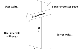 Build Your Own AJAX Web Applications
Mar 09, 2025 am 12:11 AM
So here you are, ready to learn all about this thing called AJAX. But, what exactly is it? The term AJAX refers to a loose grouping of technologies that are used to create dynamic, interactive web content. The term AJAX, originally coined by Jesse J
 10 Mobile Cheat Sheets for Mobile Development
Mar 05, 2025 am 12:43 AM
This post compiles helpful cheat sheets, reference guides, quick recipes, and code snippets for Android, Blackberry, and iPhone app development. No developer should be without them! Touch Gesture Reference Guide (PDF) A valuable resource for desig
 Improve Your jQuery Knowledge with the Source Viewer
Mar 05, 2025 am 12:54 AM
jQuery is a great JavaScript framework. However, as with any library, sometimes it’s necessary to get under the hood to discover what’s going on. Perhaps it’s because you’re tracing a bug or are just curious about how jQuery achieves a particular UI
 10 jQuery Fun and Games Plugins
Mar 08, 2025 am 12:42 AM
10 fun jQuery game plugins to make your website more attractive and enhance user stickiness! While Flash is still the best software for developing casual web games, jQuery can also create surprising effects, and while not comparable to pure action Flash games, in some cases you can also have unexpected fun in your browser. jQuery tic toe game The "Hello world" of game programming now has a jQuery version. Source code jQuery Crazy Word Composition Game This is a fill-in-the-blank game, and it can produce some weird results due to not knowing the context of the word. Source code jQuery mine sweeping game
 How do I create and publish my own JavaScript libraries?
Mar 18, 2025 pm 03:12 PM
Article discusses creating, publishing, and maintaining JavaScript libraries, focusing on planning, development, testing, documentation, and promotion strategies.
 jQuery Parallax Tutorial - Animated Header Background
Mar 08, 2025 am 12:39 AM
This tutorial demonstrates how to create a captivating parallax background effect using jQuery. We'll build a header banner with layered images that create a stunning visual depth. The updated plugin works with jQuery 1.6.4 and later. Download the


