 Web Front-end
 CSS Tutorial
 DIV CSS3 box-shadow object box shadow and picture shadow (code example)
DIV CSS3 box-shadow object box shadow and picture shadow (code example)
The content this article brings to you is about DIV CSS3 box-shadow object box shadow and picture shadow (code examples). It has certain reference value. Friends in need can For reference, I hope it will be helpful to you.
1. CSS style words and usage syntax
1. Box shadow style words: box-shadow
2. Grammar
p{box-shadow:0 0 1px #000 inset;}represents the border spacing The shadow color of left 0, top 0 and 1px shadow range is black (#000). With inset, it represents the shadow inside the box, and without inset, it represents the shadow outside the box.
Note:
box-shadow:0px 0px 1px #000
When the first value is 0, it means that the shadow of the left and right borders is 1px range
The first value is a positive integer, which means the left Border shadow
The first value is a negative integer representing the shadow of the right border
Similarly
The second value is 0 representing the shadow of the upper and lower borders
The second value is a positive integer representing 1px shadow distance from the upper border How many
The first value is a negative integer representing the bottom border shadow setting
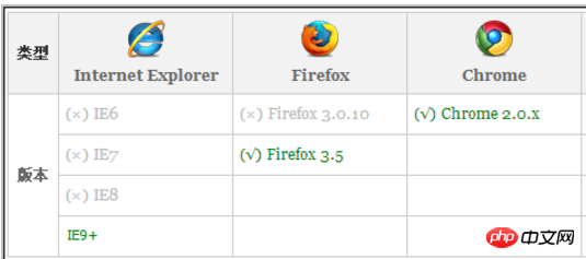
3. Browser compatibility chart
 Browser compatibility list chart
2. pCSS5 case
pCSS5 sets the inner shadow and outer shadow respectively for p box and picture IMG as cases.
1. Case HTML code
nbsp;html>


<meta>
<title>对象阴影 在线演示 DIVCSS5 VIP</title>
<link>
<!-- www.divcss5.com -->


<div>盒子对象阴影测试</div>
<div>DIV盒子内阴影</div>
<div>图片对象阴影测试</div>
<div><img  src="/static/imghw/default1.png" data-src="images/45.gif" class="lazy" alt="DIV CSS3 box-shadow object box shadow and picture shadow (code example)" ></div>
2. Case CSS code
.box {box-shadow:5px 2px 6px #000 inset; width:300px; height:80px; margin:0 auto}
.box2 img {box-shadow:5px 2px 6px #000}Set the inner shadow effect of the p object and the outer shadow effect of the image respectively
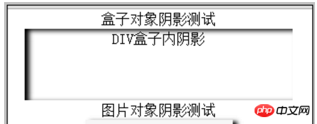
3. Case screenshots

pInner shadow and CSS image outer shadow effect screenshots
4. Note: The application needs to be tested in IE9 and above browsers or Google, Apple Wait for the browser to be tested
5. CSS3 online demonstration: (tested in IE9 or above browsers, Google and other browsers)
3. Summary explanation
1. Corresponding to CSS3 Manual
http://www.php.cn/course/45.htm
2. Due to compatibility, CSS3 attributes are not supported by IE browsers below IE9 It is not compatible, so after setting it is only compatible with IE9 and above browsers, so choose carefully when using it.
3. Generally, CSS3 styles are used regardless of lower versions. Including shadows and rounded corners used by Taobao Juhuasuan, they can also be seen in IE9 and above browsers, but CSS3 style effects cannot be seen in lower version browsers.
The above is the complete introduction. If you want to know more about CSS3 video tutorial, please pay attention to the PHP Chinese website.
The above is the detailed content of DIV CSS3 box-shadow object box shadow and picture shadow (code example). For more information, please follow other related articles on the PHP Chinese website!

Hot AI Tools

Undresser.AI Undress
AI-powered app for creating realistic nude photos

AI Clothes Remover
Online AI tool for removing clothes from photos.

Undress AI Tool
Undress images for free

Clothoff.io
AI clothes remover

AI Hentai Generator
Generate AI Hentai for free.

Hot Article

Hot Tools

Notepad++7.3.1
Easy-to-use and free code editor

SublimeText3 Chinese version
Chinese version, very easy to use

Zend Studio 13.0.1
Powerful PHP integrated development environment

Dreamweaver CS6
Visual web development tools

SublimeText3 Mac version
God-level code editing software (SublimeText3)

Hot Topics
 1378
1378
 52
52
 Making Your First Custom Svelte Transition
Mar 15, 2025 am 11:08 AM
The Svelte transition API provides a way to animate components when they enter or leave the document, including custom Svelte transitions.
 Working With GraphQL Caching
Mar 19, 2025 am 09:36 AM
If you’ve recently started working with GraphQL, or reviewed its pros and cons, you’ve no doubt heard things like “GraphQL doesn’t support caching” or
 Show, Don't Tell
Mar 16, 2025 am 11:49 AM
How much time do you spend designing the content presentation for your websites? When you write a new blog post or create a new page, are you thinking about
 Building an Ethereum app using Redwood.js and Fauna
Mar 28, 2025 am 09:18 AM
With the recent climb of Bitcoin’s price over 20k $USD, and to it recently breaking 30k, I thought it’s worth taking a deep dive back into creating Ethereum
 Creating Your Own Bragdoc With Eleventy
Mar 18, 2025 am 11:23 AM
No matter what stage you’re at as a developer, the tasks we complete—whether big or small—make a huge impact in our personal and professional growth.
 A bit on ci/cd
Apr 02, 2025 pm 06:21 PM
I'd say "website" fits better than "mobile app" but I like this framing from Max Lynch:
 Vue 3
Apr 02, 2025 pm 06:32 PM
It's out! Congrats to the Vue team for getting it done, I know it was a massive effort and a long time coming. All new docs, as well.
 Let's use (X, X, X, X) for talking about specificity
Mar 24, 2025 am 10:37 AM
I was just chatting with Eric Meyer the other day and I remembered an Eric Meyer story from my formative years. I wrote a blog post about CSS specificity, and


