 Web Front-end
 JS Tutorial
 Analysis of the relationship between viewport and related attributes (picture)
Analysis of the relationship between viewport and related attributes (picture)
The content of this article is about the analysis (picture) of the relationship between viewport and related attributes. It has certain reference value. Friends in need can refer to it. I hope it will be helpful to you.
Without further ado, let’s get to the point
Children’s shoes who have a general understanding of viewport should know that there are three types of viewport
Layout viewport (layout viewport)
Visual viewport
ideal viewport
corresponding There are 5 related properties
width: Set the width of the layout viewport to a specific value
initial-scale: Set the initialization of the page The zoom level and width of the layout viewport.
minimum-scale: Set the minimum zoom level
maximum-scale: Set the maximum zoom level
user-scalable: Whether to prevent users from zooming
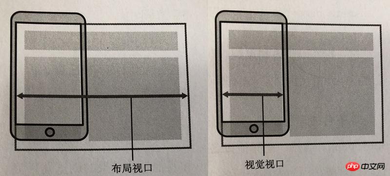

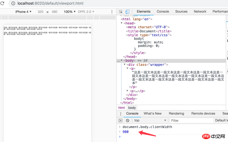
CSS layout is calculated based on the layout viewport and is constrained by it.
As shown below, the width of the pink bar is based on 600 * 30% = 180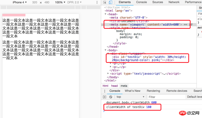
initial- Scale is also used to set the layout viewport, which is different from minimum-scale and maximum-scale.
Layout viewport width = ideal viewport width/initial-scale, so the width of the layout viewport in the picture below is equal to 106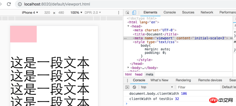
At the same time, the layout window will not be affected
Under normal circumstances, the visual window is not important to developers, but if it is really needed, you can use window. innerWidth/Height can get the current visually palatable value (there will be problems with Android webkit2 and proxy browsers)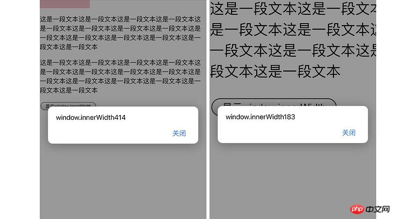
layout viewport size for the device, with the most ideal width for browsing and reading.
The ideal viewport isdefined by the browser and is not a function of the device or operating system. So different browsers on the same device may have different ideal fit widths. The ideal viewport width will change as the device changes (the exception is early Safari, which can be solved with initial-scale=1. I just tried it with iPhone 8p, and the ideal viewport will automatically change after rotating the device)
The following two methods can set the width of the layout window to the width of the ideal window, but the first method will not change after the device is rotated in early Safari, and the second method will have an incorrect width under IE 10, so The third type is the perfect mata viewport
<meta>

<meta>

<meta>
Maximum-scale and minimum-scale are determined based on the ideal window, and The width of the layout window does not matter. In the picture below, the ideal viewport width is 320px, and the layout viewport is set to 160px. The screenshot is when I zoomed in to the maximum, and the width of the corresponding visual window is 32px (the width of 2 pinks), which is the ideal viewport width. /10 times the width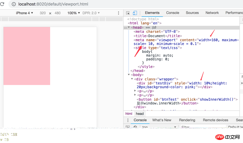
The above is the detailed content of Analysis of the relationship between viewport and related attributes (picture). For more information, please follow other related articles on the PHP Chinese website!

Hot AI Tools

Undresser.AI Undress
AI-powered app for creating realistic nude photos

AI Clothes Remover
Online AI tool for removing clothes from photos.

Undress AI Tool
Undress images for free

Clothoff.io
AI clothes remover

AI Hentai Generator
Generate AI Hentai for free.

Hot Article

Hot Tools

Notepad++7.3.1
Easy-to-use and free code editor

SublimeText3 Chinese version
Chinese version, very easy to use

Zend Studio 13.0.1
Powerful PHP integrated development environment

Dreamweaver CS6
Visual web development tools

SublimeText3 Mac version
God-level code editing software (SublimeText3)

Hot Topics
 1385
1385
 52
52
 Table Border in HTML
Sep 04, 2024 pm 04:49 PM
Guide to Table Border in HTML. Here we discuss multiple ways for defining table-border with examples of the Table Border in HTML.
 HTML margin-left
Sep 04, 2024 pm 04:48 PM
Guide to HTML margin-left. Here we discuss a brief overview on HTML margin-left and its Examples along with its Code Implementation.
 Nested Table in HTML
Sep 04, 2024 pm 04:49 PM
This is a guide to Nested Table in HTML. Here we discuss how to create a table within the table along with the respective examples.
 HTML Table Layout
Sep 04, 2024 pm 04:54 PM
Guide to HTML Table Layout. Here we discuss the Values of HTML Table Layout along with the examples and outputs n detail.
 HTML Input Placeholder
Sep 04, 2024 pm 04:54 PM
Guide to HTML Input Placeholder. Here we discuss the Examples of HTML Input Placeholder along with the codes and outputs.
 HTML Ordered List
Sep 04, 2024 pm 04:43 PM
Guide to the HTML Ordered List. Here we also discuss introduction of HTML Ordered list and types along with their example respectively
 Moving Text in HTML
Sep 04, 2024 pm 04:45 PM
Guide to Moving Text in HTML. Here we discuss an introduction, how marquee tag work with syntax and examples to implement.
 HTML onclick Button
Sep 04, 2024 pm 04:49 PM
Guide to HTML onclick Button. Here we discuss their introduction, working, examples and onclick Event in various events respectively.


