There are many length units in css, which can be described as diverse, but they can basically be divided into three categories: relative length units, absolute length units and visual area percentage length units. This article will tell you what units are included in the relative length unit category and introduce how to use commonly used relative units. It has certain reference value. Friends in need can refer to it. I hope it will be helpful to you.
The relative length units in css include: em, rem, points, pica, ex, ch, etc. Let’s introduce the two commonly used units in relative length: how to use the em and rem units. .
css length unit em unit
em is a relative font length unit, and its unit length is based on the vertical length of the text of the element. decided. For example: 1em is equivalent to the current font size (font-size attribute), then 2em is equivalent to twice the current font size. If used for other attributes (width, height), it is relative to the font-size of the element itself. It can be used to set width, height, line-height, margin, padding, border and other styles.
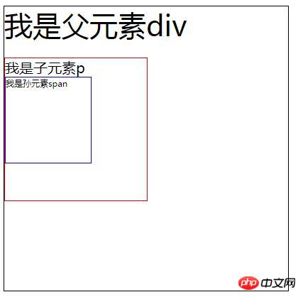
Let’s look at a simple example in detail to understand em.
<!DOCTYPE html>
<html>

	<head>
		<meta charset="UTF-8">
		<style>
			div {
				font-size: 40px;
				width: 10em;
				/* 400px */
				height: 10em;
				border: solid 1px black;
			}

			p {
				font-size: 0.5em;
				/* 20px */
				width: 10em;
				/* 200px */
				height: 10em;
				border: solid 1px red;
			}

			span {
				font-size: 0.5em;
				width: 10em;
				height: 10em;
				border: solid 1px blue;
				display: block;
			}
		</style>

	</head>

	<body>
		<div>
			我是父元素div
			<p>
				我是子元素p
				<span>我是孙元素span</span>
			</p>
		</div>
	</body>
	</body>

</html>Rendering:

Characteristics of em:
The value of the em unit is not Fixed, the em of the font size of the child element is relative to the font size of the parent element; the width/height/padding/margin of the
element using em is relative to the font-size of the element.
css length unit rem unit
rem is a new relative font length unit in CSS3, which is only relative The root element, that is, the font size of the html element is used to determine its length, which is an essential length unit for mobile pages.
<!DOCTYPE html>
<html>

	<head>
		<meta charset="UTF-8">
		<style>
			html {
				font-size: 16px;
			}

			.div1 {
				font-size: 3rem;
			}

			.div2 {
				font-size: 0.5rem;
			}
		</style>

	</head>

	<body>

		<div class="div1">
			div1---48px
			<div class="div2">
			    div2---8px
			</div>
		</div>
	</body>
	</body>

</html>Rendering:

#In the example, the font size of html is a fixed size of 16px, and the font size of div1 is set to 3rem, and: 3rem = 16px * 3 = 48px, so the font size of div1 is 48;
sets the font size of div2 to 0.5rem, and: 0.5rem = 16px * 0.5 = 8px, so the font size of div2 is 8px.
Comparison between em and rem
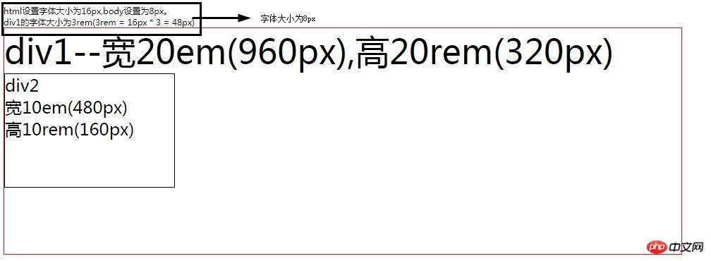
Let’s take a look at the difference between em and rem through a simple example
<!DOCTYPE html>
<html>

	<head>
		<meta charset="UTF-8">
		<style>
			html {
				font-size: 16px;
			}

			body {
				font-size: 8px;
			}

			.div1 {
				font-size: 3rem;
				/* 3rem = 16px * 3 = 48px */
				width: 20em;
				/* 20em = 48px * 20 = 960px */
				height: 20rem;
				/* 10rem = 16px * 20 = 320px */
				border: 1px solid red;
			}

			.div2 {
				font-size: 0.5em;
				/* 0.5rem = 48px * 0.5 = 24px */
				width: 10em;
				/* 10em = 48px * 10 = 480px */
				height: 10rem;
				/* 10rem = 16px * 10 = 160px */
				border: 1px solid black;
			}
		</style>

	</head>

	<body>
		<div>
			html设置字体大小为16px,body设置为8px。<br />
			div1的字体大小为3rem(3rem = 16px * 3 = 48px)
		</div>
		<div class="div1">

			div1--宽20em(960px),高20rem(320px)
			<div class="div2">
				div2<br />
				宽10em(480px)<br />
				高10rem(160px)
			</div>
		</div>
	</body>
	</body>

</html>Rendering:

Note: The font-size of the
div1 box is 3rem, for reference It is the font-size of the root element html; the width of the
div1 box is 20em. Because it has the font-size attribute, the reference text is its own font-size;
height of the div1 box It is 3rem, and the reference is the font-size of the root element html; the font-size of the
div2 box is 0.5em, and the reference is the font-size of its parent element div1 box;
div2 The height of the box is 10rem, and the reference text is the font-size of the root element html;
The width of the div2 box is 10em, and the reference text is the font-size of the parent element div1 box.
Summary : The above is the entire content of this article, I hope it will be helpful to everyone's study. For more related tutorials, please visit CSS Basics Video Tutorial, CSS3 Video Tutorial, bootstrap Video Tutorial!
The above is the detailed content of What are the relative length units in css? Introduction to commonly used relative units em and rem. For more information, please follow other related articles on the PHP Chinese website!