 Web Front-end
 CSS Tutorial
 How to use pure CSS to achieve the illusion of a chessboard animation (source code attached)
How to use pure CSS to achieve the illusion of a chessboard animation (source code attached)
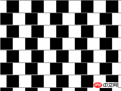
The content of this article is about how to use pure CSS to realize the illusion animation of the chessboard (source code attached). It has certain reference value. Friends in need can refer to it. I hope it will be helpful to you.
Effect preview

Source code download
https://github.com/comehope/front- end-daily-challenges
Code Interpretation
Define dom, the container contains 10 sub-elements, each sub-element represents a row:
<div>
    <span></span>
    <span></span>
    <span></span>
    <span></span>
    <span></span>
    <span></span>
    <span></span>
    <span></span>
    <span></span>
    <span></span>
</div>
Centered display:
body {
    margin: 0;
    height: 100vh;
    display: flex;
    align-items: center;
    justify-content: center;
}Define the container size in vmin units, and arrange the child elements vertically:
.container {
    width: 100vmin;
    height: 100vmin;
    display: flex;
    flex-direction: column;
}Set the background pattern of the child elements to spaced black and white blocks with a thin line at the top:
.container span {
    width: inherit;
    height: 10vmin;
    background:
        linear-gradient(
            gray, gray 0.5vmin,
            transparent 0.5vmin, transparent
        ),
        repeating-linear-gradient(
            to right,
            black, black 10vmin,
            transparent 10vmin, transparent 20vmin
        )
}Add a thin line at the bottom of the container:
.container {
    border-bottom: 0.5vmin solid gray;
}Add an animation effect to move the background of the odd-numbered rows to the right by half a color block. After moving, it will look like the odd-numbered rows are wider on the right. Narrow on the left, wide on the left and narrow on the right of even-numbered rows, this is an illusion:
.container span:nth-child(odd) {
    animation: move 5s linear infinite;
}

@keyframes move {
    0%, 55%, 100% {
        background-position: 0 0;
    }

    5%, 50% {
        background-position: 5vmin 0;
    }
}Let the background of the even-numbered rows also move, creating the illusion of the opposite direction:
.container span:nth-child(even) {
    animation: move 5s linear infinite reverse;
}Done!
The above is the detailed content of How to use pure CSS to achieve the illusion of a chessboard animation (source code attached). For more information, please follow other related articles on the PHP Chinese website!

Hot AI Tools

Undresser.AI Undress
AI-powered app for creating realistic nude photos

AI Clothes Remover
Online AI tool for removing clothes from photos.

Undress AI Tool
Undress images for free

Clothoff.io
AI clothes remover

AI Hentai Generator
Generate AI Hentai for free.

Hot Article

Hot Tools

Notepad++7.3.1
Easy-to-use and free code editor

SublimeText3 Chinese version
Chinese version, very easy to use

Zend Studio 13.0.1
Powerful PHP integrated development environment

Dreamweaver CS6
Visual web development tools

SublimeText3 Mac version
God-level code editing software (SublimeText3)

Hot Topics
 How to implement a tight transition animation in React using react-transition-group?
Apr 04, 2025 pm 11:27 PM
Using react-transition-group in React to achieve confusion about closely following transition animations. In React projects, many developers will choose to use react-transition-group library to...
 The width of emsp spaces in HTML is inconsistent. How to reliably implement text indentation?
Apr 04, 2025 pm 11:57 PM
Regarding the problem of inconsistent width of emsp spaces in HTML and Chinese characters in many web tutorials, it is mentioned that occupying the width of a Chinese character, but the actual situation is not...
 How to implement adaptive layout of Y-axis position in web annotation?
Apr 04, 2025 pm 11:30 PM
The Y-axis position adaptive algorithm for web annotation function This article will explore how to implement annotation functions similar to Word documents, especially how to deal with the interval between annotations...
 How to select and style elements of the first specific class using CSS and JavaScript?
Apr 04, 2025 pm 11:33 PM
How to select and style elements of the first specific class using CSS and JavaScript? In web development, you often encounter the need to select and modify specific classes...
 How to use the clip-path attribute of CSS to achieve the 45-degree curve effect of segmenter?
Apr 04, 2025 pm 11:45 PM
How to achieve the 45-degree curve effect of segmenter? In the process of implementing the segmenter, how to make the right border turn into a 45-degree curve when clicking the left button, and the point...
 How to achieve gap effect on the card and coupon layout with gradient background?
Apr 05, 2025 am 07:48 AM
Realize the gap effect of card coupon layout. When designing card coupon layout, you often encounter the need to add gaps on card coupons, especially when the background is gradient...
 How to accurately realize the small label effect in the design draft on the mobile terminal?
Apr 04, 2025 pm 11:36 PM
How to achieve the effect of small labels in the design draft on the mobile terminal? When designing mobile applications, it is common to find out how to accurately restore the small label effect in the design draft...
 How to achieve segmentation effect with 45 degree curve border?
Apr 04, 2025 pm 11:48 PM
Tips for Implementing Segmenter Effects In user interface design, segmenter is a common navigation element, especially in mobile applications and responsive web pages. ...


