The content of this article is about how to use pure CSS to achieve the effect of mobile phone address book. It has certain reference value. Friends in need can refer to it. I hope it will be helpful to you.
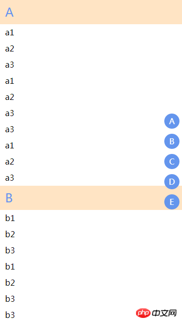
We often see address book lists on mobile phones. This type of layout generally has two significant effects

Initial letter ceiling
Quick positioning
Let’s implement it
Page structure
The page structure here is very simple, just two lists
<div class="code" style="position:relative; padding:0px; margin:0px;"><div class="code" style="position:relative; padding:0px; margin:0px;"><pre class="brush:php;toolbar:false"><div> <!--联系人列表--> <div> <dl>A <dt>a1</dt> <dt>a2</dt> <dl>B <dt>b1</dt> <dt>b2</dt> ... </dl> </dl> </div> <!--导航列表--> <div> <a>A</a> <a>B</a> </div> </div></pre><div class="contentsignin">Copy after login</div></div><div class="contentsignin">Copy after login</div></div>Then add some styles
html,body{
    margin: 0;
    height: 100%;
    padding: 0;
}
dl,dd{
    margin: 0;
}
.con{
    position: relative;
    height: 100%;
    overflow-x: hidden;
}
.index{
    position: absolute;
    right: 0;
    top: 0;
    bottom: 0;
    display: flex;
    flex-direction: column;
    justify-content: center;
}
.index a{
    display: block;
    width: 30px;
    height: 30px;
    text-align: center;
    line-height: 30px;
    border-radius: 50%;
    background: cornflowerblue;
    text-decoration: none;
    color: #fff;
    outline: 0;
    margin: 5px;
}
.contacts{
    height: 100%;
    background: #fff;
    overflow: auto;
    line-height: 2em;
}
.contacts dt{
    background: bisque;
    font-size: 1.5rem;
    color:cornflowerblue;
    height: 2em;
    line-height: 2em;
    padding: 0 10px;
}
.contacts dd{
    padding: 0 10px;
    display: block;
    cursor: pointer;
}So you can see the layout
Achieving the ceiling effect
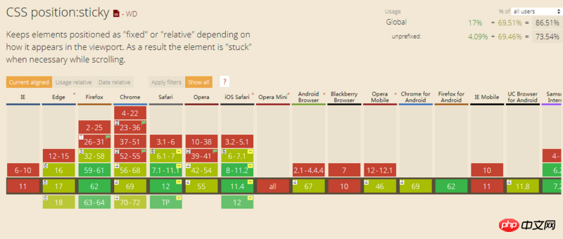
The ceiling effect is actually very simple, just use the new attribute in cssposition:sticky
The compatibility is pretty good, at least on the mobile side you can use it with confidence

Add position: sticky
.contacts dt{
    /*添加如下属性*/
    position: sticky;
    top: 0;
}Achieves quick positioning effect
If you don’t use js, you can usehref anchor Click to achieve positioning
<a></a>
...
...

<div></div>
a, then the page will quickly jump to## On the #id=A element Now add some
and id<div class="code" style="position:relative; padding:0px; margin:0px;"><div class="code" style="position:relative; padding:0px; margin:0px;"><pre class="brush:php;toolbar:false"><div>
<!--联系人列表-->
<div>
<dl>A
<dt>a1</dt>
<dt>a2</dt>
<dl>B
<dt>b1</dt>
<dt>b2</dt>
...
</dl>
</dl>
</div>
<!--导航列表-->
<div>
<a>A</a>
<a>B</a>
</div>
</div></pre><div class="contentsignin">Copy after login</div></div><div class="contentsignin">Copy after login</div></div> to our page and click the navigation button on the right , the page can be quickly positioned
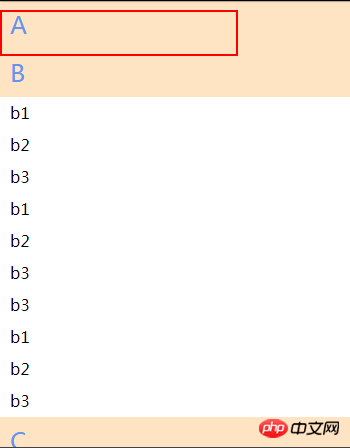
, etc., but there seems to be some problems. When jumping back, it is found that it is not fully expanded. For example, like calling back to
A, the result is The A tag appears, but the list below A does not appear.
 What is the problem?
After many studies, I found out that position:sticky is responsible!
When positioning upward, we use href to position the past. The positioning is based on the position where the element is first visible. At this time, although the element is air compressor, the following elements are not displayed. , so it caused such a problem
When you find a problem, you need to solve it
Quick positioning effect repairIn fact, what we want to position is okay It is the first list element under
A, but it cannot be this element, because if it is a first-generation element, it will be covered by the A tag above when it jumps. So we insert another label between the two for positioning
As follows, added
<div>
        <dl>A
        <dl>
        <dt>a1</dt>
        <dt>a2</dt>
        <dl>B
        <dl></dl>
        <dt>b1</dt>
        <dt>b2</dt>
        ...
    </dl>
</dl>
</dl>
</div>
If you put it directly here, it will definitely take up space, so we move it upward, and then set it to be invisible so that the element just covers the original label position
As follows
.contacts .stikcy-fix{
    position: static;
    visibility: hidden;
    margin-top: -2em;
}Now Look, is it a perfect jump?
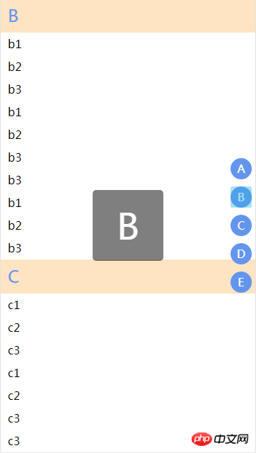
Other detailsUsually when we select the index on the right, a capital letter will appear in the middle of the page
 It is relatively simple to implement this with css. Just use the content:attr() of the pseudo element. I also mentioned it in the previous article (using pure css to achieve the star effect)
The specific implementation is as follows
.index a:active:after{
    content: attr(data-type);
    position: fixed;
    left: 50%;
    top: 50%;
    width: 100px;
    height: 100px;
    border-radius: 5px;
    text-align: center;
    line-height: 100px;
    font-size: 50px;
    transform: translate(-50%,-50%);
    background: rgba(0,0,0,.5);
} is used here, so a must have a data-type on it Attributes<div class="code" style="position:relative; padding:0px; margin:0px;"><pre class="brush:php;toolbar:false"><!--导航列表-->
<div>
<a>A</a>
<a>B</a>
</div></pre><div class="contentsignin">Copy after login</div></div>Secondly, in actual projects, we need to use
to generate these listsAssume that the data we require is as follows
var data = [
        {
            'type':'A',
            'user':[
                {
                    name:'a1'
                },
                {
                    name:'a2'
                },
                {
                    name:'a3'
                },
                {
                    name:'a1'
                },
                {
                    name:'a2'
                },
                {
                    name:'a3'
                },
                {
                    name:'a3'
                },
                {
                    name:'a1'
                },
                {
                    name:'a2'
                },
                {
                    name:'a3'
                },
            ]
        },
        {
            'type':'B',
            'user':[
                {
                    name:'b1'
                },
                {
                    name:'b2'
                },
                {
                    name:'b3'
                },
                {
                    name:'b1'
                },
                {
                    name:'b2'
                },
                {
                    name:'b3'
                },
                {
                    name:'b3'
                },
                {
                    name:'b1'
                },
                {
                    name:'b2'
                },
                {
                    name:'b3'
                },
            ]
        },
        {
            'type':'C',
            'user':[
                {
                    name:'c1'
                },
                {
                    name:'c2'
                },
                {
                    name:'c3'
                },
                {
                    name:'c1'
                },
                {
                    name:'c2'
                },
                {
                    name:'c3'
                },
                {
                    name:'c3'
                },
                {
                    name:'c1'
                },
                {
                    name:'c2'
                },
                {
                    name:'c3'
                },
            ]
        },
        {
            'type':'D',
            'user':[
                {
                    name:'d1'
                },
                {
                    name:'d2'
                },
                {
                    name:'d3'
                },
                {
                    name:'d1'
                },
                {
                    name:'d2'
                },
                {
                    name:'d3'
                },
                {
                    name:'d3'
                },
                {
                    name:'d1'
                },
                {
                    name:'d2'
                },
                {
                    name:'d3'
                },
            ]
        },
        {
            'type':'E',
            'user':[
                {
                    name:'e1'
                },
                {
                    name:'e2'
                },
                {
                    name:'e3'
                },
                {
                    name:'e1'
                },
                {
                    name:'e2'
                },
                {
                    name:'e3'
                },
                {
                    name:'e3'
                },
                {
                    name:'e1'
                },
                {
                    name:'e2'
                },
                {
                    name:'e3'
                },
            ]
        }
]Data in this format can be requested to be returned by the backend, or the front-end can be modified directly
Then just loop through the data
var indexs = document.getElementById('index');
var contacts = document.getElementById('contacts');
var index_html = '';
var contacts_html = '';
data.forEach(el=>{
contacts_html += 'Some shortcomings
Although the list can be quickly positioned through anchor points, #A will be added to the browser's address bar at this time Such a logo is not good-looking, and secondly, when using the browser's default return, all these logos will be walked through, which is inconvenient.
There is another problem. When scrolling the list, the current category of the right index cannot be highlighted. At the same time, the right index does not support sliding quick positioning.
These detailed problems can only be fixed through js.
However, if it is a simple small project without so many requirements, pure CSS can still be applied very well. The performance is definitely many times better than scrolling monitoring through js, and it is easy to reference, as long as the data is generated. You can use
directlyThe above is the detailed content of How to use pure css to achieve the effect of mobile phone address book. For more information, please follow other related articles on the PHP Chinese website!