Explanation of steps for flex layout in css (with code)
The content of this article is about the steps of flex elastic layout in CSS (with code). It has certain reference value. Friends in need can refer to it. I hope it will be helpful to you.
html:
nbsp;html>


        <meta>
        <meta>
        <title></title>
        <style>
            *{
                margin: 0;
                padding: 0;
                box-sizing: border-box;
            }
            .wrap{
                width: 300px;
                height: 300px;
                display: flex;
                flex-direction: row; /*默认主轴方向水平向右*/
                flex-direction: row-reverse;  /*可选主轴方向水平向左*/
                /* flex-direction: column; */  /*可选主轴方向垂直向下*/
                /* flex-direction: column-reverse; */ /*可选主轴方向垂直向上*/

                flex-wrap: wrap;  /*默认侧轴方向与主轴垂直方向向下或者右*/
                /* flex-wrap: wrap-reverse; */ /*可选侧轴方向与主轴垂直方向向上或者左*/
            }
            .wrap div{
                background: skyblue;
                text-align: center;
                line-height: 100px;
                width: 100px;
                height: 100px;
                border: bisque 1px solid;
            }
        </style>


        <div>
            <div>0</div>
            <div>1</div>
            <div>2</div>
            <div>3</div>
            <div>4</div>
            <div>5</div>
            <div>6</div>
            <div>7</div>
            <div>8</div>
        </div>
Step 1: First set display: flex; for the parent container, which means using flex elastic layout
Step 2: Set the main axis direction
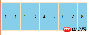
①flex -direction: row; (default parameter) the main axis direction is horizontally to the right, the result is as shown:

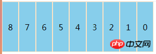
##②flex-direction: row-reverse; (optional parameter) the main axis direction is horizontally to the left, the result is as shown in the figure:

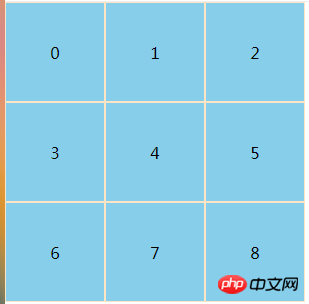
 ##②flex- wrap: wrap-reverse; The optional direction of the side axis is upward or left perpendicular to the main axis. The result is brainstorming
Note: The direction of the side axis changes with the main axis, and the main axis is always relative to the side axis. Vertical, the direction of the two axes defaults to the right and down
Other property settings:
flex-flow:
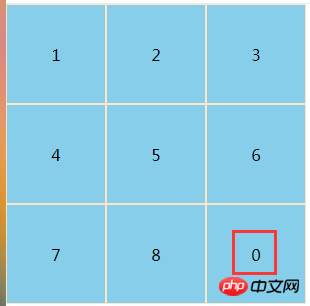
order:number scalable item, for example, add an order: 1 to a sub-container. The default order of all sub-containers is 0. When we set the order of the first container to 1, something similar to Sorting effect
 ##justify-content:flex-start(default)||flex-end||center||space-between||space -around scalable container
The above is the detailed content of Explanation of steps for flex layout in css (with code). For more information, please follow other related articles on the PHP Chinese website!

Hot AI Tools

Undresser.AI Undress
AI-powered app for creating realistic nude photos

AI Clothes Remover
Online AI tool for removing clothes from photos.

Undress AI Tool
Undress images for free

Clothoff.io
AI clothes remover

AI Hentai Generator
Generate AI Hentai for free.

Hot Article

Hot Tools

Notepad++7.3.1
Easy-to-use and free code editor

SublimeText3 Chinese version
Chinese version, very easy to use

Zend Studio 13.0.1
Powerful PHP integrated development environment

Dreamweaver CS6
Visual web development tools

SublimeText3 Mac version
God-level code editing software (SublimeText3)

Hot Topics
 1378
1378
 52
52
 How to write split lines on bootstrap
Apr 07, 2025 pm 03:12 PM
There are two ways to create a Bootstrap split line: using the tag, which creates a horizontal split line. Use the CSS border property to create custom style split lines.
 How to insert pictures on bootstrap
Apr 07, 2025 pm 03:30 PM
There are several ways to insert images in Bootstrap: insert images directly, using the HTML img tag. With the Bootstrap image component, you can provide responsive images and more styles. Set the image size, use the img-fluid class to make the image adaptable. Set the border, using the img-bordered class. Set the rounded corners and use the img-rounded class. Set the shadow, use the shadow class. Resize and position the image, using CSS style. Using the background image, use the background-image CSS property.
 How to resize bootstrap
Apr 07, 2025 pm 03:18 PM
To adjust the size of elements in Bootstrap, you can use the dimension class, which includes: adjusting width: .col-, .w-, .mw-adjust height: .h-, .min-h-, .max-h-
 The Roles of HTML, CSS, and JavaScript: Core Responsibilities
Apr 08, 2025 pm 07:05 PM
HTML defines the web structure, CSS is responsible for style and layout, and JavaScript gives dynamic interaction. The three perform their duties in web development and jointly build a colorful website.
 How to set up the framework for bootstrap
Apr 07, 2025 pm 03:27 PM
To set up the Bootstrap framework, you need to follow these steps: 1. Reference the Bootstrap file via CDN; 2. Download and host the file on your own server; 3. Include the Bootstrap file in HTML; 4. Compile Sass/Less as needed; 5. Import a custom file (optional). Once setup is complete, you can use Bootstrap's grid systems, components, and styles to create responsive websites and applications.
 How to use bootstrap button
Apr 07, 2025 pm 03:09 PM
How to use the Bootstrap button? Introduce Bootstrap CSS to create button elements and add Bootstrap button class to add button text
 How to view the date of bootstrap
Apr 07, 2025 pm 03:03 PM
Answer: You can use the date picker component of Bootstrap to view dates in the page. Steps: Introduce the Bootstrap framework. Create a date selector input box in HTML. Bootstrap will automatically add styles to the selector. Use JavaScript to get the selected date.
 How to use bootstrap in vue
Apr 07, 2025 pm 11:33 PM
Using Bootstrap in Vue.js is divided into five steps: Install Bootstrap. Import Bootstrap in main.js. Use the Bootstrap component directly in the template. Optional: Custom style. Optional: Use plug-ins.


