Explanation on the usage of clip-path attribute in css (with code)
This article brings you an explanation of the usage of the clip-path attribute in CSS (with code). It has certain reference value. Friends in need can refer to it. I hope it will be helpful to you.
Use of clip-path
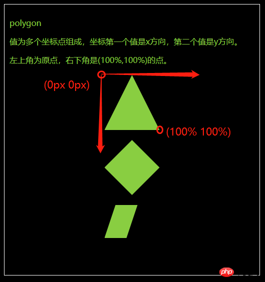
polygon
The value is composed of multiple coordinate points. The first value of the coordinate is the x direction, and the second value is the y direction.
The upper left corner is the origin, and the lower right corner is the point of (100%, 100%).
body {
  background-color: #000;
}

.fa {
  border: 1px solid #fff;
  color: yellowgreen;
  padding: 10px;
  margin: 10px;
}

.fa>p {
  width: 110px;
  height: 110px;
  background-color: yellowgreen;
  margin: 20px auto;
}

.polygon1 {
  clip-path: polygon(50% 0px, 100% 100%, 0px 100%)
}

.polygon2 {
  clip-path: polygon(0px 50%, 50% 0, 100% 50%, 50% 100%)
}

.polygon3 {
  clip-path: polygon(0% 60%, 20% 0%, 60% 0%, 40% 60%)
}<div> <p>polygon</p> <p>值为多个坐标点组成,坐标第一个值是x方向,第二个值是y方向。</p> <p>左上角为原点,右下角是(100%,100%)的点。</p> <div></div> <div></div> <div></div> </div>

##circle
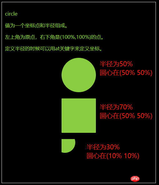
- The value is a coordinate Composed of points and radii.
- The upper left corner is the origin, and the lower right corner is the point of (100%, 100%).
- When defining the radius, you can use the at keyword to define the coordinates.
body {
  background-color: #000;
}

.fa {
  border: 1px solid #fff;
  color: yellowgreen;
  padding: 10px;
  margin: 10px;
}

.fa>p {
  width: 110px;
  height: 110px;
  background-color: yellowgreen;
  margin: 20px auto;
}

.circle1 {
  clip-path: circle(50% at 50% 50%)
}

.circle2 {
  clip-path: circle(70% at 50% 50%)
}

.circle3 {
  clip-path: circle(30% at 10% 10%)
}<div> <p>circle</p> <p>值为一个坐标点和半径组成。</p> <p>左上角为原点,右下角是(100%,100%)的点。</p> <p>定义半径的时候可以用at关键字来定义坐标。</p> <div></div> <div></div> <div></div> </div>

ellipse
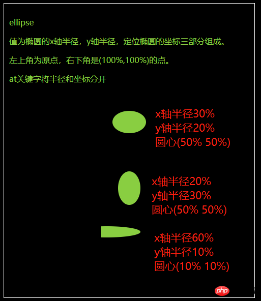
- The value is an ellipse It consists of three parts: the x-axis radius, the y-axis radius, and the coordinates of the positioning ellipse.
- The upper left corner is the origin, and the lower right corner is the point of (100%, 100%).
- at keyword separates radius and coordinates.
body {
  background-color: #000;
}

.fa {
  border: 1px solid #fff;
  color: yellowgreen;
  padding: 10px;
  margin: 10px;
}

.fa>p {
  width: 110px;
  height: 110px;
  background-color: yellowgreen;
  margin: 20px auto;
}

.ellipse1 {
  clip-path: ellipse(30% 20% at 50% 50%)
}

.ellipse2 {
  clip-path: ellipse(20% 30% at 50% 50%)
}

.ellipse3 {
  clip-path: ellipse(60% 10% at 10% 10%)
}<div> <p>ellipse</p> <p>值为椭圆的x轴半径,y轴半径,定位椭圆的坐标三部分组成。</p> <p>左上角为原点,右下角是(100%,100%)的点。</p> <p>at关键字将半径和坐标分开</p> <div></div> <div></div> <div></div> </div>

inset
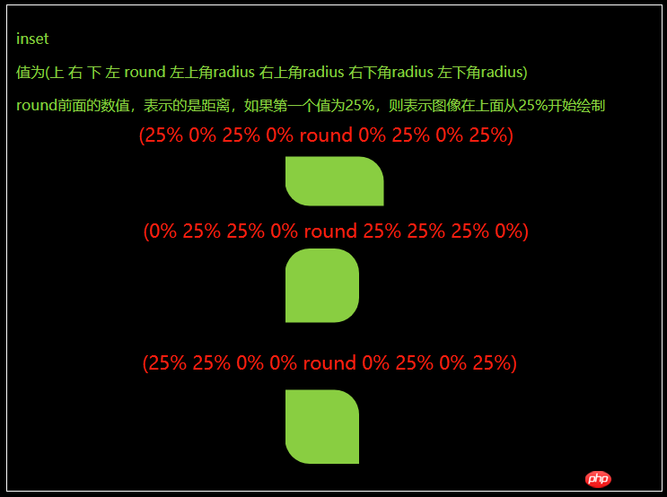
- The value is ( Top right bottom left round top left corner radius top right corner radius bottom right corner radius bottom left corner radius)
- #The value in front of round represents the distance. If the first value is 25%, then Indicates that the image is drawn above starting from 25%.
body {
  background-color: #000;
}

.fa {
  border: 1px solid #fff;
  color: yellowgreen;
  padding: 10px;
  margin: 10px;
}

.fa>p {
  width: 110px;
  height: 110px;
  background-color: yellowgreen;
  margin: 20px auto;
}

.inset1 {
  clip-path: inset(25% 0% 25% 0% round 0% 25% 0% 25%)
}

.inset2 {
  clip-path: inset(0% 25% 25% 0% round 25% 25% 25% 0%)
}

.inset3 {
  clip-path: inset(25% 25% 0% 0% round 0% 25% 0% 25%)
}<div> <p>inset</p> <p>值为(上 右 下 左 round 左上角radius 右上角radius 右下角radius 左下角radius)</p> <p>round前面的数值,表示的是距离,如果第一个值为25%,则表示图像在上面从25%开始绘制</p> <div></div> <div></div> <div></div> </div>

The above is the detailed content of Explanation on the usage of clip-path attribute in css (with code). For more information, please follow other related articles on the PHP Chinese website!

Hot AI Tools

Undresser.AI Undress
AI-powered app for creating realistic nude photos

AI Clothes Remover
Online AI tool for removing clothes from photos.

Undress AI Tool
Undress images for free

Clothoff.io
AI clothes remover

Video Face Swap
Swap faces in any video effortlessly with our completely free AI face swap tool!

Hot Article

Hot Tools

Notepad++7.3.1
Easy-to-use and free code editor

SublimeText3 Chinese version
Chinese version, very easy to use

Zend Studio 13.0.1
Powerful PHP integrated development environment

Dreamweaver CS6
Visual web development tools

SublimeText3 Mac version
God-level code editing software (SublimeText3)

Hot Topics
 1386
1386
 52
52
 How to use bootstrap in vue
Apr 07, 2025 pm 11:33 PM
Using Bootstrap in Vue.js is divided into five steps: Install Bootstrap. Import Bootstrap in main.js. Use the Bootstrap component directly in the template. Optional: Custom style. Optional: Use plug-ins.
 The Roles of HTML, CSS, and JavaScript: Core Responsibilities
Apr 08, 2025 pm 07:05 PM
HTML defines the web structure, CSS is responsible for style and layout, and JavaScript gives dynamic interaction. The three perform their duties in web development and jointly build a colorful website.
 How to write split lines on bootstrap
Apr 07, 2025 pm 03:12 PM
There are two ways to create a Bootstrap split line: using the tag, which creates a horizontal split line. Use the CSS border property to create custom style split lines.
 Understanding HTML, CSS, and JavaScript: A Beginner's Guide
Apr 12, 2025 am 12:02 AM
WebdevelopmentreliesonHTML,CSS,andJavaScript:1)HTMLstructurescontent,2)CSSstylesit,and3)JavaScriptaddsinteractivity,formingthebasisofmodernwebexperiences.
 How to set up the framework for bootstrap
Apr 07, 2025 pm 03:27 PM
To set up the Bootstrap framework, you need to follow these steps: 1. Reference the Bootstrap file via CDN; 2. Download and host the file on your own server; 3. Include the Bootstrap file in HTML; 4. Compile Sass/Less as needed; 5. Import a custom file (optional). Once setup is complete, you can use Bootstrap's grid systems, components, and styles to create responsive websites and applications.
 How to insert pictures on bootstrap
Apr 07, 2025 pm 03:30 PM
There are several ways to insert images in Bootstrap: insert images directly, using the HTML img tag. With the Bootstrap image component, you can provide responsive images and more styles. Set the image size, use the img-fluid class to make the image adaptable. Set the border, using the img-bordered class. Set the rounded corners and use the img-rounded class. Set the shadow, use the shadow class. Resize and position the image, using CSS style. Using the background image, use the background-image CSS property.
 How to resize bootstrap
Apr 07, 2025 pm 03:18 PM
To adjust the size of elements in Bootstrap, you can use the dimension class, which includes: adjusting width: .col-, .w-, .mw-adjust height: .h-, .min-h-, .max-h-
 How to use bootstrap button
Apr 07, 2025 pm 03:09 PM
How to use the Bootstrap button? Introduce Bootstrap CSS to create button elements and add Bootstrap button class to add button text


