This article mainly introduces how to use pure css to achieve the folding effect.
In our front-end page development process, the folding effect is usually used in the navigation bar or drop-down list. For front-end novices, it may be difficult.
Below we will use a simple css code example to introduce in detail the specific method of using css to achieve the folding effect.
html css code example is as follows:
<!DOCTYPE html>
<html>
<meta charset="utf-8">
<title>纯css实现折叠效果</title>
<head>
    <style>
        * {
            margin: 0;
            padding: 0;
        }
        #parent >li> span{background: #b2ecef;display: block;width: 200px;border:1px solid #ECEEF2;}
        li {line-height: 40px;display: block;}
        li  p{
            display: inline-block;
            width: 0px;
            height: 0px;
            border-left: 5px solid transparent;
            border-right: 5px solid transparent;
            border-top: 5px solid #1094f2;
        }
        li>ul{display: none;}
        li>ul>li{border: 1px solid #DEDEDE;width: 199px;}
        #parent span:hover + ul{display: block;}
        #parent span:hover >p{
            display: inline-block;
            width: 0px;
            height: 0px;
            border-top: 5px solid transparent;
            border-bottom: 5px solid transparent;
            border-left: 5px solid#2f2f2f;}
 </style>
</head>
<body>
<ul id="parent">
    <li>
        <span><p></p>主列表</span>
        <ul>
            <li>子列表1</li>
            <li>子列表2</li>
            <li>子列表3</li>
        </ul>
    </li>
</ul>

</body>
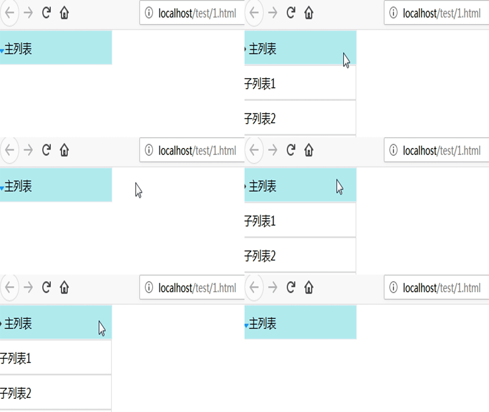
</html>The final folding effect of the front desk is as shown below:

This article This article is an introduction to the method of using pure CSS to achieve the folding effect, and it is also very simple and easy to understand. Hope it helps those in need!
If you want to know more about front-end related knowledge, you can follow PHP Chinese website HTML video tutorial, CSS video tutorial, Bootstrap video tutorial, etc. Wait for related front-end tutorials, welcome everyone to refer to and learn!
The above is the detailed content of How to achieve folding effect using pure css? (with code). For more information, please follow other related articles on the PHP Chinese website!
 How to clean up the computer's C drive when it is full
 fil currency price real-time price
 How to defend cloud servers against DDoS attacks
 How to download Binance
 How to buy and sell Bitcoin on Huobi.com
 How to open iso file
 What are the functions of computer networks
 how to hide ip address
 How to solve problems when parsing packages