
The content of this article is about how to use pure CSS to realize the water drop animation effect of buttons in Material Design. It has certain reference value. Friends in need can refer to it. I hope it will be helpful to you.
You should often see this kind of special effect, it’s very cool, isn’t it
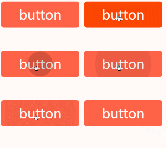
This is the most common in Google Material Design special effects, there are many ready-made js libraries on the market to simulate this special effect. But it is often necessary to introduce a lot of js and css. In fact, in existing projects, you may just want to add such a button to enhance the user experience. These js libraries seem a bit too large. At the same time, because they are implemented in js, many Also pay attention to loading issues.
So, is there a way to use css to achieve this special effect?
In fact, it is an animation, a perfect circle grows from small to large, using css3# The animation in ## is easy to implement
Sample code
@keyframes ripple{
    from {
        transform: scale(0);
        opacity: 1;
    }
    to {
        transform: scale(1);
        opacity: 0;
    }
}js is used to implement it in a very simple way, which is to add A class, and then remove the class
Sample code
var btn = document.getElementById('btn');
btn.addeventlistener('click',function(){
  addClass(btn,'animate')
},false)
btn.addeventlistener('transitionend',function(){//监听css3动画结束
  removeClass(btn,'animate')
},false)The pseudo-classes that interact with the mouse in css mainly include
hovermouse After
Mouse press
Mouse focus
Mouse selected
To achieve this, putting the mouse on it will trigger an effect and leave the animation. However, if you put the mouse on it and leave immediately, the animation will end immediately. Let’s try it first.
Structure
<style>
.btn{
  display: block;
  width: 300px;
  outline: 0;
  overflow: hidden;
  position: relative;
  transition: .3s;
  cursor: pointer;
  user-select: none;
  height: 100px;
  text-align: center;
  line-height: 100px;
  font-size: 50px;
  background: tomato;
  color: #fff;
  border-radius: 10px;
}
</style>
<a>button</a>It is very simple, it is an ordinary button style
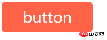 Next we add the perfect circle we need in the button.
We use pseudo elements to achieve this
.btn:after{
    content: '';
    position: absolute;
    width: 100%;
    padding-top: 100%;
    background: transparent;
    border-radius: 50%;
    left: 50%;
    top: 50%;
    transform: translate(-50%,-50%)
}We remove the overflow: hidden above and shrink the circle a little to see the effect
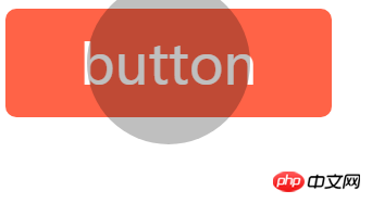 Then, we write a zoom animation
@keyframes ripple{
    from {
        transform:translate(-50%,-50%) scale(0);
        /**由于我们默认写了变换属性,所以这里要补上translate(-50%,-50%),不然就会被替换了**/
        background: rgba(0,0,0,.25);
    }
    to {
        transform:translate(-50%,-50%) scale(1);
        background: transparent;
    }
}hover small interactive experience
.btn:hover:after{
  animation: ripple 1s;
}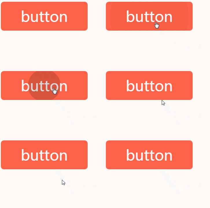 The effect is good, but if the mouse leaves too fast, the newly expanded circle will shrink back immediately, which is a bit inconsistent
But this is not the effect we want. What we want is to click once to trigger once, instead of just putting it on and it will never trigger again.
active try
is also used more often, usually for the click effect, so let’s try it? <div class="code" style="position:relative; padding:0px; margin:0px;"><pre class="brush:php;toolbar:false">.btn:active:after{
animation: ripple 1s;
}</pre><div class="contentsignin">Copy after login</div></div>
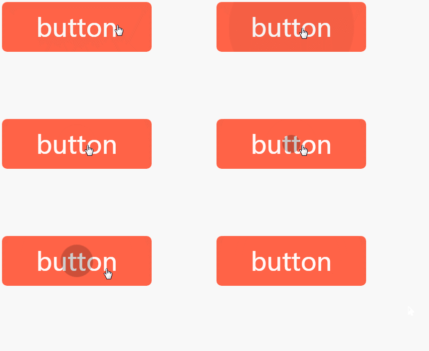 The effect is also unsatisfactory, a bit similar to
, you must keep pressing the mouse to complete the Trigger, for example, in the above example, the running implementation of the animation is 1s, then you must click on that button and continue 1s to see the complete animation effect, otherwise, it is like the above As soon as the mouse leaves, the animation retracts immediately focus experience
attribute <div class="code" style="position:relative; padding:0px; margin:0px;"><pre class="brush:php;toolbar:false"><a>button</a></pre><div class="contentsignin">Copy after login</div></div>
<div class="code" style="position:relative; padding:0px; margin:0px;"><pre class="brush:php;toolbar:false">.btn:focus:after{
animation: ripple 1s;
}</pre><div class="contentsignin">Copy after login</div></div>
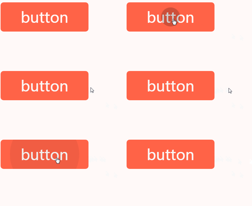
can also be triggered, but after it is triggered, it can only be triggered again after losing focus. The actual operation performance is, click over After one time, is there no other way to click on the outer space?
Of course there are still some, the last one is definitely the solution, haha
checked
checked cannot be triggered directly, it is a form element Triggered after selection. To do this, we need to transform the page structure <div class="code" style="position:relative; padding:0px; margin:0px;"><pre class="brush:php;toolbar:false"><label>
<input><span>button</span>
</label></pre><div class="contentsignin">Copy after login</div></div> We changed it to
and included the input[type=checkbox] tag , mainly to trigger the input selection when the button is clicked. Add a little style
.btn>span:after{
  /**换一下选择器**/
}
.btn>input[type=checkbox]{
  display: none
}
.btn>input[type=checkbox]:checked+span:after{
  animation: ripple 1s;
}这样也能触发动画,但问题是,当再次点击的时候就成了非选中状态了,怎么触发动画呢?
其实可以用:not来实现
.btn>input[type=checkbox]:not(:checked)+span:after{
  animation: ripple 1s;
}乍一看好像挺聪明的,仔细一想,正反两个都写了动画,不就跟:checked没关系了?还不如直接
.btn>input[type=checkbox]+span:after{
  animation: ripple 1s;
}无限轮回中...
这个问题困扰了我好久,不过皇天不负有心人,后来试着在两种状态下触发不同的动画是可以分别触发的,如下
.btn>input[type=checkbox]:checked+span:after{
  animation: ripple1 1s;
}
.btn>input[type=checkbox]:not(:checked)+span:after{
  animation: ripple2 1s;
}这个应该很好理解吧。
那么,重点来了,现在把动画ripple1和ripple2里面的动画过程都改成一样,也是可以分别触发的,也就是说,只要动画名称不一样,css都会当成不同的动画来处理
这样就简单了,我们只需要默认一个状态,选中一个状态,然后分别触发名称不同的动画就行了~
.btn>input[type=checkbox]+span:after{
  animation: ripple-in 1s;
}
.btn>input[type=checkbox]:checked+span:after{
  animation: ripple-out 1s;
}
@keyframes ripple-in{
    from {
        transform:translate(-50%,-50%) scale(0);
        background: rgba(0,0,0,.25);
    }
    to {
        transform:translate(-50%,-50%) scale(1);
        background: transparent;
    }
}
@keyframes ripple-out{/*仅仅名称不同*/
    from {
        transform:translate(-50%,-50%) scale(0);
        background: rgba(0,0,0,.25);
    }
    to {
        transform:translate(-50%,-50%) scale(1);
        background: transparent;
    }
}效果就如文章一开始所示,完美
完整demo如下
https://codepen.io/xboxyan/pe...
一些不足
由于上述动画样式在默认情况下就会被触发,所以页面加载进来就会看到按钮上的水滴动画运动一次,不过也不是特别明显,还可以接受。
其次,实际效果肯定是希望鼠标点击哪里,就以该点为中心扩散,我们css肯定是做不到这点的,只能从中心扩散,这也只能妥协了。这里提供一个思路,可以使用css的变量,每次点击的时候吧相应的值存在style里面,这样css中也能用上。
希望能用css今后挖掘出更多有趣的效果^
The above is the detailed content of How to use pure css to achieve the water drop animation effect of buttons in Material Design. For more information, please follow other related articles on the PHP Chinese website!