 Web Front-end
 CSS Tutorial
 How to implement a circular progress bar in css3? Implementation of circular progress bar in css3
How to implement a circular progress bar in css3? Implementation of circular progress bar in css3
We can often see the progress bar, but how to implement the progress bar? In our previous article (How to implement the progress bar in css3? Introduction to the implementation method of the progress bar in css3), we have briefly talked about the method of implementing the long progress bar in css3. Today’s article will give you Let’s introduce the implementation method of CSS3 circular progress bar. Interested friends can take a look.
We all know that it is very simple to make a static circular shape, just like the following
<!DOCTYPE html>
<html>
<head>
<style>
.circle{
    width: 160px;
    height: 160px;
    border:20px solid orange;
    border-radius: 50%;
}
</style>
</head>
<body>
<div class="circle"></div>
</body>
</html>css3 circular effect is as follows:

But the circular progress bar is a dynamic effect, so it needs to be considered a lot. First, let’s take a look at the implementation ideas of the CSS circular progress bar:
We can divide the entire ring into left and right parts; both left and right semicircles are rotated. For example, first let the right semicircle rotate and then connect it to the left semicircle and then rotate the left semicircle. In this way, the rotation of the entire ring can be achieved, which is a circle. Progress bar.
Let’s take a look at the specific implementation method of css3 circular progress bar.
First let’s look at the implementation of the css3 right semicircle
<div class="right">
    <div class="rightcircle"></div>
</div>.right{
position: relative;
width: 100px;
height: 200px;
overflow: hidden;
}
.rightcircle{
width: 160px;
height: 160px;
border:20px solid transparent;
border-radius: 50%;
position: absolute;
top:0;
right: 0;
border-top:20px solid lightblue;
border-right:20px solid lightblue;
-webkit-transform : rotate(45deg);
-moz-transform : rotate(45deg);
-o-transform : rotate(45deg);
transform : rotate(45deg); /* 旋转45度 */
}
/* 这里仅考虑webkit内核的情况,您可以写完整了 */
.rightcircle{
-webkit-animation-name: circle_right; /* 动画名称 */
-webkit-animation-duration: 5s; /* 完成一个动画需要的时间 */
-webkit-animation-timing-function: linear; /* 动画播放的方式,linear是匀速变化 */
-webkit-animation-iteration-count: infinite; /* 动画播放的次数,infinite是无限次数 */
}
@-webkit-keyframes circle_right{
0%{
transform : rotate(-135deg);
}
100%{
transform : rotate(45deg);
}
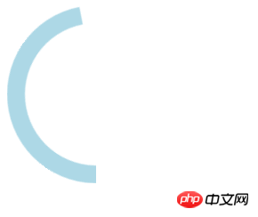
}The effect of the css3 right semicircle is as follows:

css3 left semicircle implementation and The right semicircle is just the opposite. The code is as follows:
.right{
    position: relative;
    width: 100px;
    height: 200px;
    overflow: hidden;
}
.rightcircle{
    width: 160px;
    height: 160px;
    border:20px solid transparent;
    border-radius: 50%;
    position: absolute;
    bottom:0;
    left: 0;
    border-bottom:20px solid lightblue;
    border-left:20px solid lightblue;
    -webkit-transform : rotate(45deg);
    -moz-transform : rotate(45deg);
    -o-transform : rotate(45deg);
    transform : rotate(45deg); /* 旋转45度 */
}
/* 这里仅考虑webkit内核的情况,您可以写完整了 */
.rightcircle{
    -webkit-animation-name: circle_right; /* 动画名称 */
    -webkit-animation-duration: 5s;  /* 完成一个动画需要的时间 */
    -webkit-animation-timing-function: linear; /* 动画播放的方式,linear是匀速变化 */
    -webkit-animation-iteration-count: infinite;  /* 动画播放的次数,infinite是无限次数 */
}
@-webkit-keyframes circle_right{
    0%{
        transform : rotate(-135deg);
    }
    100%{
        transform : rotate(45deg);
    }
}css3 The effect of the left semicircle is as follows:

Both semicircles have been realized. Next, you only need to add the two semicircles. By splicing two semicircles together, you can achieve the effect of a css3 circular progress bar.
The code for realizing a circular progress bar in css3 is as follows:
<div class="circle_process">
    <div class="wrapper right">
        <div class="circle rightcircle"></div>
    </div>
    <div class="wrapper left">
        <div class="circle leftcircle" id="leftcircle"></div>
    </div>
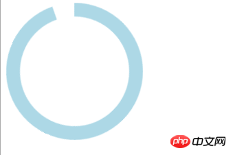
</div>The effect of a circular progress bar in css3 is as follows:

This article ends here. For more exciting content, you can pay attention to the php Chinese website! ! !
The above is the detailed content of How to implement a circular progress bar in css3? Implementation of circular progress bar in css3. For more information, please follow other related articles on the PHP Chinese website!

Hot AI Tools

Undresser.AI Undress
AI-powered app for creating realistic nude photos

AI Clothes Remover
Online AI tool for removing clothes from photos.

Undress AI Tool
Undress images for free

Clothoff.io
AI clothes remover

AI Hentai Generator
Generate AI Hentai for free.

Hot Article

Hot Tools

Notepad++7.3.1
Easy-to-use and free code editor

SublimeText3 Chinese version
Chinese version, very easy to use

Zend Studio 13.0.1
Powerful PHP integrated development environment

Dreamweaver CS6
Visual web development tools

SublimeText3 Mac version
God-level code editing software (SublimeText3)

Hot Topics
 1378
1378
 52
52
 Working With GraphQL Caching
Mar 19, 2025 am 09:36 AM
If you’ve recently started working with GraphQL, or reviewed its pros and cons, you’ve no doubt heard things like “GraphQL doesn’t support caching” or
 Show, Don't Tell
Mar 16, 2025 am 11:49 AM
How much time do you spend designing the content presentation for your websites? When you write a new blog post or create a new page, are you thinking about
 Building an Ethereum app using Redwood.js and Fauna
Mar 28, 2025 am 09:18 AM
With the recent climb of Bitcoin’s price over 20k $USD, and to it recently breaking 30k, I thought it’s worth taking a deep dive back into creating Ethereum
 Creating Your Own Bragdoc With Eleventy
Mar 18, 2025 am 11:23 AM
No matter what stage you’re at as a developer, the tasks we complete—whether big or small—make a huge impact in our personal and professional growth.
 Vue 3
Apr 02, 2025 pm 06:32 PM
It's out! Congrats to the Vue team for getting it done, I know it was a massive effort and a long time coming. All new docs, as well.
 A bit on ci/cd
Apr 02, 2025 pm 06:21 PM
I'd say "website" fits better than "mobile app" but I like this framing from Max Lynch:
 Let's use (X, X, X, X) for talking about specificity
Mar 24, 2025 am 10:37 AM
I was just chatting with Eric Meyer the other day and I remembered an Eric Meyer story from my formative years. I wrote a blog post about CSS specificity, and
 Can you get valid CSS property values from the browser?
Apr 02, 2025 pm 06:17 PM
I had someone write in with this very legit question. Lea just blogged about how you can get valid CSS properties themselves from the browser. That's like this.


