 Web Front-end
 CSS Tutorial
 Pure css js implementation method to realize material design water drop animation button effect
Pure css js implementation method to realize material design water drop animation button effect
The content of this article is about the js implementation method of realizing the material design water drop animation button effect using pure css. It has certain reference value. Friends in need can refer to it. I hope it will be helpful to you.
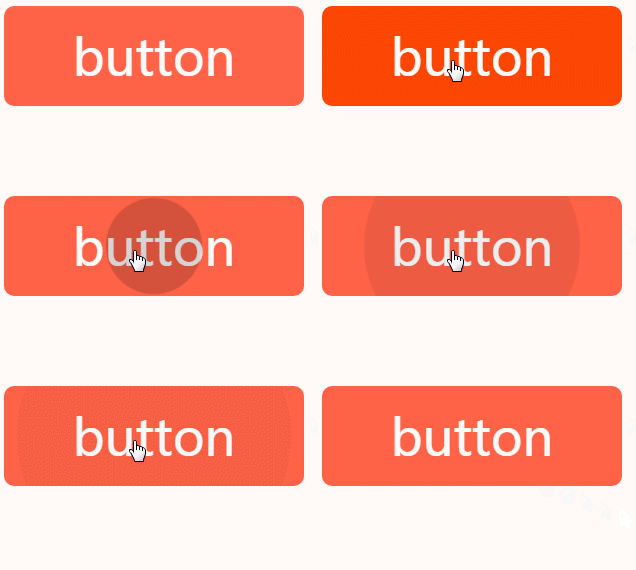
In the previous article, we have implemented the water droplet diffusion animation using pure CSS, but there are some flaws, which are also mentioned at the end of the article. First, you will see when the page is loaded. The water droplet animation on the button moves once. Secondly, it cannot spread according to the position of the mouse when clicked. Today we will solve this problem.
All the following basic codes are from the previous article

css can only be fixed Point spread
Unavoidable js
Although I really want to achieve the desired effect through css, after all, it belongs to UI interaction, so try not to involve js, but I have no choice. The stamina is not enough, and many functions cannot be realized, such as getting the mouse position. This css is really useless.
After thinking about it for a long time, we still can only obtain the location coordinates through js, but we can reduce the logic of js. We only need to know the coordinates, and the rest can be done by css.
Implementation ideas
New features of css
In fact, if there are many new features of practical css, many css that could only be implemented through js before can also be used Instead.
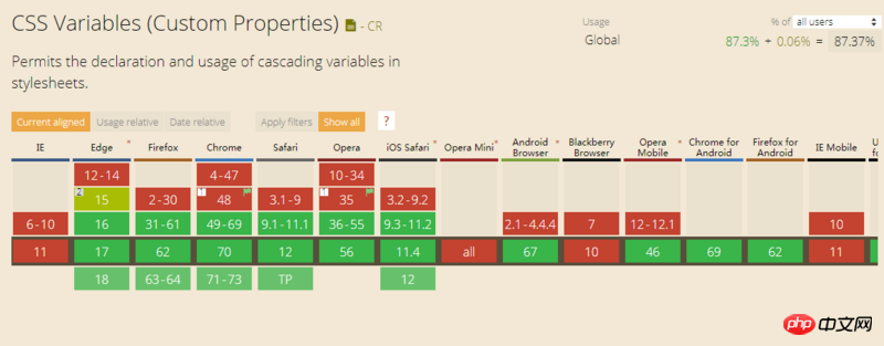
CSS native variable var, everyone should have come into contact with it. Maybe due to compatibility issues, you are hesitant to use it, and simply don't use it for the sake of compatibility

In fact, as long as you don't considerIE## If #, the compatibility is still possible. Even if we have to take into account IE, we can ensure that the buttons are intact, but it just doesn’t have animation effects. This is also the so-called Graceful downgrade, right
:root {
    --main-bg-color: red;
}
.container {
    width: 20px;
    height: 20px;
    background-color: var(--main-bg-color);/**background-color:red**/
}Almighty js
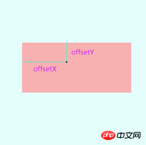
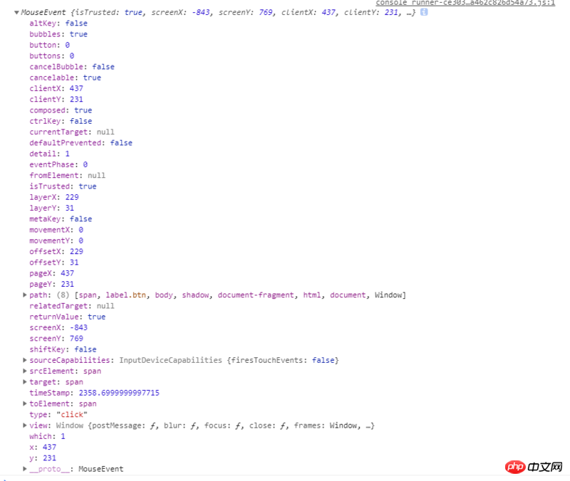
We use js There is only one purpose, which is to obtain the position of the mouse click. It is very simple. There are offsetX and offsetY in the event object event, which are used to describe the position of the mouse relative to the parent element.

var x = event.offsetX;
var y = event.offsetY;
Specific implementation
We need to get the left side when clicked, and then store it in the css variableSample codefunction ripple(ev){
var x = ev.offsetX;
var y = ev.offsetY;
this.style.setProperty('--x',x+'px');
this.style.setProperty('--y',y+'px');
}
.btn>span:after{
  content: '';
  position: absolute;
  background: transparent;
  border-radius:50%;
  width: 100%;
  padding-top: 100%;
  margin-left: -50%;
  margin-top: -50%;
  left: var(--x,-100%);
  top: var(--y,-100%);
} will be triggered once when entering for the first time: Here we have given left a default value of -100 %
left: var(--x,-100%);
--x has no value or is illegal, the next value will be taken, -100% will make The process of water drop animation is triggered out of sight and not visible on the page at all.
Diffusion follows the mouse click position: Now that the mouse position has been obtained, it is easy to realize the problem of spreading from where the mouse clicks
Complete demo
<label class="btn" tabindex="1">
<input type="checkbox"><span onclick="ripple(this,event)">button</span>
</label>
.btn{
 display: block;
 width: 300px;
 margin: 50px;
 outline: 0;
 overflow: hidden;
 position: relative;
 transition: .3s;
 cursor: pointer;
 user-select: none;
 height: 100px;
 text-align: center;
 line-height: 100px;
 font-size: 50px;
 background: tomato;
 color: #fff;
 border-radius:
 10px;
 }
.btn>span{
 position: absolute;
 left: 0; top: 0;
 width: 100%;
 height: 100%;
 }
.btn>span:after{
 content: '';
 position: absolute;
 background: transparent;
 border-radius:50%;
 width: 100%;
 padding-top: 100%;
 margin-left: -50%;
 margin-top: -50%;
 left: var(--x,-100%);
 top: var(--y,-100%);
 }
.btn:active{
 background: orangered;
 }
.btn>input[type=checkbox]{display: none}
.btn>input[type=checkbox]+span:after{animation: ripple-in 1s;}
.btn>input[type=checkbox]:checked+span:after{animation: ripple-out 1s;}
@keyframes ripple-in{
    from {
        transform: scale(0);
        background: rgba(0,0,0,.25)
    }
    to {
        transform: scale(1.5);
        background: transparent
    }
}
@keyframes ripple-out{
    from {
        transform: scale(0);
        background: rgba(0,0,0,.25)
    }
    to {
        transform: scale(1.5);
        background: transparent
    }
}function ripple(dom,ev){
console.log(ev)
var x = ev.offsetX;
var y = ev.offsetY;
dom.style.setProperty('--x',x+'px');
dom.style.setProperty('--y',y+'px');
}section
In fact, js implementation is very simple, css is the difficulty, css is much more flexible than js. Take building blocks for example. The various small parts of the building blocks are fixed and the types are limited. However, you can combine them into various toys. You can call them creative. However, you cannot combine them into a car. For automatic driving, you need to use a motor module, which is a functional driver. In fact, the process of developing building blocks is the most labor-intensive part, and the power system is the only one that remains unchanged.The above is the detailed content of Pure css js implementation method to realize material design water drop animation button effect. For more information, please follow other related articles on the PHP Chinese website!

Hot AI Tools

Undresser.AI Undress
AI-powered app for creating realistic nude photos

AI Clothes Remover
Online AI tool for removing clothes from photos.

Undress AI Tool
Undress images for free

Clothoff.io
AI clothes remover

Video Face Swap
Swap faces in any video effortlessly with our completely free AI face swap tool!

Hot Article

Hot Tools

Notepad++7.3.1
Easy-to-use and free code editor

SublimeText3 Chinese version
Chinese version, very easy to use

Zend Studio 13.0.1
Powerful PHP integrated development environment

Dreamweaver CS6
Visual web development tools

SublimeText3 Mac version
God-level code editing software (SublimeText3)

Hot Topics
 1387
1387
 52
52
 How to use bootstrap in vue
Apr 07, 2025 pm 11:33 PM
Using Bootstrap in Vue.js is divided into five steps: Install Bootstrap. Import Bootstrap in main.js. Use the Bootstrap component directly in the template. Optional: Custom style. Optional: Use plug-ins.
 The Roles of HTML, CSS, and JavaScript: Core Responsibilities
Apr 08, 2025 pm 07:05 PM
HTML defines the web structure, CSS is responsible for style and layout, and JavaScript gives dynamic interaction. The three perform their duties in web development and jointly build a colorful website.
 How to write split lines on bootstrap
Apr 07, 2025 pm 03:12 PM
There are two ways to create a Bootstrap split line: using the tag, which creates a horizontal split line. Use the CSS border property to create custom style split lines.
 Understanding HTML, CSS, and JavaScript: A Beginner's Guide
Apr 12, 2025 am 12:02 AM
WebdevelopmentreliesonHTML,CSS,andJavaScript:1)HTMLstructurescontent,2)CSSstylesit,and3)JavaScriptaddsinteractivity,formingthebasisofmodernwebexperiences.
 How to resize bootstrap
Apr 07, 2025 pm 03:18 PM
To adjust the size of elements in Bootstrap, you can use the dimension class, which includes: adjusting width: .col-, .w-, .mw-adjust height: .h-, .min-h-, .max-h-
 How to use bootstrap button
Apr 07, 2025 pm 03:09 PM
How to use the Bootstrap button? Introduce Bootstrap CSS to create button elements and add Bootstrap button class to add button text
 How to set up the framework for bootstrap
Apr 07, 2025 pm 03:27 PM
To set up the Bootstrap framework, you need to follow these steps: 1. Reference the Bootstrap file via CDN; 2. Download and host the file on your own server; 3. Include the Bootstrap file in HTML; 4. Compile Sass/Less as needed; 5. Import a custom file (optional). Once setup is complete, you can use Bootstrap's grid systems, components, and styles to create responsive websites and applications.
 How to insert pictures on bootstrap
Apr 07, 2025 pm 03:30 PM
There are several ways to insert images in Bootstrap: insert images directly, using the HTML img tag. With the Bootstrap image component, you can provide responsive images and more styles. Set the image size, use the img-fluid class to make the image adaptable. Set the border, using the img-bordered class. Set the rounded corners and use the img-rounded class. Set the shadow, use the shadow class. Resize and position the image, using CSS style. Using the background image, use the background-image CSS property.


