 Web Front-end
 CSS Tutorial
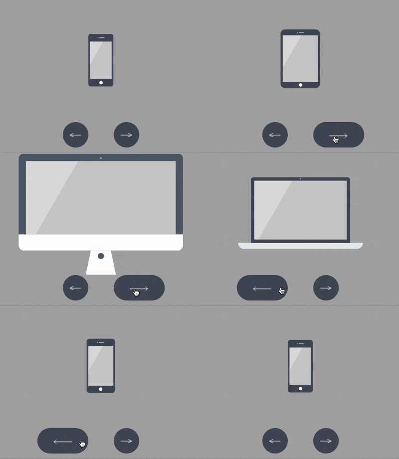
 How to use CSS and Vanilla.js to implement interactive animations showing Apple devices (source code attached)
How to use CSS and Vanilla.js to implement interactive animations showing Apple devices (source code attached)
The content of this article is about how to use CSS and Vanilla.js to implement interactive animations for displaying Apple devices (source code attached). It has certain reference value. Friends in need can refer to it. Hope it helps.
Effect preview

Source code download
https://github.com/comehope/front-end-daily -challenges
Code Interpretation
Define dom, including 5 sub-elements, representing the five devices of iphone, mini, ipad, macbook, imac:
<div>
    <div></div>
    <div></div>
    <div></div>
    <div></div>
    <div></div>
</div>
Centered display:
body {
    margin: 0;
    height: 100vh;
    display: flex;
    align-items: center;
    justify-content: center;
    background-color: #aaa;
}Set the layout of child elements in the container:
.container {
    position: relative;
    display: flex;
    flex-direction: column;
    align-items: center;
}Set the common properties of the device, and the linear gradient pattern will be used as the background of the screen:
.device {
    box-sizing: border-box;
    position: relative;
    display: flex;
    justify-content: center;
    background: linear-gradient(120deg, #ddd 30%, #ccc 30%);
}

.device::before,
.device::after {
    content: '';
    position: absolute;
}iphone, mini, ipad The shapes are similar, with a top camera, sensor opening and bottom button, so these common attributes can be set together. Use the ::before pseudo-element to draw the top details, and the ::after pseudo-element to draw the bottom button:
.iphone::before,
.mini::before,
.ipad::before {
    width: 2px;
    height: 2px;
    border-style: solid;
    border-color: #a5adbe;
    border-width: 0 12px 0 2px;
}

.iphone::after,
.mini::after,
.ipad::after {
    width: 8px;
    height: 8px;
    background-color: white;
    border-radius: 50%;
}Next draw the devices one by one. First draw the outline of the iPhone:
.iphone {
    width: 59px;
    height: 124px;
    border: #484f5e solid;
    border-width: 18px 4px;
    border-radius: 6px;
}Position the top and bottom details of the iPhone:
.iphone::before {
    top: -10px;
}

.iphone::after {
    bottom: -13px;
}Similarly, draw the mini:
.mini {
    width: 93px;
    height: 138px;
    border: #484f5e solid;
    border-width: 14px 5px;
    border-radius: 10px;
}

.mini::before {
    top: -8px;
}

.mini::after {
    bottom: -11px;
}Then draw the ipad:
.ipad {
    width: 134px;
    height: 176px;
    border: #484f5e solid;
    border-width: 18px 13px;
    border-radius: 12px;
}

.ipad::before {
    top: -10px;
}

.ipad::after {
    bottom: -13px;
}Next draw the macbook, first draw the screen:
.macbook {
    width: 234px;
    height: 155px;
    border: 8px solid #484f5e;
    border-radius: 7px 7px 0 0;
}Use ::before pseudo element to draw the camera:
.macbook::before {
    width: 294px;
    height: 14px;
    background-color: #e8ebf0;
    top: calc(100% + 8px);
    border-radius: 0 0 14px 14px;
}Use ::after pseudo element Draw the host:
.macbook::after {
    width: 3px;
    height: 3px;
    background-color: #a5adbe;
    top: -6px;
    border-radius: 50%;
}Next draw the imac, first draw the screen. The black borders on the left, top and right of the screen are not drawn with the border attribute because the border will leave a bevel at the endpoint, so change it Use box-shadow to achieve:
.imac {
    width: 360px;
    height: 215px;
    border-radius: 10px;
    box-shadow:
        inset 0 14px #484f5e,
        inset 14px 0 #484f5e,
        inset -14px 0 #484f5e;
    border-bottom: 33px solid #e8ebf1;
    transform: translateY(14px);
}Use ::before pseudo-element to draw the base of the trapezoid:
.imac::before {
    width: 90px;
    height: 0;
    top: calc(100% + 33px);
    border: solid transparent;
    border-bottom-color: #e2e4e8;
    border-width: 0 10px 47px 10px;
}Use ::after pseudo-element to draw the camera at the top and the button at the bottom of the screen. Note The button is implemented using box-shadow:
.imac::after {
    width: 4px;
    height: 4px;
    background-color: #a5adbe;
    top: 5px;
    border-radius: 50%;
    box-shadow: 0 191px 0 4px #464e5d;
}At this point, the device is completely drawn.
Delete the dom elements of other devices except iPhone, leaving only 1 dom element. All subsequent animation effects will change on this dom element:
<div>
        <div></div>
        <!-- <div class="device mini"></div>
        <div class="device ipad"></div>
        <div class="device macbook"></div>
        <div class="device imac"></div> -->
</div>Set the container size, and the child elements will be vertically centered. The height of the device accounts for 75% of the height of the container:
.container {
    width: 360px;
    height: 350px;
    justify-content: center;
}

.device {
    transform: translateY(-25%);
}Add 2 button elements in the dom, represented by .left and .right respectively:
<div>
    <div></div>
    <div>
        <span></span>
        <span></span>
    </div>
</div>
Position the button:
.buttons {
    position: absolute;
    width: inherit;
    font-size: 30px;
    height: 2em;
    bottom: 0;
    display: flex;
    justify-content: space-around;
}

.buttons > * {
    position: relative;
    width: 4em;
}The buttons are left and right arrows:
.buttons > *::before {
    position: absolute;
}

.buttons .left::before {
    content: '←';
    right: 0;
}

.buttons .right::before {
    content: '→';
}Set the button style to be circular:
.buttons > *t::before {
    position: absolute;
    width: 2em;
    height: 2em;
    background-color: #484f5e;
    color: silver;
    text-align: center;
    line-height: 2em;
    border-radius: 1em;
    cursor: pointer;
}Add the mouse hover effect:
.buttons > *::before {
    transition: 0.2s;
}

.buttons .left:hover::before {
    width: 4em;
    content: '⟵';
}

.buttons .right:hover::before {
    width: 4em;
    content: '⟶';
}Add button Click effect:
.buttons > *:active {
    transform: scale(0.9);
    filter: brightness(0.8);
}At this point, the button is created, and then the interactive script is created.
Define a function to obtain elements$:
const $ = (className) => document.getElementsByClassName(className)[0]
Define an array to store device names:
let devices = ['iphone', 'mini', 'ipad', 'macbook', 'imac']
Define the data processing method of click behavior , when the left button is clicked, the leftmost element of the array is moved to the rightmost. On the contrary, when the right button is clicked, the rightmost element of the array is moved to the leftmost, so that 2 The direction loops through the array:
let loop = {
    'left': () => devices.unshift(devices.pop()),
    'right': () => devices.push(devices.shift())
}Define the click event and switch the device according to the changes in the array:
Array.from($('buttons').children).forEach(element =>
    element.addEventListener('click', function(e) {
        loop[e.target.className]()
        $('device').className = 'device ' + devices[0]
    })
)Finally, set the easing effect of device switching:
.device,
.device::before,
.device::after {
    transition: 0.4s cubic-bezier(0.5, 1.7, 0.5, 1.2);
}Done!
The above is the detailed content of How to use CSS and Vanilla.js to implement interactive animations showing Apple devices (source code attached). For more information, please follow other related articles on the PHP Chinese website!

Hot AI Tools

Undresser.AI Undress
AI-powered app for creating realistic nude photos

AI Clothes Remover
Online AI tool for removing clothes from photos.

Undress AI Tool
Undress images for free

Clothoff.io
AI clothes remover

AI Hentai Generator
Generate AI Hentai for free.

Hot Article

Hot Tools

Notepad++7.3.1
Easy-to-use and free code editor

SublimeText3 Chinese version
Chinese version, very easy to use

Zend Studio 13.0.1
Powerful PHP integrated development environment

Dreamweaver CS6
Visual web development tools

SublimeText3 Mac version
God-level code editing software (SublimeText3)

Hot Topics
 1359
1359
 52
52
 How to remove the default style in Bootstrap list?
Apr 07, 2025 am 10:18 AM
The default style of the Bootstrap list can be removed with CSS override. Use more specific CSS rules and selectors, follow the "proximity principle" and "weight principle", overriding the Bootstrap default style. To avoid style conflicts, more targeted selectors can be used. If the override is unsuccessful, adjust the weight of the custom CSS. At the same time, pay attention to performance optimization, avoid overuse of !important, and write concise and efficient CSS code.
 How to resize bootstrap
Apr 07, 2025 pm 03:18 PM
To adjust the size of elements in Bootstrap, you can use the dimension class, which includes: adjusting width: .col-, .w-, .mw-adjust height: .h-, .min-h-, .max-h-
 How to use bootstrap button
Apr 07, 2025 pm 03:09 PM
How to use the Bootstrap button? Introduce Bootstrap CSS to create button elements and add Bootstrap button class to add button text
 How to upload files on bootstrap
Apr 07, 2025 pm 01:09 PM
The file upload function can be implemented through Bootstrap. The steps are as follows: introduce Bootstrap CSS and JavaScript files; create file input fields; create file upload buttons; handle file uploads (using FormData to collect data and then send to the server); custom style (optional).
 How to change the size of a Bootstrap list?
Apr 07, 2025 am 10:45 AM
The size of a Bootstrap list depends on the size of the container that contains the list, not the list itself. Using Bootstrap's grid system or Flexbox can control the size of the container, thereby indirectly resizing the list items.
 How to layout bootstrap
Apr 07, 2025 pm 02:24 PM
To use Bootstrap to layout a website, you need to use a grid system to divide the page into containers, rows, and columns. First add the container, then add the rows in it, add the columns within the row, and finally add the content in the column. Bootstrap's responsive layout function automatically adjusts the layout according to breakpoints (xs, sm, md, lg, xl). Different layouts under different screen sizes can be achieved by using responsive classes.
 How to insert pictures on bootstrap
Apr 07, 2025 pm 03:30 PM
There are several ways to insert images in Bootstrap: insert images directly, using the HTML img tag. With the Bootstrap image component, you can provide responsive images and more styles. Set the image size, use the img-fluid class to make the image adaptable. Set the border, using the img-bordered class. Set the rounded corners and use the img-rounded class. Set the shadow, use the shadow class. Resize and position the image, using CSS style. Using the background image, use the background-image CSS property.
 How to build a bootstrap framework
Apr 07, 2025 pm 12:57 PM
To create a Bootstrap framework, follow these steps: Install Bootstrap via CDN or install a local copy. Create an HTML document and link Bootstrap CSS to the <head> section. Add Bootstrap JavaScript file to the <body> section. Use the Bootstrap component and customize the stylesheet to suit your needs.


