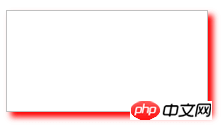
This article brings you how to use box-shadow in CSS3 to create border shadows? (Code tutorial) has certain reference value. Friends in need can refer to it. I hope it will be helpful to you.
Introduction to box-shadow property
Border shadow is a very common special effect.
Previously in CSS2.1, if you wanted to add a border shadow to an element (like the picture above), you could only do it through a background image.
In CSS3, we can easily add a shadow effect to an element using the box-shadow property.
Syntax:
box-shadow:x-shadow y-shadow blur spread color inset;
Description:
(1) x-shadow: Set the position of the horizontal shadow (X axis), you can use negative values;
(2)y-shadow: Set the position of the vertical shadow (y-axis), you can use negative values;
(3)blur: Set the shadow blur radius;
(4)spread: Expand the radius and set the size of the shadow;
(5) color: Set the color of the shadow;
(6) inset: This parameter is not set by default. The default is outer shadow, inset means inner shadow.
Example:
<!DOCTYPE html>
<html xmlns="http://www.w3.org/1999/xhtml">
<head>
    <title>CSS3 box-shadow属性</title>
    <style type="text/css">
    #div1
    {
        width:200px;
        height:100px;
        border:1px solid silver;
        box-shadow:5px 5px 8px red;
    }
    </style>
</head>
<body>
    <div id="div1">
    </div>
</body>
</html>The preview effect in the browser is as follows:

##Horizontal shadow position x-shadow and vertical shadow position y-shadow
The attribute value of horizontal shadow position x-shadow and vertical shadow position y-shadow, the unit can be px, em or percentage, etc., negative values are allowed. Example:<!DOCTYPE html>
<html xmlns="http://www.w3.org/1999/xhtml">
<head>
<title>CSS3 box-shadow属性</title>
<style type="text/css">
#div1
{
width:200px;
height:100px;
border:1px solid silver;
box-shadow:-5px -5px 8px red;
}
</style>
</head>
<body>
<div id="div1">
</div>
</body>
</html>
CSS3 video tutorial, please pay attention to the PHP Chinese website.
The above is the detailed content of How to use box-shadow in CSS3 to create border shadow? (code tutorial). For more information, please follow other related articles on the PHP Chinese website!
 setInterval
 What is the shortcut key for brush size?
 Detailed explanation of linux dd command
 How to solve disk parameter errors
 What are the SEO diagnostic methods?
 What are the css3 gradient properties?
 The most promising coin in 2024
 What does pycharm mean when running in parallel?
 The difference between PD fast charging and general fast charging