 Web Front-end
 CSS Tutorial
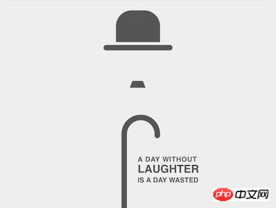
 How to use pure CSS to implement a card commemorating Chaplin (source code attached)
How to use pure CSS to implement a card commemorating Chaplin (source code attached)
The content of this article is about how to use pure CSS to implement a card commemorating Chaplin (source code attached). It has certain reference value. Friends in need can refer to it. I hope It will help you.
Effect preview

Source code download
https://github.com/comehope /front-end-daily-challenges
Code Interpretation
Define dom, the three elements contained in the container represent hats, beards and canes respectively:
<figure>
    <span></span>
    <span></span>
    <span></span>
</figure>
Centered display:
body {
    margin: 0;
    height: 100vh;
    display: flex;
    align-items: center;
    justify-content: center;
}Define the size of the container and set the child elements to be horizontally centered:
.chaplin {
    width: 40em;
    height: 30em;
    font-size: 10px;
    background-color: #eee;
    box-shadow: 0 0 3em rgba(0, 0, 0, 0.2);
    display: flex;
    flex-direction: column;
    align-items: center;
}Define the default color, and later use currentColor to reference this color:
.chaplin {
    color: #555;
}draw Draw the outline of the hat:
.chaplin {
    position: relative;
}
.hat {
    position: absolute;
    width: 6.4em;
    height: 4.6em;
    background-color: currentColor;
    border-radius: 2.3em 2.3em 0 0;
    top: 1.4em;
}Use pseudo elements to draw the brim:
.hat::before {
    content: '';
    position: absolute;
    width: 10em;
    height: 0.8em;
    background-color: currentColor;
    border-radius: 0.4em;
    top: calc(100% + 0.4em);
    left: calc((100% - 10em) / 2);
}Draw the beard:
.beard {
    position: absolute;
    width: 1.5em;
    height: 0;
    top: 11.6em;
    border: solid transparent;
    border-width: 0 0.4em 1em 0.4em;
    border-bottom-color: currentColor;
}Draw the cane shaft:
.stick {
    position: absolute;
    width: 0.8em;
    height: 10.5em;
    background-color: currentColor;
    bottom: 0;
}Use ::before pseudo-element to draw the handle of the cane:
.stick::before {
    content: '';
    position: absolute;
    box-sizing: border-box;
    width: 5.6em;
    height: 3em;
    border: 0.8em solid;
    border-radius: 5.6em 5.6em 0 0;
    border-bottom: none;
    top: -3em;
}Use ::after pseudo-element to modify the endpoint of the handle to make it rounded and natural :
.stick::after {
    content: '';
    position: absolute;
    width: 0.8em;
    height: 0.8em;
    background-color: currentColor;
    border-radius: 50%;
    left: calc(5.6em - 0.8em);
    top: -0.4em;
}Center the cane horizontally:
.stick {
    left: calc((100% - (5.6em - 0.8em)) / 2);
} At this point, the abstract image of Chaplin is completed, and then one of his famous quotes is typeset.
Add a .quote element in the dom and divide the sentence into 3 paragraphs:
<figure>
    <span></span>
    <span></span>
    <span></span>
    <p>
        <span>a day without</span>
        <span>laughter</span>
        <span>is a day wasted</span>
    </p>
</figure>
Position the text and arrange the 3 paragraphs of text vertically:
.quote {
    position: absolute;
    left: 50%;
    bottom: 2.5em;
    font-family: sans-serif;
    text-transform: uppercase;
    font-weight: bold;
    display: flex;
    flex-direction: column;
}Adjust the font size and spacing to align the three paragraphs of text:
.quote span:nth-child(1) {
    letter-spacing: 0.05em;
}

.quote span:nth-child(2) {
    font-size: 1.6em;
}You’re done!
The above is the detailed content of How to use pure CSS to implement a card commemorating Chaplin (source code attached). For more information, please follow other related articles on the PHP Chinese website!

Hot AI Tools

Undresser.AI Undress
AI-powered app for creating realistic nude photos

AI Clothes Remover
Online AI tool for removing clothes from photos.

Undress AI Tool
Undress images for free

Clothoff.io
AI clothes remover

Video Face Swap
Swap faces in any video effortlessly with our completely free AI face swap tool!

Hot Article

Hot Tools

Notepad++7.3.1
Easy-to-use and free code editor

SublimeText3 Chinese version
Chinese version, very easy to use

Zend Studio 13.0.1
Powerful PHP integrated development environment

Dreamweaver CS6
Visual web development tools

SublimeText3 Mac version
God-level code editing software (SublimeText3)

Hot Topics
 1387
1387
 52
52
 How to use bootstrap in vue
Apr 07, 2025 pm 11:33 PM
Using Bootstrap in Vue.js is divided into five steps: Install Bootstrap. Import Bootstrap in main.js. Use the Bootstrap component directly in the template. Optional: Custom style. Optional: Use plug-ins.
 The Roles of HTML, CSS, and JavaScript: Core Responsibilities
Apr 08, 2025 pm 07:05 PM
HTML defines the web structure, CSS is responsible for style and layout, and JavaScript gives dynamic interaction. The three perform their duties in web development and jointly build a colorful website.
 How to write split lines on bootstrap
Apr 07, 2025 pm 03:12 PM
There are two ways to create a Bootstrap split line: using the tag, which creates a horizontal split line. Use the CSS border property to create custom style split lines.
 Understanding HTML, CSS, and JavaScript: A Beginner's Guide
Apr 12, 2025 am 12:02 AM
WebdevelopmentreliesonHTML,CSS,andJavaScript:1)HTMLstructurescontent,2)CSSstylesit,and3)JavaScriptaddsinteractivity,formingthebasisofmodernwebexperiences.
 What Does H5 Refer To? Exploring the Context
Apr 12, 2025 am 12:03 AM
H5referstoHTML5,apivotaltechnologyinwebdevelopment.1)HTML5introducesnewelementsandAPIsforrich,dynamicwebapplications.2)Itsupportsmultimediawithoutplugins,enhancinguserexperienceacrossdevices.3)SemanticelementsimprovecontentstructureandSEO.4)H5'srespo
 How to resize bootstrap
Apr 07, 2025 pm 03:18 PM
To adjust the size of elements in Bootstrap, you can use the dimension class, which includes: adjusting width: .col-, .w-, .mw-adjust height: .h-, .min-h-, .max-h-
 React's Role in HTML: Enhancing User Experience
Apr 09, 2025 am 12:11 AM
React combines JSX and HTML to improve user experience. 1) JSX embeds HTML to make development more intuitive. 2) The virtual DOM mechanism optimizes performance and reduces DOM operations. 3) Component-based management UI to improve maintainability. 4) State management and event processing enhance interactivity.
 How to use bootstrap button
Apr 07, 2025 pm 03:09 PM
How to use the Bootstrap button? Introduce Bootstrap CSS to create button elements and add Bootstrap button class to add button text


