
 Web Front-end
CSS Tutorial
How does CSS3 implement 2D conversion? Implementation of 2D transformation (code example)
Web Front-end
CSS Tutorial
How does CSS3 implement 2D conversion? Implementation of 2D transformation (code example)
How does CSS3 implement 2D conversion? Implementation of 2D transformation (code example)

The content of this article is to introduce how to implement 2D conversion in CSS3? Implementation of 2D transformation (code example). It has certain reference value. Friends in need can refer to it. I hope it will be helpful to you.
transform
Reference W3 Manual
The transform attribute applies a transformation from 2D or 3D to an element. This property allows us to rotate, scale, move or tilt the element.
1. Format:
transform: none|transform-functions;
1. Common values:
1), rotaterotate
##- 2), translate
translate
- 3), zoom
scale
- 4), comprehensive conversion to continuous format
transform: rotate(45deg);/*其中deg是单位, 代表多少度*/
transform: translate(100px, 0px); /*第一个参数:水平方向第二个参数:垂直方向*/
transform: scale(1.5);
/*transform: scale(0.5, 0.5);*/

/*
第一个参数:水平方向
第二个参数:垂直方向
注意点:
如果取值是1, 代表不变
如果取值大于1, 代表需要放大
如果取值小于1, 代表需要缩小
如果水平和垂直缩放都一样, 那么可以简写为一个参数
*/
transform: rotate(45deg) translate(100px, 0px) scale(1.5, 1.5);
/*
注意点:
1.如果需要进行多个转换, 那么用空格隔开
2.2D的转换模块会修改元素的坐标系, 所以旋转之后再平移就不是水平平移的
*/
transform: rotateZ(45deg);

transform: rotateX(45deg);

transform: rotateY(45deg);
transform-origin
transform-origin attribute is used to change the position of the transformed element2D transformation Elements can change the element's X and Y axes. The 3D conversion element can also change its Z axis- 1. Format:
transform-origin: left top;
- 2. Value:
/*具体像素*/
transform-origin: 200px 0px;
/*百分比*/
transform-origin: 50% 50%;
/*特殊关键字*/
transform-origin: left top;
perspective
perspective attribute defines the distance of the 3D element from the view, in pixels. This attribute allows changing the view of the 3D element to view the 3D element When the perspective attribute is defined for an element, its child elements get the perspective effect, not the element itself- Format:
perspective: number|none;
/*
number  元素距离视图的距离,以像素计
none    默认值。与0相同。不设置透视
*/
- Note: The perspective attribute can only affect 3D conversion elements
Comprehensive example one
2D Module conversion poker practice
<!DOCTYPE html><html lang="zh-CN"><head>
    <meta charset="UTF-8">
    <title>2D模块转换扑克练习</title>
    <style>
        *{
            margin: 0;
            padding: 0;
        }
        p{
            width: 310px;
            height: 418px;
            border: 1px solid gold;
            margin: 100px auto;
            background-color: #afcced;
            perspective: 400px;
        }
        p img{
            transition: transform 1.2s;
            transform-origin: center bottom;
        }
        p:hover img{
            transform: rotateX(80deg);
        }
    </style></head><body><p>
    <img src="img/pk.png" alt=""></p></body></html>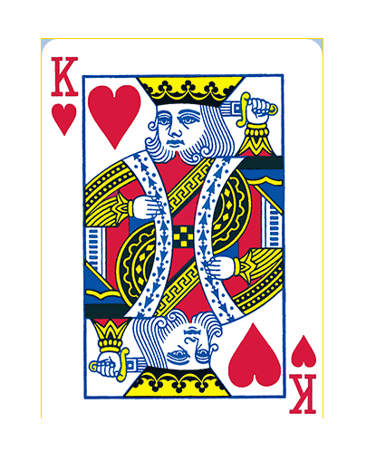
Comprehensive example two (photo wall)
2D conversion module-photo wall
<!DOCTYPE html><html lang="zh-CN"><head>
    <meta charset="UTF-8">
    <title>2D转换模块-照片墙</title>
    <style>
        *{
            margin: 0;
            padding: 0;
        }
        ul{
            height: 400px;
            margin: 100px auto;
            background-color: cornflowerblue;
            text-align: center;
            border: 1px solid #000;
        }
        ul li{
            list-style: none;
            margin-top: 100px;
            height: 200px;
            width: 150px;
            display: inline-block;
            background-color: red;
            border: 5px solid white;
            transition: transform 1s;
            box-shadow: 2px 2px 2px;
            position: relative;
        }
        ul li:nth-child(1){
            transform: rotate(30deg);
        }
        ul li:nth-child(2){
            transform: rotate(-40deg);
        }
        ul li:nth-child(3){
            transform: rotate(15deg);
        }
        ul li:nth-child(4){
            transform: rotate(60deg);
        }
        ul li:nth-child(5){
            transform: rotate(-25deg);
        }
        ul li:nth-child(6){
            transform: rotate(10deg);
        }
        ul li img{
            width: 150px;
            height: 200px;
        }
        ul li:hover {
            transform: scale(1.6);
            z-index: 999;
        }
    </style></head><body><ul>
    <li><img src="img/1.jpg" alt=""></li>
    <li><img src="img/2.jpg" alt=""></li>
    <li><img src="img/3.jpg" alt=""></li>
    <li><img src="img/4.jpg" alt=""></li>
    <li><img src="img/5.jpg" alt=""></li>
    <li><img src="img/6.jpg" alt=""></li></ul></body></html>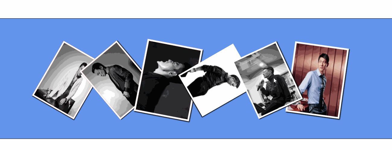
The above is the detailed content of How does CSS3 implement 2D conversion? Implementation of 2D transformation (code example). For more information, please follow other related articles on the PHP Chinese website!

Hot AI Tools

Undresser.AI Undress
AI-powered app for creating realistic nude photos

AI Clothes Remover
Online AI tool for removing clothes from photos.

Undress AI Tool
Undress images for free

Clothoff.io
AI clothes remover

AI Hentai Generator
Generate AI Hentai for free.

Hot Article
Hot Tools

Notepad++7.3.1
Easy-to-use and free code editor

SublimeText3 Chinese version
Chinese version, very easy to use

Zend Studio 13.0.1
Powerful PHP integrated development environment

Dreamweaver CS6
Visual web development tools

SublimeText3 Mac version
God-level code editing software (SublimeText3)
Hot Topics
 1378
1378
 52
52

 How to achieve wave effect with pure CSS3? (code example)
Jun 28, 2022 pm 01:39 PM
How to achieve wave effect with pure CSS3? (code example)
Jun 28, 2022 pm 01:39 PM
How to achieve wave effect with pure CSS3? This article will introduce to you how to use SVG and CSS animation to create wave effects. I hope it will be helpful to you!
 Use CSS skillfully to realize various strange-shaped buttons (with code)
Jul 19, 2022 am 11:28 AM
Use CSS skillfully to realize various strange-shaped buttons (with code)
Jul 19, 2022 am 11:28 AM
This article will show you how to use CSS to easily realize various weird-shaped buttons that appear frequently. I hope it will be helpful to you!
 How to hide elements in css without taking up space
Jun 01, 2022 pm 07:15 PM
How to hide elements in css without taking up space
Jun 01, 2022 pm 07:15 PM
Two methods: 1. Using the display attribute, just add the "display:none;" style to the element. 2. Use the position and top attributes to set the absolute positioning of the element to hide the element. Just add the "position:absolute;top:-9999px;" style to the element.
 How to implement lace borders in css3
Sep 16, 2022 pm 07:11 PM
How to implement lace borders in css3
Sep 16, 2022 pm 07:11 PM
In CSS, you can use the border-image attribute to achieve a lace border. The border-image attribute can use images to create borders, that is, add a background image to the border. You only need to specify the background image as a lace style; the syntax "border-image: url (image path) offsets the image border width inward. Whether outset is repeated;".
 It turns out that text carousel and image carousel can also be realized using pure CSS!
Jun 10, 2022 pm 01:00 PM
It turns out that text carousel and image carousel can also be realized using pure CSS!
Jun 10, 2022 pm 01:00 PM
How to create text carousel and image carousel? The first thing everyone thinks of is whether to use js. In fact, text carousel and image carousel can also be realized using pure CSS. Let’s take a look at the implementation method. I hope it will be helpful to everyone!
 How to enlarge the image by clicking the mouse in css3
Apr 25, 2022 pm 04:52 PM
How to enlarge the image by clicking the mouse in css3
Apr 25, 2022 pm 04:52 PM
Implementation method: 1. Use the ":active" selector to select the state of the mouse click on the picture; 2. Use the transform attribute and scale() function to achieve the picture magnification effect, the syntax "img:active {transform: scale(x-axis magnification, y Axis magnification);}".
 How to set animation rotation speed in css3
Apr 28, 2022 pm 04:32 PM
How to set animation rotation speed in css3
Apr 28, 2022 pm 04:32 PM
In CSS3, you can use the "animation-timing-function" attribute to set the animation rotation speed. This attribute is used to specify how the animation will complete a cycle and set the speed curve of the animation. The syntax is "element {animation-timing-function: speed attribute value;}".
 Does css3 animation effect have deformation?
Apr 28, 2022 pm 02:20 PM
Does css3 animation effect have deformation?
Apr 28, 2022 pm 02:20 PM
The animation effect in css3 has deformation; you can use "animation: animation attribute @keyframes ..{..{transform: transformation attribute}}" to achieve deformation animation effect. The animation attribute is used to set the animation style, and the transform attribute is used to set the deformation style. .
