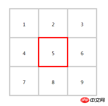
The content of this article is about how to implement Jiugong grid in CSS? The introduction of the four ways to implement Jiugongge in CSS has certain reference value. Friends in need can refer to it. I hope it will be helpful to you.
The effect is as follows, it is a nine-square grid. Click on any small square in the nine-square grid, and its border will turn red.

I have summarized a total of 4 methods to achieve this effect. The first three methods are similar, and only the fourth table layout comparison special. Below I directly give the source code of the style and DOM structure related to each layout method.
<style>
    .float{
      margin: 50px; //为了和页面中的其他块拉开距离
      height: 300px;
      width: 300px;
    }
    .float > li{
      box-sizing: border-box;
      float:left;
      width: 100px;
      height: 100px;
      margin-left: -4px;
      margin-top: -4px;
      line-height: 100px;
      text-align: center;
      list-style: none;
      border:4px solid #ccc;
    }
    .float > li:hover{
      border-color: red;
      position: relative;
    }
  </style>
There is nothing to talk about in implementing this 9-square grid with float layout. The key point is to set margin-left:-4px;margin-top:-4px for the li sub-item. ;This allows the borders between adjacent sub-blocks to overlap. You can see the effect without setting this negative margin, and you will have a deeper experience. I think the most essential part of the entire CSS is the hover style, which sets position:relative; for the li sub-item. The essence of this place is that after setting relative to an element, it will be separated from the document flow. At the same time, its cascading level will be higher than the ordinary document flow, and its content will be covered on the ordinary document flow. Then its covered border will be will be displayed, while blocking the border of adjacent elements. This setting is really essential. The next two methods are similar to this method, so I won’t explain too much.
<style>
.flex{
      display: flex;
      width: 300px;
      /*height: 300px;*/
      margin: 50px;
      flex-wrap: wrap;
      /*align-content: flex-start;      */
      box-sizing: border-box;
    }
    .flex > li{
      box-sizing: border-box;
      height: 100px;
      width: 100px;
      margin-left: -4px;
      margin-top: -4px;
      line-height: 100px;
      text-align: center;
      list-style: none;
      border: 4px solid #ccc;
    }

    .flex > li:hover{
      border-color:red;
      position: relative;
      /*z-index:2;*/
    }
</style>
When using flex layout, one thing you need to pay attention to is not to set the height of the parent container ul.flex. If you set the height, then in the vertical direction The negative margin setting of the child item will be invalid. I don't know the specific reason. If you set the height and want the vertical margin value to take effect, then you can add an algin-content:flex-start; attribute to ul.flex. I don’t quite understand why this happens specifically. I hope someone who understands can provide some guidance in the comment area. In this flex layout, you can also add z-index:2; during hover to improve the overlay level.
<style>
.grid{
      margin: 50px;
      height: 300px;
      width: 300px;
      display: grid;
      grid-template-rows: 100px  100px 100px;
      grid-template-columns: 100px 100px 100px;
      box-sizing: border-box;
    }
    .grid > li{
      margin-top: -4px;
      margin-left: -4px;
      box-sizing: border-box;
      list-style: none;
      line-height: 100px;
      text-align: center;
      border: 4px solid #ccc;
    }
    .grid > li:hover{
      border-color: red;
      position: relative;
      /*z-index:2;*/
    }
</style>
There is one thing you need to pay attention to here, that is, do not set the width and height for the li sub-items. In this grid layout, you can also add z-index:2; during hover to improve the overlay level.
<style>
    .table{
      margin-top: 100px;
      width: 300px;
      height: 300px;
      text-align: center;
      border: 4px solid #ccc;
      border-collapse: collapse;
      box-sizing: border-box;
    }
    .table td{
      /*height: 100px;*/
      width: 100px;
      vertical-align: middle;
      border: 4px solid #ccc;
      text-align: center;
      box-sizing: border-box;
      line-height: 100px;
    }
    .table td:hover{
      border-color: red;
      position: absolute;
      width: 94px;
      height: 100px;
      margin-top: -4px;
      margin-left: -4px;
      box-sizing: content-box;
    }
  </style>
| 1 | 2 | 3 |
| 1 | table | 3 |
| 1 | 2 | 3 |
When using table layout, there are the following points to note:
1. The setting value of line-height needs to be consistent with the value of height. . Because for a row in the table, its height depends on the height of the largest cell in the row or the row height. Inconsistency between line-height and height will cause the border in the column to overflow the cell.
2. If you want to make the border of a certain cell cover the border of other cells, you must set position:absolute; instead of relative for the cell.
3. The setting value of margin-left is 1.5 times that of border-width. This is my test result under chrome. I don’t know the specific reason. I hope someone can answer it in the comment area.
The above is the detailed content of How to implement the nine-square grid in CSS? Introduction to four ways to implement Jiugongge with CSS. For more information, please follow other related articles on the PHP Chinese website!
 The difference between gateway and router
 How to recover files emptied from Recycle Bin
 How to fix libcurl.dll missing from your computer
 Delete exif information
 WiFi shows no access to the Internet
 My computer can't open it by double-clicking it.
 How to restore friends after being blocked on TikTok
 Introduction to javascript special effects code