Home > Web Front-end > CSS Tutorial > Introduction to the basic content of grid layout in css (with examples)

Introduction to the basic content of grid layout in css (with examples)

不言
Release: 2018-10-29 16:15:45
forward
2889 people have browsed it

This article brings you the basic content of grid layout in CSS (with examples). It has certain reference value. Friends in need can refer to it. I hope it will be helpful to you.

CSS grid layout (also known as "grid") is a two-dimensional grid layout system. CSS has never been very good at handling web page layout. At first we used table (table) layout, and then used float (floating), position (positioning) and inline-block (inline block) layout, but these methods are essentially hacks and miss many features, such as vertical centering. Later, the flexbox box layout came out, which solved many layout problems, but it was only a one-dimensional layout, not a complex two-dimensional layout. In fact, they (flexbox and grid) can be used together very well.

Browser support

Before we start to formally learn Grid layout, it is useful to take a look at the support of grid layout in various browsers on can i use.

Introduction to the basic content of grid layout in css (with examples)

Basic concepts

If you want to learn how to use Grid layout, the introduction of basic concepts is indispensable, although it seems boring.

Grid Container

You can create a grid container by setting the attribute value to grid or inline-grid through the display attribute. All child elements in the grid container will automatically become grid items (Grid items)

Grid Lines (Grid Line)

The dividing lines that make up the grid lines. They can be column grid lines (column grid lines) or row grid lines (row grid lines) and be located on either side of the row or column

Grid Track(Grid Track)

Between two adjacent grid lines is a grid track. You can think of them as columns or rows of a grid

Grid Cell

It consists of two adjacent column grid lines and two adjacent row grid lines is the grid unit, which is the smallest grid unit

Grid Area(Grid Area)

The grid area is composed of any number of grid units

Basically Properties and functions

A simple example

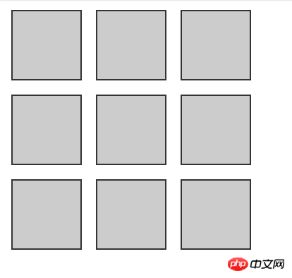
To introduce the Grid layout properties, let us start with a simple example:
Introduction to the basic content of grid layout in css (with examples)

##As shown in the picture above, if we want to implement a 3x3 square matrix, how to implement it using Grid layout?

 <div>
    <div></div>
    <div></div>
    <div></div>
    <div></div>
    <div></div>
    <div></div>
    <div></div>
    <div></div>
    <div></div>
</div>
Copy after login
.container {
    display: grid;
    width: 200px;
    height: 200px;
    grid-template-rows: repeat(3, 50px);
    grid-template-columns: repeat(3, 50px);
    grid-row-gap: 10px;
    grid-column-gap:10px;
}
.container p {
    background-color: #ccc;
    border: 1px solid #333;
}
Copy after login
As shown in the above code, the 3x3 matrix layout is very simple and convenient to write using Grid layout. Compared with using other layouts, the advantages of Grid layout are revealed. Then, the next step is Let's take a look at the common properties in the Grid partial:

grid-template-rows: Each value specified can create the height of each row. The size of the row height can be any non-negative value, and the length can be a value in length units such as px, %, em, etc.

grid-template-columns: Specify each value to create the column width of each column

repeat function: Use repeat() to create repeated grid tracks. This is suitable for creating equal-sized grid items and multiple grid items. repeat() accepts two parameters: the first parameter defines the number of times the grid track should be repeated, and the second parameter defines the size of each track

The grid-column-gap and grid-row-gap properties are used to create the spacing between columns and rows. The spacing (Gap) can be set to any non-negative value, and the length value can be px, %, em and other unit values.

Grid line number positioning

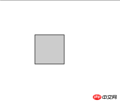
It’s still the above html code, a 3x3 matrix. The difference is that this time we use the network line number to locate a specific square.

.container {
    display: grid;
    width: 200px;
    height: 200px;
    grid-template-rows: repeat(3, 50px);
    grid-template-columns: repeat(3, 50px);
}
.container div {
    background-color: #ccc;
    border: 1px solid #333;
    grid-column-start: 2;
    grid-column-end: 3;
    grid-row-start: 2;
    grid-row-end: 3; 
/*  grid-area: 2/2/3/3; */
  }
Copy after login
Through the above code we can achieve the following effects:

Introduction to the basic content of grid layout in css (with examples)

The small square in the middle of our positioning matrix is ​​displayed, and the rest will not be displayed, here are the attributes of our grid line number positioning:

Each line starts from the grid track, the grid lines of the grid start from 1, and each grid line gradually increases 1

grid-row-start: Indicates the starting row grid line number

grid-row-end: Indicates the ending row grid line number

grid-column -start: Indicates the starting column grid line number

grid-row-end: Indicates the ending column grid line number

If a grid item spans only one row or column, then grid -row-end and grid-column-end are not required

grid-area: grid area, also used for positioning, if only one value is provided, it specifies grid-row-start and grid-column -start value. If two values ​​are provided, the first value is the value of grid-row-start and grid-column-start, and the second value is the value of grid-row-end and grid-column-end. There must be Separate with /. If four values ​​are specified, the first value corresponds to grid-row-start, the second value corresponds to grid-column-start, the third value corresponds to grid-row-end and the fourth value corresponds to grid-column-end

网格区域命名定位网格项目

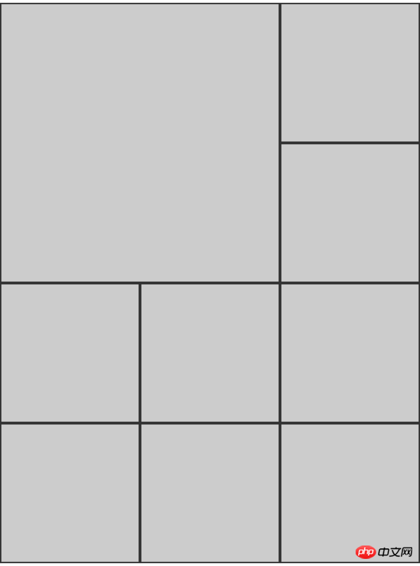
通过上面的例子,我们知道了如何用网格线去定位网格项目,接下来我们将学习如何通过网格区域的命名来定位网格项目,老样子,依旧从一个例子开始:

<div>
    <div></div>
    <div></div>
    <div></div>
    <div></div>
    <div></div>
    <div></div>
    <div></div>
    <div></div>
    <div></div>
</div>
Copy after login
.container {
    display: grid;
    width: 400px;
    height: 400px;
    grid-template-rows: repeat(3, 100px);
    grid-template-columns: repeat(3, 100px);
    grid-template-areas: "header header2 header3" "body body2 body3" "footer footer2 footer3";
}
.container div {
    background-color: #ccc;
    border: 1px solid #333;
}
.container .first {
    grid-row-start: header2;
    grid-row-end: body2;
    grid-column-start: header;
    grid-column-end: header2;
}
Copy after login

Introduction to the basic content of grid layout in css (with examples)

如上述例子看到的,本来是一个3x3的矩阵,但是通过区域命名的方式,将第一个p设置了跨两行两列,接下来让我们一起了解一下网格区域命名定位网格项目的相关属性:

  • 像网格线名称一样,网格区域的名称也可以使用grid-template-areas属性来命名。引用网格区域名称也可以设置网格项目位置

  • 设置网格区域的名称应该放置在单引号或双引号内,每个名称由一个空格符分开。网格区域的名称,每组(单引号或双引号内的网格区域名称)定义了网格的一行,每个网格区域名称定义网格的一列

  • grid-row-start和grid-row-end通过区域命名分别设置了行开始的位置和结束,grid-column-start和grid-column-end通过区域命名分别设置了列开始的位置和结束位置

总结

这篇文章简单的介绍了一些Grid布局的属性和用法,但没有涉及所有,Grid布局还有很多属性和用法需要自己去探索,通过不同属性的排列组合,可以发掘不同的玩法,这不正是布局的魅力吗?

The above is the detailed content of Introduction to the basic content of grid layout in css (with examples). For more information, please follow other related articles on the PHP Chinese website!

Related labels:
css
source:segmentfault.com
Statement of this Website
The content of this article is voluntarily contributed by netizens, and the copyright belongs to the original author. This site does not assume corresponding legal responsibility. If you find any content suspected of plagiarism or infringement, please contact admin@php.cn
Popular Tutorials
More>
Latest Downloads
More>
Web Effects
Website Source Code
Website Materials
Front End Template