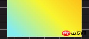
We all know that using margin:auto can center the element horizontally. But have you ever thought about why using margin:auto can center an element horizontally? To answer this question, we first need to take a look at how margin:auto works. If auto is suitable for vertical centering, what is the situation? Let's look at the specific content.
First of all, what does auto do?
Define the auto element, which varies depending on the element type and context. In margins, auto can mean two things: taking up available space or 0 px. These two will define different layouts for the elements.
"Automatically" occupy available space
This is the most common way we use auto. By assigning the left and right margins of auto elements, they occupy the available horizontal space in the element's container equally - so the element will be centered.
<div id="outer">
<div id="inner"></div>
</div>
#inner {
  margin: auto;
  width: 250px;
  height: 125px;
  background-image: linear-gradient(45deg, #84ECEF 10%, #F8F62F 60%, #FDC018);
}
#outer {
  height: 500px;
  width: 500px;
  background: #1F1D20;
  background-image: linear-gradient(#757575 1px, transparent 1px), linear-gradient(90deg, #757575 1px, transparent 1px);
  background-size: 25px 25px;
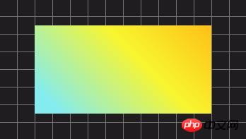
}The effect is as follows:

However, this only works with horizontal margins, it does not work with floated and inline elements, and it does not work by itself Used for absolutely and fixedly positioned elements.
Recommended Manual: CSS Online Manual
Since the left and right margins of auto occupy the "available" space evenly, when you auto only give them What do you think will happen when one occurs?
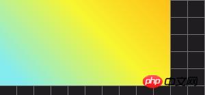
Left or right margin auto will take up all "available" space, making the element appear to be offset to the right or left.
<div id="outer">
<div id="inner"></div>
</div>
#inner {
  margin-right: auto;
  width: 250px;
  height: 125px;
  background-image: linear-gradient(45deg, #84ECEF 10%, #F8F62F 60%, #FDC018);
}

#outer {
  height: 500px;
  width: 500px;
  background: #1F1D20;
  background-image: linear-gradient(#757575 1px, transparent 1px), linear-gradient(90deg, #757575 1px, transparent 1px);
  background-size: 25px 25px;
}The effect is as follows:

"auto" is 0px
As mentioned before, auto is floating , does not work in inline and absolute elements. All of these elements already have their layout determined, so there's no auto for margins and expecting it to be centered like this.
This would defeat the original purpose of using something like float. So set the auto value of these elements to 0px.
auto will also not work on a typical block element if it has no width. All the examples I've shown you so far have width.
The width auto of the value will have 0px margins. The width of a block element usually covers its entire container, which is auto or 100%, so margin:auto will be set to 0px.
What will it look like if auto is set vertically?
auto always evaluates to 0px in top and bottom margins (except for absolute elements). The W3C spec says it is this:
"If "margin-top" or "margin-bottom" is "auto", its usage value is 0"
So far, why This is not said. This is probably because of typical vertical page flow, where the page size increases in height. Therefore, centering an element vertically in its container relative to the page itself will not cause it to appear centered, unlike doing it horizontally (in most cases).
Perhaps for the same reason, they decided to add an exception for absolute elements, which can be vertically centered the entire height of the page.
This may also be due to an edge collapse effect (the collapse of the "edges" of adjacent elements), which is another exception to vertical margins.
However, the latter seems to be an unlikely scenario - since elements that don't collapse their margins - like Floats and overflow other elements visible, still have 0px vertical margin auto assigned to them.
Recommended related articles:
1.Causes and solutions why margin does not work in CSS
Recommended related videos:
1.CSS Video Tutorial-Jade Girl Heart Sutra Edition
center on the absolutely positioned element
Because the absolutely positioned element happens to have an exception , we will use the auto value to center vertically and horizontally. But before that, we need to find out when margin:auto actually works like we want it to in absolutely positioned elements.
This is where another W3C spec comes in:
"If all three of "left", "width" and "right" are "auto": first add " Any "auto" value of margin-left" and "margin-right" is set to 0... "
" if none of the three is "auto": If "margin-left" and "margin -right" are both "auto", then the equation is solved with the additional constraint that the two margins get equal values"
This pretty much says that for the margins of horizontal auto, the catch intervals are equal, Then the values left, width and right should not be auto, their default values. So all we have to do is give them some value in the absolutely positioned elements. left and right should have the same value for perfect centering.
The spec also mentions something like vertical margins.
"If all three of "top", "height" and "bottom" are auto, set "top" to a static position..."
“如果三者中没有一个是”自动“:如果”margin-top“和”margin-bottom“都是”auto“,则在额外约束下解决方程式,即两个边距得到相等的值......”
因此,对于一个绝对元件被垂直居中,其top,height和bottom值不应该auto。
现在结合所有这些,这是我们将得到的:
<div id="outer">
<div id="inner"></div>
</div>
HTML

CSS
Result
EDIT ON#inner {
  margin: auto;
  position: absolute;
  left: 0px;
  right: 0px;
  bottom: 0px;
  top: 0px;
  width: 250px;
  height: 125px;
  background-image: linear-gradient(45deg, #84ECEF 10%, #F8F62F 60%, #FDC018);
}
#outer {
  position: relative;
  height: 500px;
  width: 500px;
  background: #1F1D20;
  background-image: linear-gradient(#757575 1px, transparent 1px), linear-gradient(90deg, #757575 1px, transparent 1px);
  background-size: 25px 25px;
}效果如下:

最后
如果您想要将页面上的元素向右或向左偏移而没有包含它的其他元素(就像浮点数一样),请记住有auto用于边距的选项。
将元素转换为绝对定位只是为了使它可以垂直居中可能不是一个好主意。还有其他选项,如flexbox和CSS变换,更适合那些。
The above is the detailed content of What does margin:auto mean in css? Detailed explanation of the usage of margin:auto attribute. For more information, please follow other related articles on the PHP Chinese website!