 Web Front-end
 CSS Tutorial
 Analysis of five common problems encountered in CSS floating (with examples)
Analysis of five common problems encountered in CSS floating (with examples)
CSS "Floats" (floating elements) are simple to use, but once used, their effect on surrounding elements can sometimes become unpredictable. If you've ever had problems with nearby elements disappearing or floating elements, worry no more. This article covers five essential questions to help you become an expert with floating elements.
1. Which elements do not float?
2. What happens to the element when it is floated?
3. What will happen to the sibling elements of "Floats"?
4. What will happen to the parent element of "Float"?
5. How do you clear "Float"?
1. Which elements do not float?
Absolutely or fixedly positioned elements will not float. So next time you encounter a float that doesn't behave properly, check if it can be changed at position:absolute or position:fixed accordingly.
2. What happens when an element is floated?
When an element is marked as "floated", it basically floats to the left or right until it hits the bounds of its container element. Alternatively, it will run until it hits another floated element that has already hit the same boundary. They will keep piling up until space is exhausted, and new incomings will move down.
Floating elements will not float to other elements in the code. Sometimes you need to consider the floating side of the latter element before writing a "float".
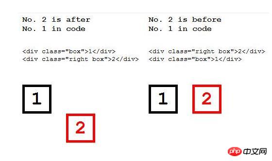
Here are two other things that happen to floated elements, depending on the type of floated element:
(1) Inline elements in When floated, it becomes a block-level element.
Ever wonder why suddenly you are able to assign height and width spans to floats? This is because all elements when floated will get the value of block's display attribute (inline-table will get table), making them block-level elements.
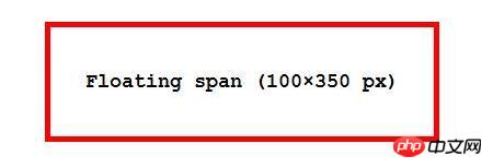
# (2) A block element with no specified width will adapt its content when floated.
Normally, if a block element's width is not specified, its width is the default value of 100%. However, when floated, this is no longer the case; the block element's box will shrink until its contents remain visible.
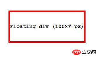
#3. What will happen to the sibling elements of "Floats"?
When you decide to float an element in a stack of elements, don't worry about how it will behave, it will behave predictably and move to the left or right. What you should really consider is how sibling elements behave afterward.
"Floats" has the best elements of its class in the world. They will do their best to accommodate the floated element.
The text and inline elements will only make way for "Floats", and their position will be around the "float" element.
The block element will shrink its position and wrap itself around a "float" ” element, even if that means kicking out its own child elements in order to follow the “floated” space.
Let’s check it out in the experiment. Below is a blue box, followed by a red box of the same size with some child elements.
<div id="blue">
</div>
<div id="red">
  <img src="/static/imghw/default1.png"  data-src="https://cdn4.iconfinder.com/data/icons/ionicons/512/icon-ios7-people-outline-64.png"  class="lazy"   alt="" />
</div>
#blue{
  background: blue;
}
#red{
  background: red;
}
div{
  width: 100px;
  height: 100px;
}The effect is as follows:

Now, let’s float the blue box and see what happens to the red box and its subframes.
<div id="blue">
</div>
<div id="red">
  <img src="/static/imghw/default1.png"  data-src="https://cdn4.iconfinder.com/data/icons/ionicons/512/icon-ios7-people-outline-64.png"  class="lazy"   alt="" />
</div>
#blue{
  background: blue;
  float: left;
}
#red{
  background: red;
}
div{
  width: 100px;
  height: 100px;
}Once the red box stops surrounding the blue box and you can use overflow:hidden to make everything fine.
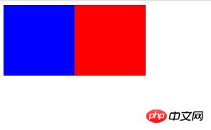
When you add overflow:hidden to an element that already wraps a float, it will stop doing this. See the red box below for how overflow:hidden behaves.
<div id="blue">
</div>
<div id="red">
  <img src="/static/imghw/default1.png"  data-src="https://cdn4.iconfinder.com/data/icons/ionicons/512/icon-ios7-people-outline-64.png"  class="lazy"   alt="" />
</div>
#blue{
  background: blue;
  float: left;
}
#red{
  background: red;
  overflow: hidden;
}
div{
  width: 100px;
  height: 100px;
}The effect is as follows:
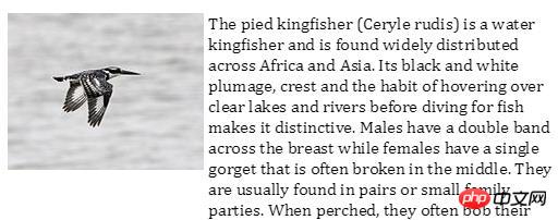
<div id="container">


  <img src="/static/imghw/default1.png"  data-src="https://upload.wikimedia.org/wikipedia/commons/thumb/b/b9/Pied_Kingfisher_%28Ceryle_rudis%29.jpg/180px-Pied_Kingfisher_%28Ceryle_rudis%29.jpg"  class="lazy"  alt="" >

  <p>The pied kingfisher (Ceryle rudis) is a water kingfisher and is found widely distributed across Africa and Asia. Its black and white plumage, crest and the habit of hovering over clear lakes and rivers before diving for fish makes it distinctive. Males
    have a double band across the breast while females have a single gorget that is often broken in the middle. They are usually found in pairs or small family parties. When perched, they often bob their head and flick up their tail.</p>
</div>img {
float: left;
margin-right: 4px;
}
p {
overflow: hidden;
}
#container {
width: 500px;
font-family: cambria;
}The effect is as follows:
4. What will happen to the parent element of “Float”?
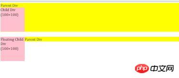
Parent elements don't care about their "floating" child elements, except that they shouldn't leave their left or right borders.
Normally, a block element with no specified height will increase its height to accommodate its children, but this is not the case for "Float" child elements. If a "float" increases in size, its parent will not increase its height accordingly. This can be solved by using overflow:hidden in the parent element.
<div class="parents"> Parent Div <div class="children" >Child Div (100×100)</div> </div> <br /> <div class="parents"> Parent Div <div class="children" style="float:left">Floating Child Div (100×100)</div> </div>
The effect is as follows:
5.如何清除“浮动”?
我已经提到过使用overflow:hidden父元素的一个高度方式容纳一个浮动的子元素,同时在“Float”之后为其他元素创建正确的空间,并阻止同级元素包裹“Floats”。
这就是你如何使一个元素靠近“浮动”而不妥协的方式。
还有另一种方法,即元素甚至不会靠近“Float”的同级元素。通过使用该clear属性,您可以使元素不受“浮动”附近的影响。
clear: left;
clear: right;
clear: both;
leftvalue清除元素左侧的所有“Floats”,反之亦然right,两侧为both。clear根据您的方便,此属性可以在兄弟,空div或伪元素上使用。
The above is the detailed content of Analysis of five common problems encountered in CSS floating (with examples). For more information, please follow other related articles on the PHP Chinese website!

Hot AI Tools

Undresser.AI Undress
AI-powered app for creating realistic nude photos

AI Clothes Remover
Online AI tool for removing clothes from photos.

Undress AI Tool
Undress images for free

Clothoff.io
AI clothes remover

Video Face Swap
Swap faces in any video effortlessly with our completely free AI face swap tool!

Hot Article

Hot Tools

Notepad++7.3.1
Easy-to-use and free code editor

SublimeText3 Chinese version
Chinese version, very easy to use

Zend Studio 13.0.1
Powerful PHP integrated development environment

Dreamweaver CS6
Visual web development tools

SublimeText3 Mac version
God-level code editing software (SublimeText3)

Hot Topics
 1392
1392
 52
52
 Vue 3
Apr 02, 2025 pm 06:32 PM
It's out! Congrats to the Vue team for getting it done, I know it was a massive effort and a long time coming. All new docs, as well.
 Building an Ethereum app using Redwood.js and Fauna
Mar 28, 2025 am 09:18 AM
With the recent climb of Bitcoin’s price over 20k $USD, and to it recently breaking 30k, I thought it’s worth taking a deep dive back into creating Ethereum
 Can you get valid CSS property values from the browser?
Apr 02, 2025 pm 06:17 PM
I had someone write in with this very legit question. Lea just blogged about how you can get valid CSS properties themselves from the browser. That's like this.
 A bit on ci/cd
Apr 02, 2025 pm 06:21 PM
I'd say "website" fits better than "mobile app" but I like this framing from Max Lynch:
 Stacked Cards with Sticky Positioning and a Dash of Sass
Apr 03, 2025 am 10:30 AM
The other day, I spotted this particularly lovely bit from Corey Ginnivan’s website where a collection of cards stack on top of one another as you scroll.
 Using Markdown and Localization in the WordPress Block Editor
Apr 02, 2025 am 04:27 AM
If we need to show documentation to the user directly in the WordPress editor, what is the best way to do it?
 Comparing Browsers for Responsive Design
Apr 02, 2025 pm 06:25 PM
There are a number of these desktop apps where the goal is showing your site at different dimensions all at the same time. So you can, for example, be writing
 Why are the purple slashed areas in the Flex layout mistakenly considered 'overflow space'?
Apr 05, 2025 pm 05:51 PM
Questions about purple slash areas in Flex layouts When using Flex layouts, you may encounter some confusing phenomena, such as in the developer tools (d...


