 Web Front-end
 CSS Tutorial
 How to create a 3D bar chart with css? Example of creating a 3D bar chart
How to create a 3D bar chart with css? Example of creating a 3D bar chart
This article introduces how to create a 3D bar chart using CSS. It has certain reference value. Friends in need can refer to it. I hope it will be helpful to you.
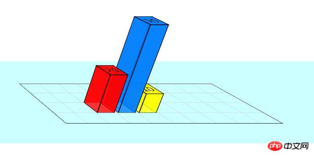
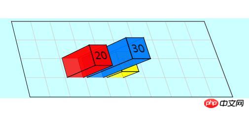
The example of creating a three-dimensional bar chart introduced in this article uses the 3D effect of perspective and rotation, not just tilt transformation. The result is a chart that can be viewed from any direction.
Let’s introduce step by step how to create it. The sample code works best in WebKit browser and also works quite well in Firefox (v13).
1. Set up the grid
First set up a #stage element, where we can define the perspective in which any 3D transformation will be viewed. Basically the position of the viewer in relation to the flat screen. Then, since we are creating a graph, we need to set up the axes and grid (#chart).
While we could easily create a background image and tile it to form a grid pattern, we decided to use CSS linear gradient syntax. In all code below, -moz-styles only copies -webkit-styles.
<style type="text/css">

  #stage {
    -webkit-perspective: 1200px;
    -webkit-perspective-origin: 0% 0%;
    -moz-perspective: 1200px;
    -moz-perspective-origin: 0% 0%;
    background: rgba(0,255,255,0.2);
  }
  #chart {
    position: relative;
    margin: 10em auto;
    width: 400px;
    height: 160px;
    border: 1px solid #000;
    background: -webkit-repeating-linear-gradient(left, rgba(0,0,0,0) 0, rgba(0,0,0,0) 38px, #ccc 40px), -webkit-repeating-linear-gradient(bottom, rgba(0,0,0,0), rgba(0,0,0,0) 38px, #ccc 40px);
    background: -moz-repeating-linear-gradient(left, rgba(0,0,0,0) 0, rgba(0,0,0,0) 38px, #ccc 40px), -moz-repeating-linear-gradient(bottom, rgba(0,0,0,0), rgba(0,0,0,0) 38px, #ccc 40px);
    -webkit-transform-origin: 50% 50%;
    -webkit-transform: rotateX(65deg);
    -webkit-transform-style: preserve-3d;
    -moz-transform-origin: 50% 50%;
    -moz-transform: rotateX(65deg);
    -moz-transform-style: preserve-3d;
  }

</style>Chart size is 400 x 160 pixels, grid is 40 pixels. As you can see, the background grid consists of two repeating gradients running horizontally and vertically. The chart has been tilted 65 degrees from the screen.
2. Define 3D bar chart
Each bar in the chart is composed of four sides and a cap. The styling here is for the Bar CSS class, which can then be used multiple times in different positions and colors. They are defined in HTML, as you'll see shortly.
To visualize the transformation being applied, think of the vertical cross plane on the page. The four sides are then rotated away from us to form the columns. Simple.
<style type="text/css">

  .bar {
    position: absolute;
    bottom: 40px;
    margin: 0 4px;
    width: 32px;
    height: 40px;
    outline: 1px solid #000;
    text-align: center;
    line-height: 40px;
    -webkit-transform-style: preserve-3d;
    -moz-transform-style: preserve-3d;
    font-size: 20px;
  }
  .barfront, .barback, .barleft, .barright {
    position: absolute;
    outline: inherit;
    background: inherit;
  }
  .barfront {
    width: inherit;
    bottom: 0;
    -webkit-transform: rotateX(90deg);
    -webkit-transform-origin: 50% 100%;
    -moz-transform: rotateX(90deg);
    -moz-transform-origin: 50% 100%;
  }
  .barback {
    width: inherit;
    top: 0;
    -webkit-transform: rotateX(-90deg);
    -webkit-transform-origin: 50% 0;
    -moz-transform: rotateX(-90deg);
    -moz-transform-origin: 50% 0;
  }
  .barright {
    height: inherit;
    right: 0;
    -webkit-transform: rotateY(-90deg);
    -webkit-transform-origin: 100% 50%;
    -moz-transform: rotateY(-90deg);
    -moz-transform-origin: 100% 50%;
  }
  .barleft {
    height: inherit;
    left: 0;
    -webkit-transform: rotateY(90deg);
    -webkit-transform-origin: 0% 50%;
    -moz-transform: rotateY(90deg);
    -moz-transform-origin: 0% 50%;
  }

</style>In the CSS code, we do not define the position or color of the bars in the chart. This needs to be done individually for each element. But please note that we use the inherit attribute where possible to simplify this process.
3. Bar Chart HTML Markup
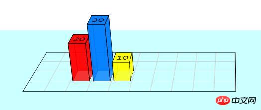
Here you can see the code used in practice for the demonstration below. There are three bars on the chart. Each bar is a div with four child divs making up the four sides. You can have as many bars as you want and place them anywhere on the chart.
<div id="stage">
	<div id="chart">

		<div class="bar" style="left: 80px; background: rgba(255,0,0,0.8); -webkit-transform: translateZ(80px); -moz-transform: translateZ(80px);">
			<div class="barfront" style="height: 80px;"></div>
			<div class="barback" style="height: 80px;"></div>
			<div class="barright" style="width: 80px;"></div>
			<div class="barleft" style="width: 80px;"></div>
			20
		</div>

		<div class="bar" style="left: 120px; background: rgba(0,127,255,0.8); -webkit-transform: translateZ(120px); -moz-transform: translateZ(120px);">
			<div class="barfront" style="height: 120px;"></div>
			<div class="barback" style="height: 120px;"></div>
			<div class="barright" style="width: 120px;"></div>
			<div class="barleft" style="width: 120px;"></div>
			30
		</div>

		<div class="bar" style="left: 160px; background: rgba(255,255,0,0.8); -webkit-transform: translateZ(40px); -moz-transform: translateZ(40px);">
			<div class="barfront" style="height: 40px;"></div>
			<div class="barback" style="height: 40px;"></div>
			<div class="barright" style="width: 40px;"></div>
			<div class="barleft" style="width: 40px;"></div>
			10
		</div>

	</div>
</div>
In the code above you can see highlighted the code that sets the x position of the bars in the chart as well as the height of each bar (which needs to be defined for each element that makes up the bar ). There we apply the colors (red, blue, yellow) slightly transparent.
4. Final Result
If you are using a WebKit browser (Safari, Chrome, iPhone, iPad), then you should see the 3D bar graph as well Some sliders that can be used to modify certain values. In Firefox, the bar chart has some artifacts and the slider renders as a normal input box, but it still works.

Instructions:
You can change the height of the bar by modifying the value of the .bar box, for example:
<div class="bar"   style="max-width:90%">
	<div class="barfront" style="height: 180px;"></div>
	<div class="barback" style="height: 180px;"></div>
	<div class="barright" style="width: 180px;"></div>
	<div class="barleft" style="width: 180px;"></div>
	30
</div>

Modify the values in the #stage box and #chart box to view the bar chart from different angles
#stage {
-webkit-perspective: 1200px;
-webkit-perspective-origin: 60% 0%;
-moz-perspective: 1200px;
-moz-perspective-origin: 60% 0%;
background: rgba(0, 255, 255, 0.2);
}
#chart {
	-webkit-transform-origin: 50% 50%;
	-webkit-transform: rotateX(22deg);
	-webkit-transform-style: preserve-3d;
	-moz-transform-origin: 50% 50%;
	-moz-transform: rotateX(22deg);
	-moz-transform-style: preserve-3d;
}
Summary: The above is the entire content of this article, I hope it will be helpful to everyone's study.
The above is the detailed content of How to create a 3D bar chart with css? Example of creating a 3D bar chart. For more information, please follow other related articles on the PHP Chinese website!

Hot AI Tools

Undresser.AI Undress
AI-powered app for creating realistic nude photos

AI Clothes Remover
Online AI tool for removing clothes from photos.

Undress AI Tool
Undress images for free

Clothoff.io
AI clothes remover

AI Hentai Generator
Generate AI Hentai for free.

Hot Article

Hot Tools

Notepad++7.3.1
Easy-to-use and free code editor

SublimeText3 Chinese version
Chinese version, very easy to use

Zend Studio 13.0.1
Powerful PHP integrated development environment

Dreamweaver CS6
Visual web development tools

SublimeText3 Mac version
God-level code editing software (SublimeText3)

Hot Topics
 How to achieve wave effect with pure CSS3? (code example)
Jun 28, 2022 pm 01:39 PM
How to achieve wave effect with pure CSS3? This article will introduce to you how to use SVG and CSS animation to create wave effects. I hope it will be helpful to you!
 Use CSS skillfully to realize various strange-shaped buttons (with code)
Jul 19, 2022 am 11:28 AM
This article will show you how to use CSS to easily realize various weird-shaped buttons that appear frequently. I hope it will be helpful to you!
 How to hide elements in css without taking up space
Jun 01, 2022 pm 07:15 PM
Two methods: 1. Using the display attribute, just add the "display:none;" style to the element. 2. Use the position and top attributes to set the absolute positioning of the element to hide the element. Just add the "position:absolute;top:-9999px;" style to the element.
 How to implement lace borders in css3
Sep 16, 2022 pm 07:11 PM
In CSS, you can use the border-image attribute to achieve a lace border. The border-image attribute can use images to create borders, that is, add a background image to the border. You only need to specify the background image as a lace style; the syntax "border-image: url (image path) offsets the image border width inward. Whether outset is repeated;".
 It turns out that text carousel and image carousel can also be realized using pure CSS!
Jun 10, 2022 pm 01:00 PM
How to create text carousel and image carousel? The first thing everyone thinks of is whether to use js. In fact, text carousel and image carousel can also be realized using pure CSS. Let’s take a look at the implementation method. I hope it will be helpful to everyone!
 How to enlarge the image by clicking the mouse in css3
Apr 25, 2022 pm 04:52 PM
Implementation method: 1. Use the ":active" selector to select the state of the mouse click on the picture; 2. Use the transform attribute and scale() function to achieve the picture magnification effect, the syntax "img:active {transform: scale(x-axis magnification, y Axis magnification);}".
 css3 what is adaptive layout
Jun 02, 2022 pm 12:05 PM
Adaptive layout, also known as "responsive layout", refers to a web page layout that can automatically recognize the screen width and make corresponding adjustments; such a web page can be compatible with multiple different terminals instead of making a specific version for each terminal. . Adaptive layout was born to solve the problem of mobile web browsing, and can provide a good user experience for users using different terminals.
 Does css3 animation effect have deformation?
Apr 28, 2022 pm 02:20 PM
The animation effect in css3 has deformation; you can use "animation: animation attribute @keyframes ..{..{transform: transformation attribute}}" to achieve deformation animation effect. The animation attribute is used to set the animation style, and the transform attribute is used to set the deformation style. .


