How to position html elements using css? (with examples)
When positioning content on the page, you can use a small number of attributes to help manipulate the position of elements. This article will show you some examples of using the CSS position property to include different positioned element types.
To use positioning on an element, you must first declare its position property, which specifies the type of positioning method used for the element. Using the position attribute value, position the element using the top, bottom, left and right attributes. Their position also depends on their position value. (Recommended course: css video tutorial)
There are five types of positioning values: static (static), relative (relative), fixed (fixed), absolute (absolute) , sticky (sticky)
static (static)
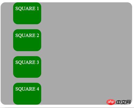
By default, HTML elements are positioned statically, and elements are positioned according to the normal flow of the document; static positioning The element is not affected by the top, bottom, left and right properties. An element positioned using position: static will not have any other special positioning methods.
The CSS used to set the position to static is:
position: static;
Next is an example of using a static position value:
<!DOCTYPE html>
<html>
<head>
<style>
body {
  color: WHITE;
  font:  Helvetica;
  width: 420px;
}
.square-set,
.square {
  border-radius: 15px;
}
.square-set {
  background: darkgrey;
}
.square {
  position: static;
  background: Green;
  height: 70px;
  line-height: 40px;
  text-align: center;
  width: 90px;
}
</style>
</head>
<body>
<div class="square-set">
  <figure class="square square-1">SQUARE 1</figure>
  <figure class="square square-2">SQUARE 2</figure>
  <figure class="square square-3">SQUARE 3</figure>
  <figure class="square square-4">SQUARE 4</figure>
</div>
</body>
</html>The effect is as follows:
relative
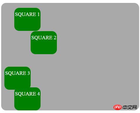
The element is positioned relative to its normal position according to the normal flow of the document, and then offset relative On itself based on the top, right, bottom and left values. The offset does not affect the position of any other element; therefore, the space given to the element in the page layout is the same as if the position were static. Setting the top, right, bottom and left properties of a relatively positioned element will cause it to adjust further away from its normal position. Other content will not be adjusted to fit any white space left by the element.
The CSS used to set the position to relative is:
position: relative;
The following example uses a relative position value:
<!DOCTYPE html>
<html>
<head>
<style>
body {
  color: white;
  font:   Helvetica ;
  width: 420px;
}
.square-set,
.square {
  border-radius: 15px;
}
.square-set {
  background: darkgrey;
}
.square {
  background: green;
  height: 70px;
  line-height: 40px;
  position: relative;
  text-align: center;
  width: 80px;
}
.square-1 {
    top: 15px;
  }
.square-2 {
  left: 50px;
}
.square-3 {
  bottom: -23px;
  right: 30px;
}
</style>
</head>
<body>
<div class="square-set">
  <figure class="square square-1">SQUARE 1</figure>
  <figure class="square square-2">SQUARE 2</figure>
  <figure class="square square-3">SQUARE 3</figure>
  <figure class="square square-4">SQUARE 4</figure>
</div>
</body>
</html>The effect is as follows:
absolute
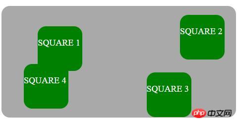
The element will be removed from the normal document flow, and no space will be created for the element in the page layout. The element is positioned relative to its most recently positioned ancestor, if any; otherwise, it is placed relative to the initial containing block, with its final position determined by the values of top, right, bottom, and left.
The CSS for setting position to absolute is:
position: absolute;
Have position: absolute; An element positioned relative to its closest ancestor. If an absolutely positioned element has no positioned ancestor, it will use the document body and move with the page scroll. A "positioned" element is an element with its static position
The following example emphasizes the absolute position of the element:
<!DOCTYPE html>
<html>
<head>
<style>
.square-set {
 color: WHITE;
 background: darkgrey;
 height: 200px;
 position: relative;
 border-radius: 15px;
 font:  Helvetica ;
 width: 420px;
}
.square {
 background: green;
 height: 80px;
 position: absolute;
 width: 80px;
 border-radius: 15px;
 line-height: 60px;
}
.square-1 {
 top: 10%;
 left: 6%;
}
.square-2 {
 top: 5;
 right: -20px;
}
.square-3 {
 bottom: -15px;
 right: 40px;
}
.square-4 {
 bottom: 0;
}
</style>
</head>
<body>
<div class="square-set">
 <figure class="square square-1">SQUARE 1</figure>
 <figure class="square square-2">SQUARE 2</figure>
 <figure class="square square-3">SQUARE 3</figure>
 <figure class="square square-4">SQUARE 4</figure>
</div>
</body>
</html>The effect is as follows:
fixed
It removes the element from the normal document flow and creates no space for the element in the page layout. The element is positioned relative to the initial containing block established by the viewport, with its final position determined by the values top, right, bottom, and left. This value always creates a new stacking context.
The CSS used to set the position to fixed looks like this:
position: fixed;
Element position: fixed; is positioned relative to the viewport, which means it always stays in the same position even if the page scrolls Location. The top, right, bottom and left attributes are used to position elements.
sticky
The element is positioned corresponding to the normal flow of the document and then relative to its value based on the top, right, bottom and left values. Offset of the closest ascending block level (including table-related elements). The offset does not affect the position of any other elements.
This value always creates a new stacking context. Note that a sticky element "sticks" to its nearest ancestor, which has a "scrolling mechanism" even if that ancestor is not the nearest actual scrolling ancestor.
The CSS for setting position to sticky is:
position: sticky;
position: sticky; Positions the element based on the user's scroll position and switches between position relative and fixed position based on the scroll position.
Overlapping elements
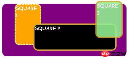
网页上的重叠元素非常有用,可以突出显示,推广和关注我们网页上的重要内容。在您的网站上制作元素叠加是非常有用且非常有价值的功能设计实践。当元素被定位时,它们可以与其他元素重叠,因此为了指定顺序(应该在其他元素的前面或后面放置哪个元素),我们应该使用z-index属性。堆栈顺序较大的元素始终位于堆栈顺序较低的元素前面。作为通知,z-index属性仅适用于定位元素(position:absolute,position:relative或position:fixed)。
以下示例显示了z-index属性如何在不同的方块上工作:
<!DOCTYPE html>
<html>
<head>
<style>
.square-set {
  color: white;
  background: purple;
  height: 170px;
  position: relative;
  border-radius: 15px;
  font:  Helvetica;
  width: 400px;
}
.square {
  background: orange;
  border: 4px solid goldenrod;
  position: absolute;
  border-radius: 15px;
  height: 80px;
  width: 80px;
}
.square-1 {
  position: relative;
  z-index: 1;
  border: dashed;
  height: 8em;
  margin-bottom: 1em;
  margin-top: 2em;
}
.square-2 {
  position: absolute;
  z-index: 2;
  background: black;
  width: 65%;
  left: 60px;
  top: 3em;
}
.square-3 {
  position: absolute;
  z-index: 3;
  background: lightgreen;
  width: 20%;
  left: 65%;
  top: -25px;
  height: 7em;
  opacity: 0.9;
}
</style>
</head>
<body>
<div class="square-set">
  <figure class="square square-1">SQUARE 1</figure>
  <figure class="square square-2">SQUARE 2</figure>
  <figure class="square square-3">SQUARE 3</figure>
</div>
</body>
</html>效果如下:
在图像上定位文本
下面的示例使用上述CSS定位值在图像上覆盖一些文本:
<!DOCTYPE html>
<html>
<head>
<style>
.module{
  background:
    linear-gradient{
      rgba(0, 4, 5, 0.6),
      rgba(2, 0, 3, 0.6)
    ),
    url(http://www.holtz.org/Library/Images/Slideshows/Gallery/Landscapes/43098-DSC_64xx_landscape-keltern-1_wall.jpg);
  background-size: cover;
  width: 600px;
  height: 400px;
  margin: 10px 0 0 10px;
  position: relative;
  float: left;
}
.mid h3 {
  font-family: Helvetica;
  font-weight: 900;
  color: white;
  text-transform: uppercase;
  margin: 0;
  position: absolute;
  top: 30%;
  left: 50%;
  font-size: 3rem;
  transform: translate(-50%, -50%);
}
</style>
</head>
<body>
<div class="module mid">
  <h3 id="Wild-nbsp-nature">Wild nature</h3>
</div>
</body>
</html>效果如下:

最后
在本文中,我们已经描述并给出了CSS定位类型的示例,并描述了如何重叠元素并在图像上添加一些文本。
The above is the detailed content of How to position html elements using css? (with examples). For more information, please follow other related articles on the PHP Chinese website!

Hot AI Tools

Undresser.AI Undress
AI-powered app for creating realistic nude photos

AI Clothes Remover
Online AI tool for removing clothes from photos.

Undress AI Tool
Undress images for free

Clothoff.io
AI clothes remover

AI Hentai Generator
Generate AI Hentai for free.

Hot Article

Hot Tools

Notepad++7.3.1
Easy-to-use and free code editor

SublimeText3 Chinese version
Chinese version, very easy to use

Zend Studio 13.0.1
Powerful PHP integrated development environment

Dreamweaver CS6
Visual web development tools

SublimeText3 Mac version
God-level code editing software (SublimeText3)

Hot Topics
 1385
1385
 52
52
 Working With GraphQL Caching
Mar 19, 2025 am 09:36 AM
If you’ve recently started working with GraphQL, or reviewed its pros and cons, you’ve no doubt heard things like “GraphQL doesn’t support caching” or
 Building an Ethereum app using Redwood.js and Fauna
Mar 28, 2025 am 09:18 AM
With the recent climb of Bitcoin’s price over 20k $USD, and to it recently breaking 30k, I thought it’s worth taking a deep dive back into creating Ethereum
 Vue 3
Apr 02, 2025 pm 06:32 PM
It's out! Congrats to the Vue team for getting it done, I know it was a massive effort and a long time coming. All new docs, as well.
 Can you get valid CSS property values from the browser?
Apr 02, 2025 pm 06:17 PM
I had someone write in with this very legit question. Lea just blogged about how you can get valid CSS properties themselves from the browser. That's like this.
 A bit on ci/cd
Apr 02, 2025 pm 06:21 PM
I'd say "website" fits better than "mobile app" but I like this framing from Max Lynch:
 Comparing Browsers for Responsive Design
Apr 02, 2025 pm 06:25 PM
There are a number of these desktop apps where the goal is showing your site at different dimensions all at the same time. So you can, for example, be writing
 Using Markdown and Localization in the WordPress Block Editor
Apr 02, 2025 am 04:27 AM
If we need to show documentation to the user directly in the WordPress editor, what is the best way to do it?
 Stacked Cards with Sticky Positioning and a Dash of Sass
Apr 03, 2025 am 10:30 AM
The other day, I spotted this particularly lovely bit from Corey Ginnivan’s website where a collection of cards stack on top of one another as you scroll.


