Detailed explanation of css3 linear gradient syntax (code example)
This article brings you a detailed explanation of CSS3 linear gradient syntax (code example). It has certain reference value. Friends in need can refer to it. I hope it will be helpful to you.
Full syntax for linear gradient:
.demo  {
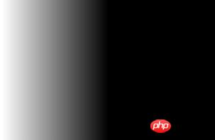
    background: linear-gradient(to left, black, white);
}Effect:

Compatibility writing method:
To make the linear gradient applicable to all supported browsers, you can do this:
.demo {
	/* IE6 & IE7 */
	filter: progid:DXImageTransform.Microsoft.gradient(startColorstr='#000000', endColorstr='#ffffff');

	/* IE8+ */
	-ms-filter: "progid:DXImageTransform.Microsoft.gradient(startColorstr='#000000', endColorstr='#ffffff')";

	/* Safari 4 +,Chrome 2+  */
	background: -webkit-gradient(linear, left, right, color-stop(0%, #000000), color-stop(100%, #ffffff));

	/* Safari 5.1 - 6.0 */
	background: -webkit-linear-gradient(right, black, white);

	/* Firefox 3.6 - 15 */
	background: -moz-linear-gradient(right, black, white);

	/* Opera 11.1 - 12.0 */
	background: -o-linear-gradient(right, black, white);

	/* 标准的语法 */
	background: linear-gradient(to left, black, white);

}The effect is as shown above.
Gradient angle or starting point
A linear gradient is a gradient created by specifying a straight gradient line and then placing several colors along the line. We can provide a direction for the gradient through settings.
We can set the direction of the gradient line in two ways:
1. Declare the angle used by the gradient.
2. Use keywords to tell the browser Where does the gradient start.
In the above example, we tell it start from the right and go to the left, which is equivalent to the angle "-90deg". So this will produce the same result:
background: linear-gradient(-90deg, black, white);
Rendering:

The same result will also be displayed if the "270deg" angle is used, which is equivalent to " -90deg".
So we can use one of the position keywords (top, right, left, bottom) or just give it a specific angle numerically and it will figure out where to start.
End color and position
End position
With a simple linear gradient, you just Two termination colors are required without specifying a position (as in the example above). But in the following example:
background: linear-gradient(-90deg, black 50%, white 100%);
we will notice that this has included the position of each color in the percentage value.
Rendering:

This tells the browser where the gradient of each color should start and end (specify the length of the color). The browser will naturally figure out the actual gradient; you just tell it where the "gradual change" should "stop" entirely. In the example above, the "gradient" would stop on the left side of the element, so you won't see much (if any) full white in that element.
End Color
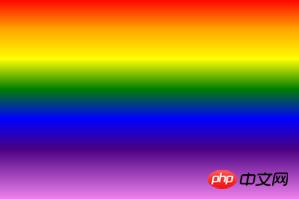
Adding color blocks is not very complicated anymore, just add any number of comma separated values. Here is the CSS for the rainbow:
.demo  {
   background:linear-gradient(to bottom,red 0%,orange 15%,yellow 30%,green 45%,blue 60%,indigo 75%,violet 100%)  ;
}Rendering:

## Some notes on linear gradients:
1. CSS3 gradient is not an attribute, and the second is an image rendered by the browser; 2. You can use gradients at any position through url (image.jpg) in CSS;3. The syntax for creating gradients is actually a function that takes various values as parameters; 4. You can also specify repeated linear gradients, which can be useful in some cases. Very useful; 5. The value of the color end position can be expressed in percentage or pixels; 6. For the color scale, a negative percentage value (for example -20%) and percentages above 100% are perfectly valid.Summary: The above is the entire content of this article, I hope it will be helpful to everyone's study.
The above is the detailed content of Detailed explanation of css3 linear gradient syntax (code example). For more information, please follow other related articles on the PHP Chinese website!

Hot AI Tools

Undresser.AI Undress
AI-powered app for creating realistic nude photos

AI Clothes Remover
Online AI tool for removing clothes from photos.

Undress AI Tool
Undress images for free

Clothoff.io
AI clothes remover

AI Hentai Generator
Generate AI Hentai for free.

Hot Article

Hot Tools

Notepad++7.3.1
Easy-to-use and free code editor

SublimeText3 Chinese version
Chinese version, very easy to use

Zend Studio 13.0.1
Powerful PHP integrated development environment

Dreamweaver CS6
Visual web development tools

SublimeText3 Mac version
God-level code editing software (SublimeText3)

Hot Topics
 1371
1371
 52
52
 How to achieve wave effect with pure CSS3? (code example)
Jun 28, 2022 pm 01:39 PM
How to achieve wave effect with pure CSS3? This article will introduce to you how to use SVG and CSS animation to create wave effects. I hope it will be helpful to you!
 Let's talk about how to cleverly use CSS to add color gradients to ordinary black QR codes!
Jul 14, 2022 am 10:34 AM
How to skillfully use CSS to build gradient color QR codes? The following article will introduce to you how to use CSS to add color gradients to ordinary black QR codes. I hope it will be helpful to you!
 Use CSS skillfully to realize various strange-shaped buttons (with code)
Jul 19, 2022 am 11:28 AM
This article will show you how to use CSS to easily realize various weird-shaped buttons that appear frequently. I hope it will be helpful to you!
 How to hide elements in css without taking up space
Jun 01, 2022 pm 07:15 PM
Two methods: 1. Using the display attribute, just add the "display:none;" style to the element. 2. Use the position and top attributes to set the absolute positioning of the element to hide the element. Just add the "position:absolute;top:-9999px;" style to the element.
 How to implement lace borders in css3
Sep 16, 2022 pm 07:11 PM
In CSS, you can use the border-image attribute to achieve a lace border. The border-image attribute can use images to create borders, that is, add a background image to the border. You only need to specify the background image as a lace style; the syntax "border-image: url (image path) offsets the image border width inward. Whether outset is repeated;".
 It turns out that text carousel and image carousel can also be realized using pure CSS!
Jun 10, 2022 pm 01:00 PM
How to create text carousel and image carousel? The first thing everyone thinks of is whether to use js. In fact, text carousel and image carousel can also be realized using pure CSS. Let’s take a look at the implementation method. I hope it will be helpful to everyone!
 How to enlarge the image by clicking the mouse in css3
Apr 25, 2022 pm 04:52 PM
Implementation method: 1. Use the ":active" selector to select the state of the mouse click on the picture; 2. Use the transform attribute and scale() function to achieve the picture magnification effect, the syntax "img:active {transform: scale(x-axis magnification, y Axis magnification);}".
 Does css3 animation effect have deformation?
Apr 28, 2022 pm 02:20 PM
The animation effect in css3 has deformation; you can use "animation: animation attribute @keyframes ..{..{transform: transformation attribute}}" to achieve deformation animation effect. The animation attribute is used to set the animation style, and the transform attribute is used to set the deformation style. .


