This article brings you a detailed explanation of how css3 radial gradient defines the center and size shape (code example). It has certain reference value. Friends in need can refer to it. I hope it will be helpful to you.
To make radial gradients --radial-gradient() work correctly in all supported browsers and to have some new features to cover any future support. We can write like this:
.demo {
	/* 不支持浏览器的后备 */
	background: #000000;

	/* 旧的WebKit语法 */
	background-image: -webkit-gradient(radial, center center, 0, center center, 141, from(black), to(white), color-stop(25%, blue), color-stop(40%, green), color-stop(60%, red), color-stop(80%, purple));

	/* 新的WebKit语法 */
	background-image: -webkit-radial-gradient(center center, circle contain, black 0%, blue 25%, green 40%, red 60%, purple 80%, white 100%);

	background-image: -moz-radial-gradient(center center, circle contain, black 0%, blue 25%, green 40%, red 60%, purple 80%, white 100%);

	/* IE10 + */
	background-image: -ms-radial-gradient(center center, circle contain, black 0%, blue 25%, green 40%, red 60%, purple 80%, white 100%);

	/* Opera (13?) */
	background-image: -o-radial-gradient(center center, circle contain, black 0%, blue 25%, green 40%, red 60%, purple 80%, white 100%);

    /* 标准写法*/
    background-image: radial-gradient(center center, circle contain, black 0%, blue 25%, green 40%, red 60%, purple 80%, white 100%);
}Let’s use standard writing to analyze the syntax of radial gradient step by step:
.demo {
    background-image: radial-gradient(center center, circle cover, black, blue, green, red, purple, white);
}Define the gradient center
The first argument passed to the radial-gradient() function (yes, radial-gradient() is a function - that's why it has parentheses) defines the ellipse that is created when the gradient completes central location. We used the "center center" pair of values in the example above.
The word "radial" means "from the center outward along a radius...". So the first parameter defines where the outward action starts.
Basically, this parameter can accept any value you put in the background-position property. The default or initial value of the gradient center position is center center.
Defining shape and size
The second parameter in the function defines the shape and size of the gradient.
The first part of the second parameter can be a circle or ellipse (ie: circle or ellipse). The difference is basically that the ellipse is not a perfect circle; therefore, depending on the size and center of the gradient, the ellipse value can make the gradient elliptical; but the circle value means that the gradient is always a perfect circle.
The second part of the second parameter (defining the size) can take one of six values (keywords). They can be:
1, closest-side (nearest end)
2, closest-corner (nearest corner)
3, farthest-side ( The farthest end)
4, farthest-corner (the farthest corner)
5, contain (include)
6, cover (cover)
At first glance, these values may be a bit difficult to grasp, so let's break them down one by one with examples to understand them. Let's use a basic black to white gradient so we can illustrate what each value does. Here is the code:
.demo {
  background-image: radial-gradient(50px 50px, circle closest-side, black, white);
}All other values will remain the same, but we will change the size value (currently shown closest-side) so you can see the effect each value has on the appearance of the gradient.
Please note that I have set the center position to 50px 50px to help make the shape and size values clearer.
closest-side
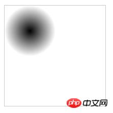
This value causes the edge of the gradient to intersect the side of the element closest to the center of the gradient. This is what it looks like:

##closest-corner
This value makes the edge of the gradient the closest The corners of the elements at the center of the gradient meet. Here it is:
farthest-side

farthest-corner
This value causes the gradient to stretch to the corner of the element furthest from the center of the gradient:
contain
This value causes the element to enlarge the gradient until it is fully contained without any of the gradient being cut off by the element's borders:

cover
This value will cause the gradient to amplify until it covers the entire area of the component:)
Note: Using keywords to define the size cannot accurately define the size of a progressive circle.
Summary: The above is all the content introduced in this article, I hope it will be helpful to everyone's study.
The above is the detailed content of Detailed explanation of how css3 radial gradient defines center and size shapes (code example). For more information, please follow other related articles on the PHP Chinese website!