 Web Front-end
 CSS Tutorial
 Detailed explanation of css3 radial gradient: accurately define the shape and size of the gradient and add multiple termination colors
Detailed explanation of css3 radial gradient: accurately define the shape and size of the gradient and add multiple termination colors
This article brings you a detailed explanation of css3 radial gradient, accurately defining the shape and size of the gradient, and adding multiple termination colors. It has certain reference value. Friends in need can refer to it. I hope it will be helpful to you.
Clearly defined shape and size
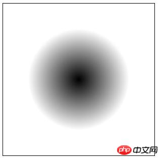
In the previous article [Detailed explanation of how css3 radial gradient defines the center and In "Size and Shape" we introduce the method of defining the gradient center and using keywords to define the gradient shape and size. You can refer to it. However, sometimes we need to define the size and shape of a radial gradient more precisely, which requires using length values or percentage values. As shown below:
1 2 3 4 5 6 7 |
|
Rendering:

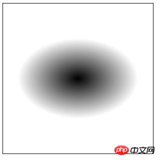
This defines a perfect circle with a diameter of 100px. We can also define an ellipse:
1 2 3 4 5 6 7 |
|
Rendering:

Description:
1. Unable to combine explicit size values with any size and shape keywords in together; you can only use one method.
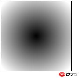
2. Explicit values define the length on the horizontal and vertical axes of the radial shape. So if we double the value from the first example (using 200px 200px), the new gradient will look like this:

End Color And the placement of colors
The last few parameters in the radial-gradient() function are to define which colors the gradient starts and ends with, as well as any intermediate transition colors.
Of course, the color value can be any valid value in CSS colors, and we can also choose the added position for each color.
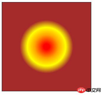
Here is an example of using percentages to place four colors at specific intervals:
1 2 3 4 5 6 7 |
|
Rendering:

Here are the colors in question Notes on values:
1. You can choose to omit the position of any color, which will cause the browser to calculate the position by itself;
2. You can use negative values, which will cause the color to be Invisible at first, but you will still see the result (a gradual change from one color to the next), depending on the value;
3. The position where the colors stop defines where each corresponding color is The position of the full state; everything in between is where gradual changes (i.e. gradients) occur;
4. Since we are dealing with radial gradients, the color termination will naturally define the boundaries and colors of the nested ellipses .
The above is the detailed content of Detailed explanation of css3 radial gradient: accurately define the shape and size of the gradient and add multiple termination colors. For more information, please follow other related articles on the PHP Chinese website!

Hot AI Tools

Undresser.AI Undress
AI-powered app for creating realistic nude photos

AI Clothes Remover
Online AI tool for removing clothes from photos.

Undress AI Tool
Undress images for free

Clothoff.io
AI clothes remover

AI Hentai Generator
Generate AI Hentai for free.

Hot Article

Hot Tools

Notepad++7.3.1
Easy-to-use and free code editor

SublimeText3 Chinese version
Chinese version, very easy to use

Zend Studio 13.0.1
Powerful PHP integrated development environment

Dreamweaver CS6
Visual web development tools

SublimeText3 Mac version
God-level code editing software (SublimeText3)

Hot Topics
 1359
1359
 52
52
 How to achieve wave effect with pure CSS3? (code example)
Jun 28, 2022 pm 01:39 PM
How to achieve wave effect with pure CSS3? This article will introduce to you how to use SVG and CSS animation to create wave effects. I hope it will be helpful to you!
 Use CSS skillfully to realize various strange-shaped buttons (with code)
Jul 19, 2022 am 11:28 AM
This article will show you how to use CSS to easily realize various weird-shaped buttons that appear frequently. I hope it will be helpful to you!
 How to hide elements in css without taking up space
Jun 01, 2022 pm 07:15 PM
Two methods: 1. Using the display attribute, just add the "display:none;" style to the element. 2. Use the position and top attributes to set the absolute positioning of the element to hide the element. Just add the "position:absolute;top:-9999px;" style to the element.
 How to implement lace borders in css3
Sep 16, 2022 pm 07:11 PM
In CSS, you can use the border-image attribute to achieve a lace border. The border-image attribute can use images to create borders, that is, add a background image to the border. You only need to specify the background image as a lace style; the syntax "border-image: url (image path) offsets the image border width inward. Whether outset is repeated;".
 It turns out that text carousel and image carousel can also be realized using pure CSS!
Jun 10, 2022 pm 01:00 PM
How to create text carousel and image carousel? The first thing everyone thinks of is whether to use js. In fact, text carousel and image carousel can also be realized using pure CSS. Let’s take a look at the implementation method. I hope it will be helpful to everyone!
 How to enlarge the image by clicking the mouse in css3
Apr 25, 2022 pm 04:52 PM
Implementation method: 1. Use the ":active" selector to select the state of the mouse click on the picture; 2. Use the transform attribute and scale() function to achieve the picture magnification effect, the syntax "img:active {transform: scale(x-axis magnification, y Axis magnification);}".
 css3 what is adaptive layout
Jun 02, 2022 pm 12:05 PM
Adaptive layout, also known as "responsive layout", refers to a web page layout that can automatically recognize the screen width and make corresponding adjustments; such a web page can be compatible with multiple different terminals instead of making a specific version for each terminal. . Adaptive layout was born to solve the problem of mobile web browsing, and can provide a good user experience for users using different terminals.
 Does css3 animation effect have deformation?
Apr 28, 2022 pm 02:20 PM
The animation effect in css3 has deformation; you can use "animation: animation attribute @keyframes ..{..{transform: transformation attribute}}" to achieve deformation animation effect. The animation attribute is used to set the animation style, and the transform attribute is used to set the deformation style. .


