What is the repeating gradient in css3? how to use? (code example)
The content of this article is to introduce to you what is the repeated gradient of CSS3? how to use? (code example). It has certain reference value. Friends in need can refer to it. I hope it will be helpful to you.
First of all, let’s introduceWhat is a repeating gradient?
In addition to linear gradient [linear-gradient()] and radial gradient [radial-gradient()], in CSS3, repeated gradients can also be implemented. Repeating gradients in css3 can be divided into two types:
Repeating linear gradient: repeating-linear-gradient()
Repeating radial gradient: repeating-radial-gradient()
Next, let’s take a look at how two repeating gradients are used through a simple code example.
Repeat gradient. When rendering, the end color will repeat infinitely in both directions, and their positions will be the difference between the position of the last specified end color and the position of the first specified end color. multiple shift. For example, repeating-linear-gradient(red 10px, blue 50px) is equivalent to linear-gradient(..., red -30px, blue 10px, red 10px, blue 50px, red 50px, blue 90px, ...). Note that the last stop color and the first stop color always coincide at the boundary of each group, which will produce sharp transitions if the gradient does not start and end with the same color.
In fact, the syntax of repeating gradients is the same as that of non-repeating gradients. Example:
1 |
|
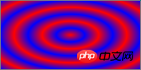
Rendering:
 ##
##
1 |
|

1 |
|
find the average color of the gradient through the following steps:
1. Define the list as an initial empty list of RGBA colors, and define the total length as the first The distance between the first and last color. 2. For each pair of adjacent color patches, define the weight as half the distance between the two color patches divided by the total length. Add two lists of entries, the first is obtained by the color representing the first color stop in RGBA and scales all components by weight, the second is obtained by the second color stop in the same way. 3. Sum the entries of the list in order to generate the average color and return it. Summary: The above is all the content introduced in this article, I hope it will be helpful to everyone's study.The above is the detailed content of What is the repeating gradient in css3? how to use? (code example). For more information, please follow other related articles on the PHP Chinese website!

Hot AI Tools

Undresser.AI Undress
AI-powered app for creating realistic nude photos

AI Clothes Remover
Online AI tool for removing clothes from photos.

Undress AI Tool
Undress images for free

Clothoff.io
AI clothes remover

Video Face Swap
Swap faces in any video effortlessly with our completely free AI face swap tool!

Hot Article

Hot Tools

Notepad++7.3.1
Easy-to-use and free code editor

SublimeText3 Chinese version
Chinese version, very easy to use

Zend Studio 13.0.1
Powerful PHP integrated development environment

Dreamweaver CS6
Visual web development tools

SublimeText3 Mac version
God-level code editing software (SublimeText3)

Hot Topics
 How to achieve wave effect with pure CSS3? (code example)
Jun 28, 2022 pm 01:39 PM
How to achieve wave effect with pure CSS3? This article will introduce to you how to use SVG and CSS animation to create wave effects. I hope it will be helpful to you!
 Use CSS skillfully to realize various strange-shaped buttons (with code)
Jul 19, 2022 am 11:28 AM
This article will show you how to use CSS to easily realize various weird-shaped buttons that appear frequently. I hope it will be helpful to you!
 How to hide elements in css without taking up space
Jun 01, 2022 pm 07:15 PM
Two methods: 1. Using the display attribute, just add the "display:none;" style to the element. 2. Use the position and top attributes to set the absolute positioning of the element to hide the element. Just add the "position:absolute;top:-9999px;" style to the element.
 How to implement lace borders in css3
Sep 16, 2022 pm 07:11 PM
In CSS, you can use the border-image attribute to achieve a lace border. The border-image attribute can use images to create borders, that is, add a background image to the border. You only need to specify the background image as a lace style; the syntax "border-image: url (image path) offsets the image border width inward. Whether outset is repeated;".
 How to enlarge the image by clicking the mouse in css3
Apr 25, 2022 pm 04:52 PM
Implementation method: 1. Use the ":active" selector to select the state of the mouse click on the picture; 2. Use the transform attribute and scale() function to achieve the picture magnification effect, the syntax "img:active {transform: scale(x-axis magnification, y Axis magnification);}".
 It turns out that text carousel and image carousel can also be realized using pure CSS!
Jun 10, 2022 pm 01:00 PM
How to create text carousel and image carousel? The first thing everyone thinks of is whether to use js. In fact, text carousel and image carousel can also be realized using pure CSS. Let’s take a look at the implementation method. I hope it will be helpful to everyone!
 How to set animation rotation speed in css3
Apr 28, 2022 pm 04:32 PM
In CSS3, you can use the "animation-timing-function" attribute to set the animation rotation speed. This attribute is used to specify how the animation will complete a cycle and set the speed curve of the animation. The syntax is "element {animation-timing-function: speed attribute value;}".
 Does css3 animation effect have deformation?
Apr 28, 2022 pm 02:20 PM
The animation effect in css3 has deformation; you can use "animation: animation attribute @keyframes ..{..{transform: transformation attribute}}" to achieve deformation animation effect. The animation attribute is used to set the animation style, and the transform attribute is used to set the deformation style. .


)


