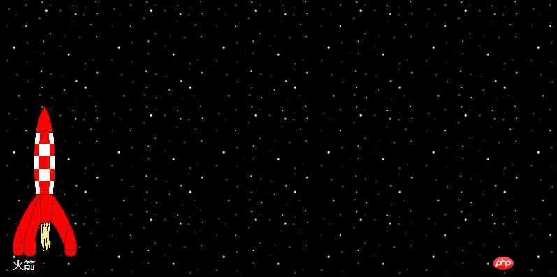
The content of this article is to use CSS3 to create a simple rocket animation (with code). It has certain reference value. Friends in need can refer to it. I hope it will be helpful to you.
In the previous article [css3 animation simple use of transform attribute and transition attribute], the simple use of transform attribute and transition attribute was introduced. Below we introduce how to use the transform attribute and transition attribute to combine different effects to achieve a simple animation effect of mouse hovering and rocket flying. Let’s take a look at the code!
html code:
<div id="outerspace">
	<div class="rocket">
		<div>
			<!-- rocket -->
		</div>
				火箭
	</div>
</div>
css code 1:
/* 初始状态 */

#outerspace {
	width: 800px;
	height: 500px;
	margin: 100px auto;
	position: relative;
	height: 400px;
	background: #0c0440 url(img/outerspace.jpg);
	color: #fff;
}

div.rocket {
	position: absolute;
	bottom: 10px;
	left: 20px;

}

div.rocket div {
	width: 92px;
	height: 215px;
	background: url(img/rocket.gif) no-repeat;

}
After adding the mouseover effect, css2 code:
/* 悬停效果 */

#outerspace:hover div.rocket {
	-webkit-transform: translate(540px, -200px);
	-moz-transform: translate(540px, -200px);
	-o-transform: translate(540px, -200px);
	-ms-transform: translate(540px, -200px);
	transform: translate(540px, -200px);
}

#outerspace:hover div.rocket div {
	-webkit-transform: rotate(70deg);
	-moz-transform: rotate(70deg);
	-o-transform: rotate(70deg);
	-ms-transform: rotate(70deg);
	transform: rotate(70deg);
}
When the mouse is hovering, although the transformation is implemented, the effect is a bit abrupt and a little transition effect needs to be added.
Add transition to the original css1 code, css3 code:
div.rocket {
	position: absolute;
	bottom: 10px;
	left: 20px;
	-webkit-transition: 3s ease-in;
	-moz-transition: 3s ease-in;
	-o-transition: 3s ease-in;
	transition: 3s ease-in;
}

div.rocket div {
	width: 92px;
	height: 215px;
	background: url(img/rocket.gif) no-repeat;
	-webkit-transition: 2s ease-in-out;
	-moz-transition: 2s ease-in-out;
	-o-transition: 2s ease-in-out;
	transition: 2s ease-in-out;
}
You’re done!
Summary: The above is the entire content of this article, I hope it will be helpful to everyone's study.
The above is the detailed content of Create a simple rocket animation with css3 (with code). For more information, please follow other related articles on the PHP Chinese website!