In this article, we will discuss the two new extended attributes Background-Origin and Background-Clip added to the background attribute in CSS3. Friends in need can take a look and hope to help you.
Background-Origin
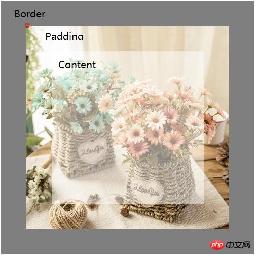
Before the Background-Origin property appeared, when we added a background image to an element, the image position was filled from the element starting from the upper left corner.
Print the screen at the default background origin position. If background-position is set to left (left) 0, top (top) 0, you can see the background image in the filled area (red dot). (Recommended tutorial: CSS3 Video Tutorial)

The code is as follows:
<!DOCTYPE html>
<html>
<head>
<meta charset="utf-8">
	<title></title>
	<style type="text/css">
.box{ background:url("image/flowers.jpg") no-repeat;
  width:500px;
  height:500px;
  border:solid 50px rgba(0,0,0,0.5);
  padding:50px;
  float:left;
  margin-right:15px;
  box-sizing:border-box;
}

.box span{color:#000; display:block; font-size:30px; font-weight:bold; height:100%; text-transform:uppercase; background-color:rgba(256,256,256,0.5)}
</style>
</head>
<body>
<div class="box">
  <span> </span>
</div>
</body>
</html>Background-Origin allows you to decide what you want The starting point of the background position, border, padding and content.
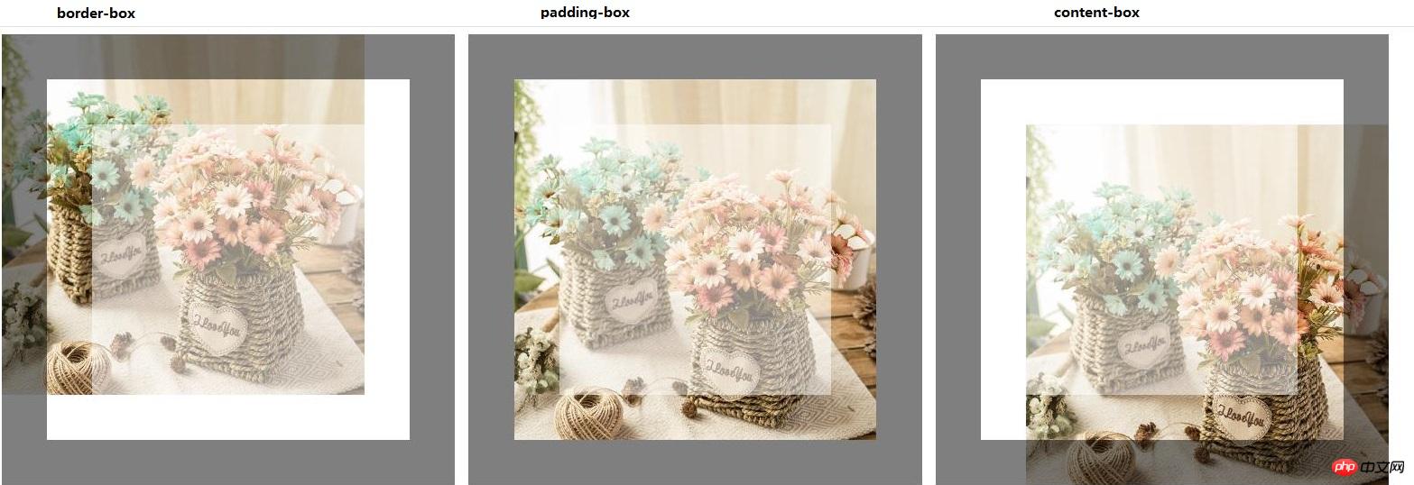
The new attribute background-origin has 3 values according to the box-model:
1. border-box - Position the background position 0, 0 points to the upper left corner of the border.
2. padding-box (default) - Position the background position at 0,0 point in the upper left corner of the padding.
3. content-box - Position the background position 0,0 to point to the upper left corner of the content.

The code is as follows:
<!DOCTYPE html>
<html>
<head>
<meta charset="utf-8">
	<title></title>
	<style type="text/css">
.box{
 background:url("image/flowers.jpg") no-repeat;
  width:500px;
  height:500px;
  border:solid 50px rgba(0,0,0,0.5);
  padding:50px;
  float:left;
  margin-right:15px;
  box-sizing:border-box;
}
.box span{
 color:#000;
 display:block; font-size:30px;
 font-weight:bold; height:100%;
 text-transform:uppercase;
 background-color:rgba(256,256,256,0.5)
}
.box1{background-origin:border-box;}
.box2{background-origin:padding-box;}
.box3{background-origin:content-box;}
</style>
</head>
<body>
<div class="box box1">
  <span> </span>
</div>
<div class="box box2">
  <span> </span>
</div>
<div class="box box3">
  <span> </span>
</div>
</body>
</html>In the above example and picture, you can see the impact of the Background-Origin value.
background-clip
As you can see in the previous example, background-origin is fine but still missing something. The image is positioned according to the Background-Origin, but to the right/bottom of the border/padding.
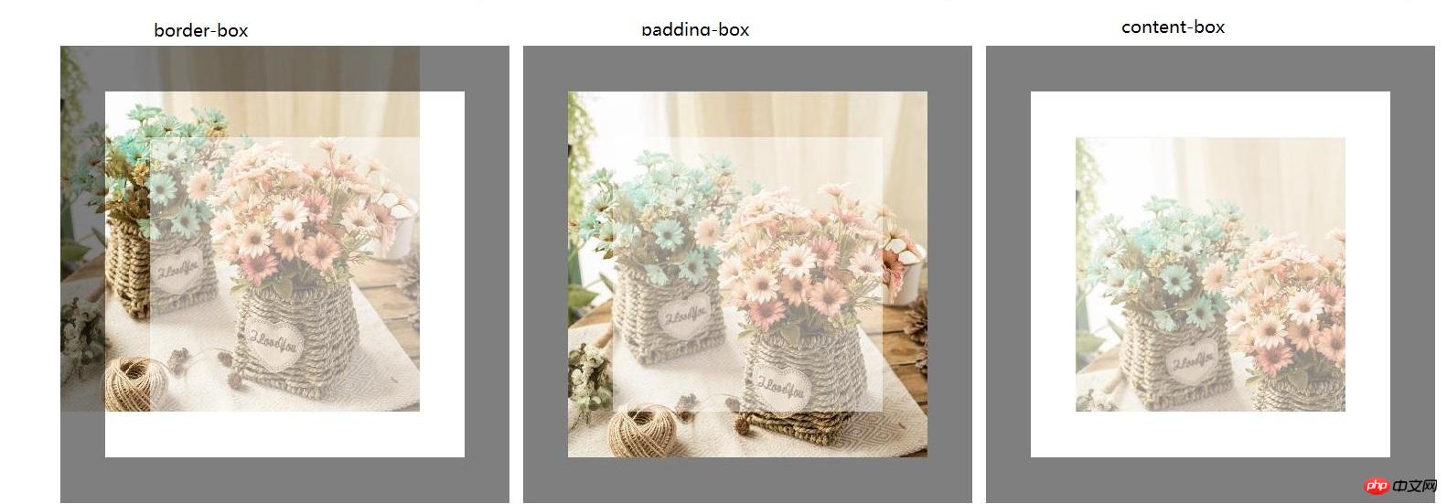
background-clip can solve this problem! Using background-clip, we can decide where to clip the background image, which is the same value as the background origin mentioned earlier.
The new property of background-clip also has 3 values:
1, border-box (default) - displays the complete image and will not cut any content.
2. padding-box - cut the border background image.
3. content-box- Cut the border and fill the background image.

The code is as follows:
<!DOCTYPE html>
<html>
<head>
<meta charset="utf-8">
	<title></title>
	<style type="text/css">
.box{
 background:url("image/flowers.jpg") no-repeat;
  width:500px;
  height:500px;
  border:solid 50px rgba(0,0,0,0.5);
  padding:50px;
  float:left;
  margin-right:15px;
  box-sizing:border-box;
}
.box span{
color:#000;
display:block;
font-size:30px;
font-weight:bold;
height:100%;
text-transform:uppercase;
background-color:rgba(256,256,256,0.5)
}
.box1{
  background-origin:border-box;
  background-clip:border-box;
}
.box2{
  background-origin:padding-box;
  background-clip:padding-box;
}
.box3{
  background-origin:content-box;
  background-clip:content-box;
}

</style>
</head>
<body>
<div class="box box1">
  <span> </span>
</div>
<div class="box box2">
  <span> </span>
</div>
<div class="box box3">
  <span> </span>
</div>
</body>
</html>As you can see in the previous example, background-origin and background-clip work well together, large Most of the time you will use the same value, for example, let's say you use the "content-box" value to both position the background image to the content and clip the background image at the padding and borders.
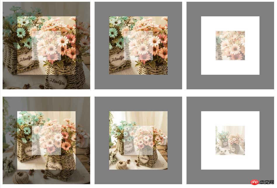
You can also use this property to make a better background effect, see this example: I centered the background image, in the first line I completely kept the background size and used both background-origin and background- clip as well as the second line of this example I have stretched the background image size to fit the entire box with the background-size property and executed it again using both background-origin and background-clip.
Code example:
<!DOCTYPE html>
<html>
<head>
<meta charset="utf-8">
	<title></title>
	<style type="text/css">
.box{
background:url("image/flowers.jpg") no-repeat center center;
  width:300px;
  height:300px;
  border:solid 50px rgba(0,0,0,0.5);
  padding:50px;
  float:left;
  margin-right:15px; margin-bottom:15px;
  box-sizing:border-box;
}
.box span{
color:#000;
display:block;
font-size:30px;
font-weight:bold;
height:100%;
text-transform:uppercase;
background-color:rgba(256,256,256,0.5)}
.box1{
  background-clip:border-box;
  background-origin:border-box;
}
.box2{
  background-clip:padding-box;
  background-origin:padding-box;
}
.box3{
  background-clip:content-box;
  background-origin:content-box;
}
.cover{
background-size:cover;
margin-top:10px;
}
</style>
</head>
<body>
<div class="box box1">
  <span></span>
</div>
<div class="box box2">
  <span></span>
</div>
<div class="box box3">
  <span></span>
</div>
<div class="box box1 cover" style="clear:both;">
  <span></span>
</div>
<div class="box box2 cover">
  <span></span>
</div>
<div class="box box3 cover">
  <span></span>
</div>
</body>
</html>The effect is as follows:

The above is the detailed content of Detailed explanation of CSS3 new properties Background-Origin and Background-Clip. For more information, please follow other related articles on the PHP Chinese website!
 How to solve garbled html page
 Usage of write function
 What should I do if my windows license is about to expire?
 What is the main difference between c language and python?
 What are the ways to clear floats?
 css3transition
 The difference between WeChat service account and official account
 stackoverflowatline1