 Web Front-end
 CSS Tutorial
 Detailed explanation of the usage of flex-grow attribute in CSS (with code)
Detailed explanation of the usage of flex-grow attribute in CSS (with code)
In this article we will use the flex-grow property in Flexbox to implement the behavior of widening the width of the frame when the width of the frame wraps and becomes larger than necessary.
Use the flex-grow property to specify the width of the frame width in Flexbox when it is wider than necessary.
Syntax:
flex-grow :(数量)
Code example:
flex-grow.html
<!DOCTYPE html>
<html>
<head>
<meta charset="utf-8" />
<title></title>
<link rel="stylesheet" href="flex-grow.css" />
</head>
<body>
<div class="container">
    <div class="frameA">第一个内容<br/>php中文网<br />php中文网</div>
    <div class="frameB">第二个内容<br />php中文网<br /></div>
    <div class="frameC">第三个内容<br />php中文网<br />php中文网</div>
    <div class="frameD">第四个内容<br />php中文网<br />php中文网</div>
    <div class="frameE">第五个内容<br />php中文网<br />php中文网</div>
  </div>
</body>
</html>flex-grow.css
.container {
    display: flex;
}
.frameA {
    border: 1px solid #e9006b;
    flex-grow: 5;
}
.frameB {
    border: 1px solid #ff6a00;
    flex-grow: 4;
}
.frameC {
    border: 1px solid #d0b106;
    flex-grow: 3;
}
.frameD {
    border: 1px solid #4aae20;
    flex-grow: 2;
}
.frameE {
    border: 1px solid #01b9b3;
    flex-grow: 1;
}Instructions:
We set frame-A flex-grow to 5, frame B flex-grow to 4, frame C flex-grow 3, frame D flex-2 to frameE flex-grow 1 . With this setting, the width of the frame will expand further even if it becomes wider than necessary to display the text. In this case, the extent of frame extension, frameA:frameB:frame C:frame D:frameE = 5:4:3:2:1 ratio extension
Display results
Use a web browser to display the above HTML file. The screen shown below will be displayed. When the window width is narrow, each frame is displayed with the same width.
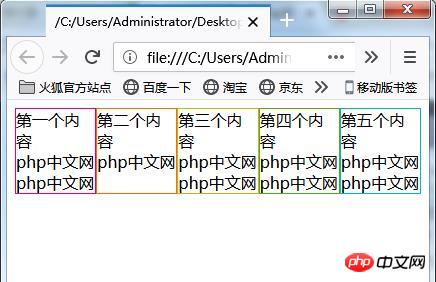
Increase the window width. In states where wrapping is required to display text in a frame, the width of the frame is still displayed at the same width.
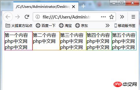
#When the text inside the box displays an unnecessary width, display it with the same width.
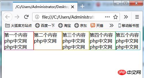
If you widen the window size beyond the width required to display the frames without wrapping text, the size of each frame will expand. The frame size increase is frameA:frameB:frameC:frameD:frameE = 5:4:3:2:1 ratio.

Set the flex-grow property in only one box
Change the CSS code to the following and set only one flex-grow property.
flex-grow.css
.container {
    display: flex;
}
.frameA {
    border: 1px solid #e9006b;
    flex-grow: 1;
}
.frameB {
    border: 1px solid #ff6a00;
}
.frameC {
    border: 1px solid #d0b106;
}

.frameD {
    border: 1px solid #4aae20;
}
.frameE {
    border: 1px solid #01b9b3;
}Use a web browser to display the page. When the window width is narrower, the displayed frame width is the same as in the previous case.
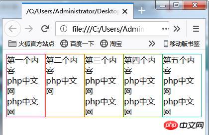
Increase the web browser window width. In the state where line wrapping is required during display, the width of each frame is the same.

Further increase the window size. Shows the width of the text without breaking in the middle.
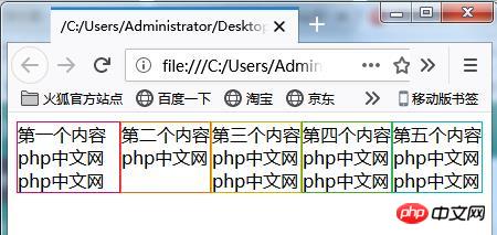
Further widen the window width. Frame-A with the flex-grow property has its width further increased, but the width of other borders without the flex-grow property specified remains the same.
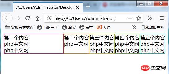
# Even if the window width is further widened, only frameA has a wider width.
The above is the detailed content of Detailed explanation of the usage of flex-grow attribute in CSS (with code). For more information, please follow other related articles on the PHP Chinese website!

Hot AI Tools

Undresser.AI Undress
AI-powered app for creating realistic nude photos

AI Clothes Remover
Online AI tool for removing clothes from photos.

Undress AI Tool
Undress images for free

Clothoff.io
AI clothes remover

AI Hentai Generator
Generate AI Hentai for free.

Hot Article

Hot Tools

Notepad++7.3.1
Easy-to-use and free code editor

SublimeText3 Chinese version
Chinese version, very easy to use

Zend Studio 13.0.1
Powerful PHP integrated development environment

Dreamweaver CS6
Visual web development tools

SublimeText3 Mac version
God-level code editing software (SublimeText3)

Hot Topics
 Demystifying Screen Readers: Accessible Forms & Best Practices
Mar 08, 2025 am 09:45 AM
This is the 3rd post in a small series we did on form accessibility. If you missed the second post, check out "Managing User Focus with :focus-visible". In
 Create a JavaScript Contact Form With the Smart Forms Framework
Mar 07, 2025 am 11:33 AM
This tutorial demonstrates creating professional-looking JavaScript forms using the Smart Forms framework (note: no longer available). While the framework itself is unavailable, the principles and techniques remain relevant for other form builders.
 Adding Box Shadows to WordPress Blocks and Elements
Mar 09, 2025 pm 12:53 PM
The CSS box-shadow and outline properties gained theme.json support in WordPress 6.1. Let's look at a few examples of how it works in real themes, and what options we have to apply these styles to WordPress blocks and elements.
 Working With GraphQL Caching
Mar 19, 2025 am 09:36 AM
If you’ve recently started working with GraphQL, or reviewed its pros and cons, you’ve no doubt heard things like “GraphQL doesn’t support caching” or
 Making Your First Custom Svelte Transition
Mar 15, 2025 am 11:08 AM
The Svelte transition API provides a way to animate components when they enter or leave the document, including custom Svelte transitions.
 Show, Don't Tell
Mar 16, 2025 am 11:49 AM
How much time do you spend designing the content presentation for your websites? When you write a new blog post or create a new page, are you thinking about
 Classy and Cool Custom CSS Scrollbars: A Showcase
Mar 10, 2025 am 11:37 AM
In this article we will be diving into the world of scrollbars. I know, it doesn’t sound too glamorous, but trust me, a well-designed page goes hand-in-hand
 What the Heck Are npm Commands?
Mar 15, 2025 am 11:36 AM
npm commands run various tasks for you, either as a one-off or a continuously running process for things like starting a server or compiling code.


