 Web Front-end
 CSS Tutorial
 Introduction to the implementation method of border shadow (box-shadow) in CSS (code example)
Introduction to the implementation method of border shadow (box-shadow) in CSS (code example)
The content shared in this article is the method of realizing border shadow with CSS. The content is very detailed. Friends in need can refer to it.
What we need to add a shadow to the border is the box-shadow attribute. Let’s take a look at the syntax formats of the box-shadow attribute
box-shadow: (distance in the horizontal direction) (distance in the vertical direction) (shadow blur) (shadow size) (shadow color) (shadow direction);
(shadow blur) (shadow Size) (Shadow Color) (Shadow Direction) can be omitted or the following format can be used. (Related recommendations: CSS Learning Manual)
box-shadow: (distance in the horizontal direction) (distance in the vertical direction);
box -shadow: (distance in the horizontal direction) (distance in the vertical direction) (blurred shadow);
box-shadow: (distance in the horizontal direction) (distance in the vertical direction) (blurred shadow) ( Shadow size);
box-shadow: (distance in the horizontal direction) (distance in the vertical direction) (shadow blur) (shadow color);
box -shadow: (distance in the horizontal direction) (distance in the vertical direction) (shadow blur) (shadow size) (shadow color);
box-shadow: (distance in the horizontal direction) (vertical Distance in direction) (shadow blur) (shadow color) (shadow direction);
Syntax example:
box-shadow:5px 5px 3px 1px#000000 inset;
Let’s take a look at the code example in detail:
SimpleShadow.html
<!DOCTYPE html>
<html>
<head>
    <meta charset="utf-8" />
    <title></title>
  <link rel="stylesheet" type="text/css" href="SimpleShadow.css" />
</head>
<body>
  <div class="SimpleFrame">php中文网</div>
  </body>
</html>SimpleShadow.css
body {
  background-color:#C0C0C0;
}
.SimpleFrame {
  background-color: #FFFFFF;
  margin-left: 128px;
  margin-top: 64px;
  width: 128px;
  height: 220px;
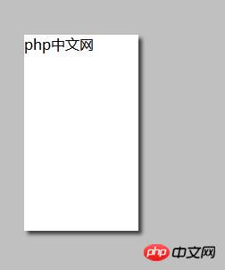
  box-shadow: 4px 4px 5px #404040;
}The effect is as follows:
The shadow effect is attached to the container of the DIV and displays the shadow.
When setting the degree of shadow blur, change the CSS code to the following.
SimpleShadow.css
body {
  background-color:#C0C0C0;
  }
.SimpleFrame {
  background-color: #FFFFFF;
  margin-left: 128px;
  margin-top: 64px;
  width: 128px;
  height: 220px;
  box-shadow: 4px 4px 0px #808080;
}The effect is as follows:
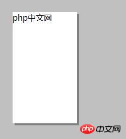
When setting "box-shadow: 4px 4px 4px #808080; ”
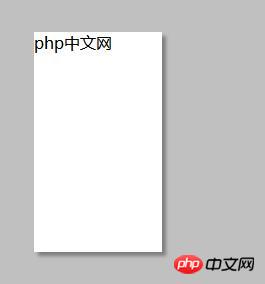
When setting “box-shadow: 4px 4px 16px #808080;”
The larger the number, the blurry the outline of the shadow and the display Softer shades.
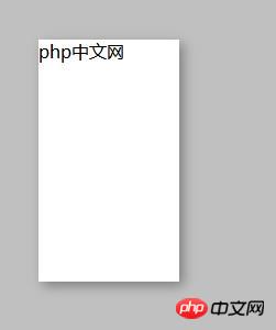
Set the shadow size
SimpleShadow.css
body {
  background-color:#C0C0C0;
}
.SimpleFrame {
  background-color: #FFFFFF;
  margin-left: 128px;
  margin-top: 64px;
  width: 128px;
  height: 220px;
  box-shadow: 4px 4px 5px 10px #404040;
}If you specify the size of the shadow, the shadow will be the size specified externally Display, the effect is as follows:
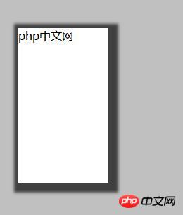
Setting of shadow direction
CSS code is as follows:
body {
  background-color:#C0C0C0;
}
.SimpleFrame {
  background-color: #FFFFFF;
  margin-left: 128px;
  margin-top: 64px;
  width: 128px;
  height: 220px;
  box-shadow: 4px 4px 5px #404040 inset;
}The effect is as follows: the shadow is displayed inside the frame
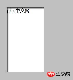
Set shadow color
Specify the shadow color of box-shadow.
body {
  background-color:#C0C0C0;
  }
.SimpleFrame {
  background-color: #FFFFFF;
  margin-left: 128px;
  margin-top: 64px;
  width: 128px;
  height: 220px;
  box-shadow: 2px 2px 10px #ff6a00;
}The effect is as follows: the shadow is tinted and displayed.
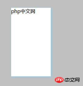
This article ends here. For more information about CSS, you can study the CSS Video Tutorial column on the PHP Chinese website! ! !
The above is the detailed content of Introduction to the implementation method of border shadow (box-shadow) in CSS (code example). For more information, please follow other related articles on the PHP Chinese website!

Hot AI Tools

Undresser.AI Undress
AI-powered app for creating realistic nude photos

AI Clothes Remover
Online AI tool for removing clothes from photos.

Undress AI Tool
Undress images for free

Clothoff.io
AI clothes remover

AI Hentai Generator
Generate AI Hentai for free.

Hot Article

Hot Tools

Notepad++7.3.1
Easy-to-use and free code editor

SublimeText3 Chinese version
Chinese version, very easy to use

Zend Studio 13.0.1
Powerful PHP integrated development environment

Dreamweaver CS6
Visual web development tools

SublimeText3 Mac version
God-level code editing software (SublimeText3)

Hot Topics
 Demystifying Screen Readers: Accessible Forms & Best Practices
Mar 08, 2025 am 09:45 AM
This is the 3rd post in a small series we did on form accessibility. If you missed the second post, check out "Managing User Focus with :focus-visible". In
 Adding Box Shadows to WordPress Blocks and Elements
Mar 09, 2025 pm 12:53 PM
The CSS box-shadow and outline properties gained theme.json support in WordPress 6.1. Let's look at a few examples of how it works in real themes, and what options we have to apply these styles to WordPress blocks and elements.
 Create a JavaScript Contact Form With the Smart Forms Framework
Mar 07, 2025 am 11:33 AM
This tutorial demonstrates creating professional-looking JavaScript forms using the Smart Forms framework (note: no longer available). While the framework itself is unavailable, the principles and techniques remain relevant for other form builders.
 Comparing the 5 Best PHP Form Builders (And 3 Free Scripts)
Mar 04, 2025 am 10:22 AM
This article explores the top PHP form builder scripts available on Envato Market, comparing their features, flexibility, and design. Before diving into specific options, let's understand what a PHP form builder is and why you'd use one. A PHP form
 Working With GraphQL Caching
Mar 19, 2025 am 09:36 AM
If you’ve recently started working with GraphQL, or reviewed its pros and cons, you’ve no doubt heard things like “GraphQL doesn’t support caching” or
 Making Your First Custom Svelte Transition
Mar 15, 2025 am 11:08 AM
The Svelte transition API provides a way to animate components when they enter or leave the document, including custom Svelte transitions.
 Show, Don't Tell
Mar 16, 2025 am 11:49 AM
How much time do you spend designing the content presentation for your websites? When you write a new blog post or create a new page, are you thinking about
 Classy and Cool Custom CSS Scrollbars: A Showcase
Mar 10, 2025 am 11:37 AM
In this article we will be diving into the world of scrollbars. I know, it doesn’t sound too glamorous, but trust me, a well-designed page goes hand-in-hand


