This article brings you an introduction to how CSS uses media queries for responsive design? (detailed example), let’s look at the use of minimum width and maximum width through a simple example. It has certain reference value. Friends in need can refer to it. I hope it will be helpful to you.
The idea behind responsive design is to use the same code base to deliver a great experience across a variety of devices. This means that the code we write should be device independent. Executing responsive design is no small task and requires us to embrace the fluidity of the web rather than strive to control it. Media queries are an integral part of responsive design implementation.
The extensibility of media queries allows for a variety of complex media expressions, but the most commonly used in the context of responsive design are those that target width and, to a lesser extent, height.
Broadly speaking, there are two ways to construct a media query like this. We tend to refer to min-width media-based queries as mobile-first. This means that the base style targets the smallest viewport and applies additional styles as the viewport gets larger. In contrast, max-width media-based queries take the maximum viewport size as the default and apply additional styles to cater for smaller viewport sizes.
Let’s use a simple example to illustrate How to use media queries for responsive design?
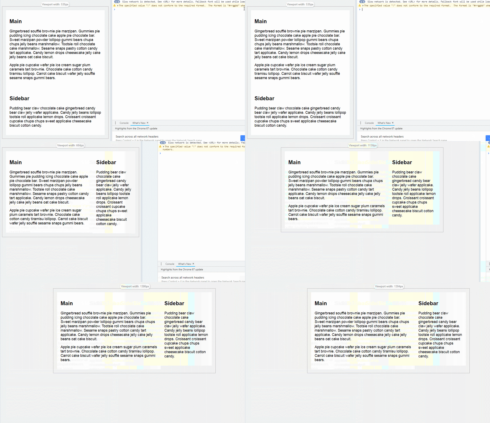
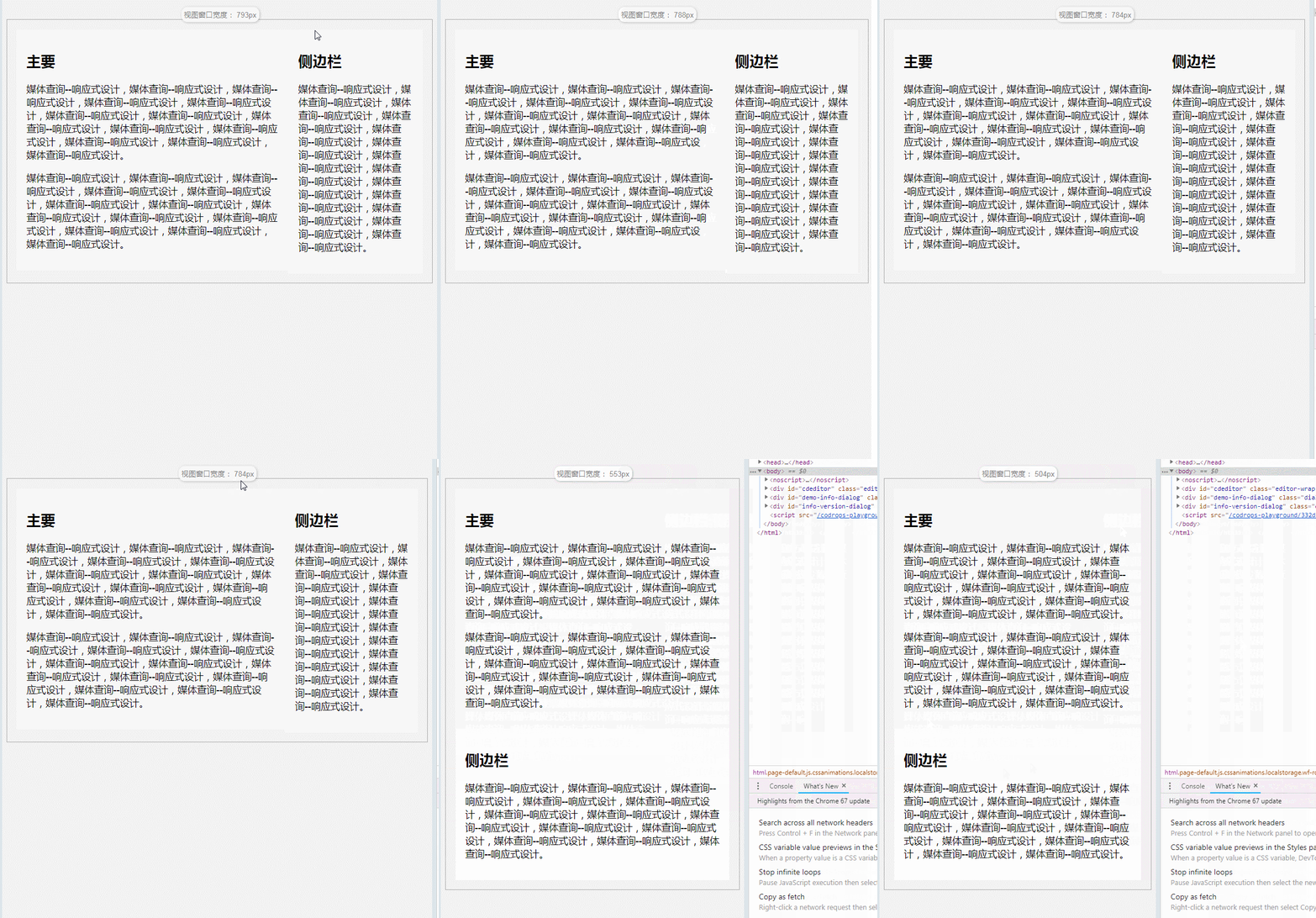
Suppose we need a two-column layout, where the main content part occupies 3/4 of the page, and the sidebar on the right occupies 1/4 of the page. Then, on a device with a narrow viewport, such as a mobile phone, we want the same webpage to render the sidebar's content below the main content.
.container {
  max-width: 45em;
}
.main {
  width: 67%;
  float: left;
}
.sidebar {
  width: 33%;
  float: right;
}
@media (min-width: 35em) {
  .main {
    width: 67%;
    float: left;
  }
  .sidebar {
    width: 33%;
    float: right;
  }
}
@media (max-width: 35em) {
  .main {
    width: 100%;
    float: none;
  }
  .sidebar {
    width: 100%;
    float: none;
  }
}Simple minimum width example:
First look at the demo effect:

In the above example , the query used is:
@ media(min-width:35em){
  / *一些CSS属性* /
}We use simple code to tell the browser that when the screen is greater than or equal to 35em wide, apply the style contained in this block to let the main element and sidebar element Float, displayed on the same line. When using a min-width media query, our base style (i.e. the default style when media conditions don't work) will launch on a narrower screen size.
For this particular scenario, we don't even have to write any basic styles because the main element and sidebar elements are block elements and by default browsers place the main element at the top and render the sidebar element at the bottom. This is one of the reasons why some developers advocate using minimum-width media queries for responsive design. Typically, you'll write less code.
Simple max-width example
Let’s use a max-width query instead for the same scenario.

The media query used in this case would be:
@media (max-width: 35em) {
  / *一些CSS属性* /
}In contrast to the minimum width, the maximum width is when the screen is less than or equal to 35em wide , this rule will apply the styles contained in this block. This means your basic styles will work on wider screen sizes.
At this time, you need to write the basic style that renders the main element on the left and the sidebar element on the right. Then undo the style in the media query to fit the size of the narrow screen. So, for this specific scenario, it makes more sense to use the "min-width" media query.
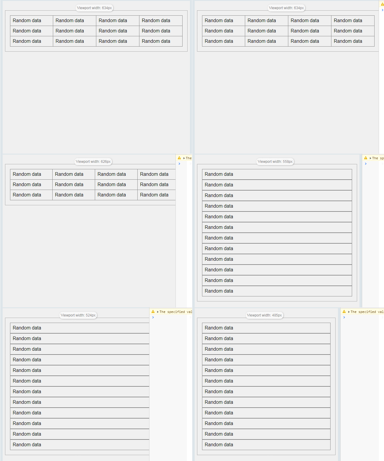
But in some scenarios, "max-width" media queries make sense, just like tables. The default display of tables works well on wide screens, but on smaller screens we may want to apply 'display:block;' to table rows and table cells to make the content read better on narrow screens.

The media query used in this case would be:
@media screen and (max-width: 35em) {
  tr,
  td {
    display: block;
    width: 100%;
  }
}There are no hard and fast rules, but the guideline is to make your choice based on element defaults. If the default works well on narrow screens, use the "min-width" media query to add styles on wider screens. If the default works well on wide screens, use the "max-width" media query to add styles on narrower screens.
Summary: The above is the entire content of this article. You can compile it yourself and try it to deepen your understanding; I hope it will be helpful to your study.
The above is the detailed content of How to use media queries in css for responsive design? (Example detailed explanation). For more information, please follow other related articles on the PHP Chinese website!
 css3 tutorial
 What are the css3 gradient properties?
 mstsc remote connection failed
 Ranking of foreign CDN service providers
 What are the four main IO models in Java?
 What are the differences between hibernate and mybatis
 Introduction to win11 screenshot shortcut keys
 What should I do if the web video cannot be opened?