The content of this article is to introduce how to implement mini program animation? How to implement mini program animation. It has certain reference value. Friends in need can refer to it. I hope it will be helpful to you.
In ordinary web development, animation effects can achieve most needs through css3. In small program development, css3 can also be used, and also through apiway to achieve.
API Interpretation
In the applet, to create animation by calling api, you need to create an instance object first. This object is returned through wx.createAnimation, and a series of properties of animation are based on this instance object.
Create this object
    let animation = wx.createAnimation({
        duration: 2000,
        delay: 0,
        timingFunction: "linear",
});This animation is returned after passing wx.createAnimation Example. During the creation process, you can add some attributes to this instance, as shown in the above code, which is equivalent to the writing method of animation:$name 2s linear in css3.
Add dynamic effects
After the instance is created, add the required dynamic effects based on the instance. The dynamic type can be found in the documentation. Take the most common movement and rotation as an example:
animation.translate($width, 0).rotate($deg);
End animation
.step() represents a group The end of animation
animation.step();
Export animation
The animation effect is added, how to add animation effect to the desired dom. You need to use .export() to export the animation queue and assign it to a DOM object.
this.setData({ moveOne: animation.export() })<view></view>
Example
The following will use 2 sets of animations to compare css3 and apiDifferences in implementation methods.
1. Module movement animation
Animation effect:
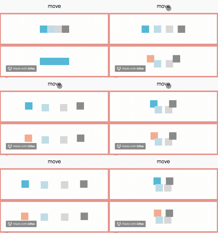
There are two sets of animations in the picture below , respectively the effects completed by api method (top) and css3 method (bottom). Click the move button to start the animation.

Code implementation
The following are the core codes of css3 and api :
css3:
        <view></view>
        <view></view>
        <view></view>
        <view></view>
    // scss
    @mixin movePublic($oldLeft,$oldTop,$left,$top) {
        from {
          transform:translate($oldLeft,$oldTop);
        }
        to {
          transform:translate($left,$top);
        }
    }

    @mixin blockStyle($color,$name) {
        background: $color;
        animation:$name 2s linear infinite alternate;
    }
    .one {
        @include blockStyle(lightsalmon,onemove);
    }

    @keyframes onemove {
        @include movePublic(50rpx,-25rpx,-150rpx,0rpx);
    }

    .two {
        @include blockStyle(lightblue,twomove);
    }

    @keyframes twomove {
        @include movePublic(0rpx,25rpx,-50rpx,0rpx);
    }

    .three {
        @include blockStyle(lightgray,threemove);
    }

    @keyframes threemove {
        @include movePublic(0rpx,25rpx,50rpx,0rpx);
    }

    .four {
        @include blockStyle(grey,fourmove);
    }

    @keyframes fourmove {
        @include movePublic(-50rpx,-25rpx,150rpx,0rpx);
} // js
moveFunction(){
this.setData({
isMove: true
})
}css3 is achieved by dynamically changing the class class name For the effect of animation, the above code uses one, two, three, four to control the moving distance respectively. The code can be avoided through sass Too much redundancy problem. (For children who are confused about how to use sass in the mini program, please see here: wechat-mina-template)
api:
    moveClick(){
        this.move(-75,-12.5,25,'moveOne');
        this.move(-25,12.5, 0,'moveTwo');
        this.move(25, 12.5,0,'moveThree');
        this.move(75, -12.5,-25,'moveFour');
        this.moveFunction(); // 该事件触发css3模块进行移动
    },

    // 模块移动方法
    move: function (w,h,m,ele) {
        let self = this;
        let moveFunc = function () {
        let animation = wx.createAnimation({
            duration: 2000,
            delay: 0,
            timingFunction: "linear",
        });

        animation.translate(w, 0).step()
        self.setData({ [ele]: animation.export() })
        let timeout = setTimeout(function () {
            animation.translate(m, h).step();
            self.setData({
                // [ele] 代表需要绑定动画的数组对象
                [ele]: animation.export()
            })
          }.bind(this), 2000)
        }
        moveFunc();
        let interval = setInterval(moveFunc,4000)
}As can be seen from the renderings, the modules are all simple movements. Their movement changes can be written as a public event, and they can be moved to different positions by passing values to the event. The parameters w, h, m, ele respectively represent the distance moved in the horizontal direction when diverging, the distance in the vertical direction and the horizontal direction when converging, and the object that needs to be modified animationData.
The animation generated by this method cannot be retracted according to the original trajectory, so a timer is set after the event and is defined to execute another animation 2s after the animation is executed. At the same time, the animation can only be executed once . If a looping animation is required, a timer for repeated execution must be wrapped in the outer layer.
Check the source code and find that the api method is to insert and change the inline style through js to achieve the animation effect. The following animation can clearly see the style change .

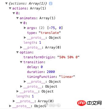
Print out the assigned animationData, animates stores the type and parameters of the animation event; options stores the configuration options for this animation, transition stores the configuration when wx.createAnimation is called, transformOrigin is the default configuration, meaning The animation starts from the center of the object, which can also be configured at wx.createAnimation.

2. Music playback animation
The above module movement animation does not involve logical interaction, so the new I tried a music playback animation, which needs to achieve pause and continue effects.
Animation effect:

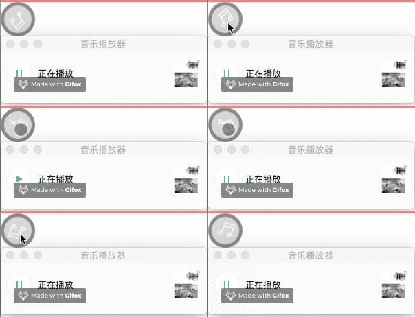
两组不同的动画效果对比,分别为api(上)实现与css3实现(下):

代码实现
以下分别是css3实现与api实现的核心代码:
css3:
    <!-- wxml -->
    <view>
        <text></text>
        <text></text>
    </view>
    // scss
    .musicRotate{
        animation: rotate 3s linear infinite;
    }

    @keyframes rotate{
        from{
            transform: rotate(0deg)
        }
        to{
            transform: rotate(359deg)
        }
    }

    .musicPaused{
        animation-play-state: paused;
} // js
playTwo(){
this.setData({
playTwo: !this.data.playTwo
},()=>{
let back = this.data.backgroundAudioManager;
if(this.data.playTwo){
back.play();
} else {
back.pause();
}
})
}通过playTwo这个属性来判断是否暂停,并控制css类的添加与删除。当为false时,添加.musicPaused类,动画暂停。
api:
    <!-- wxml -->
    <view>
        <text></text>
        <text></text>
    </view>
    // js
    play(){
        this.setData({
            play: !this.data.play
        },()=>{
            let back = this.data.backgroundAudioManager;
            if (!this.data.play) {
                back.pause();
               // 跨事件清除定时器
               clearInterval(this.data.rotateInterval);
            } else {
                back.play();
                // 继续旋转,this.data.i记录了旋转的程度
                this.musicRotate(this.data.i);
            }
        })
    },
    musicRotate(i){
        let self = this;
        let rotateFuc = function(){
            i++;
            self.setData({
                i:i++
            });
            let animation = wx.createAnimation({
                duration: 1000,
                delay: 0,
                timingFunction: "linear",
            });
            animation.rotate(30*(i++)).step()
            self.setData({ musicRotate: animation.export() });
        }
        rotateFuc();
        let rotateInterval = setInterval(
            rotateFuc,1000
        );
        // 全局定时事件
        this.setData({
            rotateInterval: rotateInterval
        })
}通过api实现的方式是通过移除animationData来控制动画,同时暂停动画也需要清除定时器,由于清除定时器需要跨事件进行操作,所以定了一个全局方法rotateInterval。
api方式定义了旋转的角度,但旋转到该角度之后便会停止,如果需要实现重复旋转效果,需要通过定时器来完成。因此定义了变量i,定时器每执行一次便加1,相当于每1s旋转30°,对animation.rotate()中的度数动态赋值。暂停之后继续动画,需要从原有角度继续旋转,因此变量i需要为全局变量。
代码变化:
下图可以看出,api方式旋转是通过不断累加角度来完成,而非css3中循环执行。

对比
通过上述两个小例子对比,无论是便捷度还是代码量,通过css3来实现动画效果相对来说是更好的选择。api方式存在较多局限性:
动画只能执行一次,循环效果需要通过定时器完成。
无法按照原有轨迹返回,需要返回必须定义定时器。
频繁借助定时器在性能上有硬伤。
综合以上,推荐通过css3来完成动画效果。
The above is the detailed content of How to implement mini program animation? How to implement mini program animation. For more information, please follow other related articles on the PHP Chinese website!