CSS to achieve glowing button effect (code example)
We often use button effects. This article will share with you the implementation of a beautiful button effect. Let’s use CSS to achieve a glowing button effect.
Without further ado, let’s look directly at the code
The following code is the basic code for all subsequent button styles:
HTML
<a class="button" href="#">Button</a>
CSS
.button {
width:80px;
height:20px;
  display: block;
  padding: 1em 3.2em;
  border-radius: 1.6em;
  color: #fff;
  font-size: 18px;
  font-family: 'Lato', sans-serif;
  font-weight: 700;
  text-align: center;
  text-decoration: none;
}The basic color is changed from button1 to button4 below, and the color transmittance of the button body is also adjusted by box-shadow to describe the shadow used for each button. Start designing buttons with gradient effects starting from button5. Let's look at the specific code implementation.
button1:
.button {
  background-color: rgba(252, 28, 143, 1);
  box-shadow: 0 5px 20px rgba(252, 28, 143, .5);
}The effect is as follows:

button2:
.button{
background-color: rgba(251, 152, 11, 1);
box-shadow: 0 5px 20px rgba(251, 152, 11, .5);
}The effect is as follows:

button3:
.button {
  background-color: rgba(241, 196, 15, 1);
  box-shadow: 0 5px 20px rgba(241, 196, 15, .5);
}The effect is as follows:

button4:
.button {
  background-color: rgba(0, 63, 255, 1);
  box-shadow: 0 5px 20px rgba(0, 63, 255, .5);
}The effect As follows:

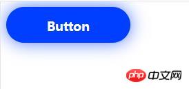
button5:
The basic appearance is "button4", box-shadow changes the position of the shadow attached below by setting the shadow .
.button {
  background-color: rgba(0, 63, 255, 1);
  box-shadow: 0 0 40px rgba(0, 63, 255, .7);
}The effect is as follows:
button6:
This is the box-shadow we added to the "button4" position specified by inset.
.button {
  background-color: rgba(0, 63, 255, 1);
  box-shadow: 0 5px 20px rgba(0, 63, 255, .5), 0 0 40px rgba(255, 255, 255, .5) inset;
}The effect is as follows:

button7:
Use the gradient type button to combine different colors and adjust the angle .
.button {
  background: linear-gradient(-45deg, rgba(87, 225, 181, 1) 0%, rgba(0, 63, 255, 1) 100%);
  box-shadow: 0 5px 20px rgba(0, 63, 255, .5);
}The effect is as follows:

#The above is the entire content of this article. For more other exciting content, please refer to the video tutorial on the php Chinese website The CSS video tutorial and CSS3 video tutorial columns in the column! ! !
The above is the detailed content of CSS to achieve glowing button effect (code example). For more information, please follow other related articles on the PHP Chinese website!

Hot AI Tools

Undresser.AI Undress
AI-powered app for creating realistic nude photos

AI Clothes Remover
Online AI tool for removing clothes from photos.

Undress AI Tool
Undress images for free

Clothoff.io
AI clothes remover

AI Hentai Generator
Generate AI Hentai for free.

Hot Article

Hot Tools

Notepad++7.3.1
Easy-to-use and free code editor

SublimeText3 Chinese version
Chinese version, very easy to use

Zend Studio 13.0.1
Powerful PHP integrated development environment

Dreamweaver CS6
Visual web development tools

SublimeText3 Mac version
God-level code editing software (SublimeText3)

Hot Topics
 How to correctly display the locally installed 'Jingnan Mai Round Body' on the web page?
Apr 05, 2025 pm 10:33 PM
Using locally installed font files in web pages Recently, I downloaded a free font from the internet and successfully installed it into my system. Now...
 How to select a child element with the first class name item through CSS?
Apr 05, 2025 pm 11:24 PM
When the number of elements is not fixed, how to select the first child element of the specified class name through CSS. When processing HTML structure, you often encounter different elements...
 Does H5 page production require continuous maintenance?
Apr 05, 2025 pm 11:27 PM
The H5 page needs to be maintained continuously, because of factors such as code vulnerabilities, browser compatibility, performance optimization, security updates and user experience improvements. Effective maintenance methods include establishing a complete testing system, using version control tools, regularly monitoring page performance, collecting user feedback and formulating maintenance plans.
 What are the advantages of H5 page production
Apr 05, 2025 pm 11:48 PM
The advantages of H5 page production include: lightweight experience, fast loading speed, and improving user retention. Cross-platform compatibility, no need to adapt to different platforms, improving development efficiency. Flexibility and dynamic updates, no audit required, making it easier to modify and update content. Cost-effective, lower development costs than native apps.
 How to compatible with multi-line overflow omission on mobile terminal?
Apr 05, 2025 pm 10:36 PM
Compatibility issues of multi-row overflow on mobile terminal omitted on different devices When developing mobile applications using Vue 2.0, you often encounter the need to overflow text...
 Is H5 page production a front-end development?
Apr 05, 2025 pm 11:42 PM
Yes, H5 page production is an important implementation method for front-end development, involving core technologies such as HTML, CSS and JavaScript. Developers build dynamic and powerful H5 pages by cleverly combining these technologies, such as using the <canvas> tag to draw graphics or using JavaScript to control interaction behavior.
 Is the threshold for H5 page production high?
Apr 05, 2025 pm 11:45 PM
The threshold for making H5 pages is neither high nor low, depending on the goal. It is easier to make simple static pages, you only need to master the basic knowledge of HTML and CSS; it is relatively high to create pages with strong interactive and rich features, and you need to have in-depth knowledge of HTML, CSS, JavaScript, front-end frameworks, performance optimization and compatibility.
 Why does negative margins not take effect in some cases? How to solve this problem?
Apr 05, 2025 pm 10:18 PM
Why do negative margins not take effect in some cases? During programming, negative margins in CSS (negative...


