How to remove gaps caused by CSS inline-block line breaks
There is a problem with the use of inline elements and inline block elements, that is, a blank will be formed when displaying line breaks that exist in the source code. This article will introduce to you how to eliminate CSS The inline-block newline causes the gap.
The reason for gaps when using inline-block
inline-block can be processed like inline elements, can be simply arranged horizontally, and can give horizontal Width and vertical width etc. This is a very convenient setup, so it can be used in a lot of ways.
But at the same time, we often encounter the so-called gap problem when using inline-block. Let's take a look at an example
HTML
<div class="container">
  <div class="inline-contents"></div>
  <div class="inline-contents"></div>
  <div class="inline-contents"></div>
</div>
CSS
 .container {
  display: block;
  border: 1px #000 solid;
}
.inline-contents {
  width: 33.3333%;
  height: 200px;
  display: inline-block;
  background-color: #66b6d5;
}The effect is as follows:

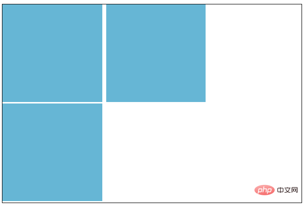
From the above picture we can clearly see that there are no values set on the right and bottom, but there are gaps
Therefore, the three boxes with width: 33.3333% (that is, less than 1 / 3) should be arranged horizontally, but the last box is on a new line.
Even if box-sizing is set this time, margin and padding are set to 0, there is no change.
inline - block as the side of the inline element is not only a matter of "horizontal arrangement", but may also affect values such as font-size and line-height.
How to eliminate the gaps in inline - block
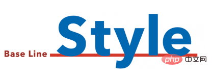
The gaps that can appear below are the default settings for letters, the baseline is as shown, so you can use the properties to try Leave a little gap below.

(So if you apply vertical-align: bottom; to .inline-contents, it will only fix the gap issue below.)
next to The gap is due to the line changes between < div >, so it can be solved by removing them all, but the code will look very complicated. Although you can write comments between < div >, it may be a bit troublesome. In fact, just Writing a "font-size: 0;" value in the parent element (.container) solves the problem.
Why do we say it is a parent element? Because the element itself with inline-block set has the characteristics of "character".
Let’s look at an example
HTML
<div class="container">
  <div class="inline-contents">aaa
  </div>
  <div class="inline-contents">aaa<br>
    aaa
  </div>
  <div class="inline-contents">aaa</div>
</div>CSS
.container {
  display: block;
  border: 1px #000 solid;
  font-size: 0;
}

.inline-contents {
  width: 33.3333%;
  height: 200px;
  display: inline-block;
  background-color: #66b6d5;
  font-size: 16px;
}Enter text in inline-block At this time, if the new inlin-block sets font-size, it will be fine.
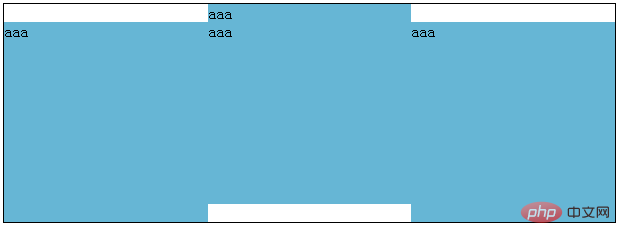
However, if the number of lines of text in each box is different, this will happen.

In this case, solve it by adding vertical-align: bottom; and font-size to inline-block.
CSS
.container {
  display: block;
  border: 1px #000 solid;
  font-size: 0;
}

.inline-contents {
  width: 33.3333%;
  height: 200px;
  display: inline-block;
  background-color: #66b6d5;
  font-size: 16px;
  vertical-align: bottom;
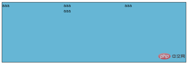
}The effect is as follows:

This article ends here, more exciting content for you You can pay attention to the CSS video tutorial column on the php Chinese website! ! !
The above is the detailed content of How to remove gaps caused by CSS inline-block line breaks. For more information, please follow other related articles on the PHP Chinese website!

Hot AI Tools

Undresser.AI Undress
AI-powered app for creating realistic nude photos

AI Clothes Remover
Online AI tool for removing clothes from photos.

Undress AI Tool
Undress images for free

Clothoff.io
AI clothes remover

AI Hentai Generator
Generate AI Hentai for free.

Hot Article

Hot Tools

Notepad++7.3.1
Easy-to-use and free code editor

SublimeText3 Chinese version
Chinese version, very easy to use

Zend Studio 13.0.1
Powerful PHP integrated development environment

Dreamweaver CS6
Visual web development tools

SublimeText3 Mac version
God-level code editing software (SublimeText3)

Hot Topics
 Demystifying Screen Readers: Accessible Forms & Best Practices
Mar 08, 2025 am 09:45 AM
This is the 3rd post in a small series we did on form accessibility. If you missed the second post, check out "Managing User Focus with :focus-visible". In
 Adding Box Shadows to WordPress Blocks and Elements
Mar 09, 2025 pm 12:53 PM
The CSS box-shadow and outline properties gained theme.json support in WordPress 6.1. Let's look at a few examples of how it works in real themes, and what options we have to apply these styles to WordPress blocks and elements.
 Create a JavaScript Contact Form With the Smart Forms Framework
Mar 07, 2025 am 11:33 AM
This tutorial demonstrates creating professional-looking JavaScript forms using the Smart Forms framework (note: no longer available). While the framework itself is unavailable, the principles and techniques remain relevant for other form builders.
 Comparing the 5 Best PHP Form Builders (And 3 Free Scripts)
Mar 04, 2025 am 10:22 AM
This article explores the top PHP form builder scripts available on Envato Market, comparing their features, flexibility, and design. Before diving into specific options, let's understand what a PHP form builder is and why you'd use one. A PHP form
 Working With GraphQL Caching
Mar 19, 2025 am 09:36 AM
If you’ve recently started working with GraphQL, or reviewed its pros and cons, you’ve no doubt heard things like “GraphQL doesn’t support caching” or
 Making Your First Custom Svelte Transition
Mar 15, 2025 am 11:08 AM
The Svelte transition API provides a way to animate components when they enter or leave the document, including custom Svelte transitions.
 Show, Don't Tell
Mar 16, 2025 am 11:49 AM
How much time do you spend designing the content presentation for your websites? When you write a new blog post or create a new page, are you thinking about
 Classy and Cool Custom CSS Scrollbars: A Showcase
Mar 10, 2025 am 11:37 AM
In this article we will be diving into the world of scrollbars. I know, it doesn’t sound too glamorous, but trust me, a well-designed page goes hand-in-hand


