

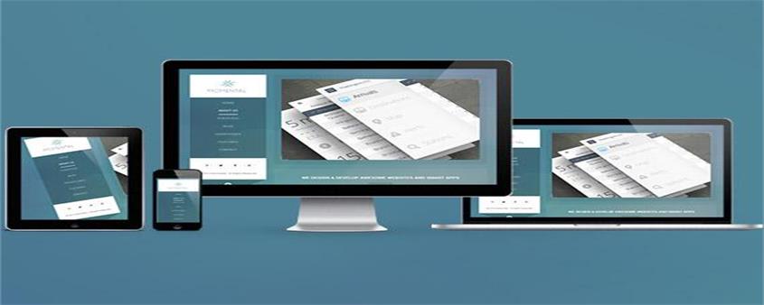
What is responsive layout

Today I will share with you the knowledge about responsive layout. It has a certain reference function and I hope it will be helpful to everyone.
Concept
Responsive design is a web development method by which a website is planned, designed and developed so that it displays optimally in a variety of devices, whether using a desktop, tablet or mobile device, Web page layouts defined in CSS can be allowed to expand to the width of the browser, and Javascript and jQuery will also accompany this behavior
Responsive Design Basics
Breakpoints
are created when a CSS3 media query is used to create a conditional boundary and then trigger the width to an alternate style in the browser for a specific device type. We typically use max-width breakpoints for mobile-first (scaling up) builds as well as creating desktop-first (shrinking) builds and min-width bounds. Media queries can also be used to determine height and even device orientation. The breakpoint size, which is the width, can be set by px or em. As new technology continues to improve, it will be discovered that two different devices can match the same breakpoint
fluidity
Fluid scaling can be achieved though several different way to do it, but it always involves percentages or em values that make the container expand within the scope of its parent element, and ultimately the browser. Fluid scaling is necessary to achieve responsiveness between breakpoints and maintain column flow in a responsive grid. For example, if a div is set to have a width of 100% and a height of auto, then we will find that the div will always be centered no matter whether the browser is enlarged or reduced. This is the benefit of fluidity
Responsive web design in action
Responsive sites use a fluid grid i.e. all page elements will resize proportionally, not pixels. For example, if we want to write three columns, we will not define a specific width for each column, but how wide it is relative to other columns. You can use a percentage to set it, and media such as images must also be resized relatively. This allows the image to remain within its column or relative design element.
Example
Use the viewport meta tag to control the layout on the mobile browser
<!DOCTYPE html>
<html>
<head>
<meta charset="UTF-8">
<meta content="initial-scale=1.0,user-scalable=no,maximum-scale=1,width=device-width" name="viewport" />
<title>Document</title>
<style>
*{
padding:0;
left:0;
list-style: none;
}
.box li{
width:25%;
height: 100%;
margin-bottom: 1%;
background-color: pink;
color:#fff;
text-align: center;
}
}
</style>
</head>
<body>
<div>
<ul>
<li>盒子1</li>
<li>盒子2</li>
<li>盒子3</li>
<li>盒子4</li>
</ul>
</div>
</body>
</html>When the browser window is the largest

When the browser window is reduced

Summary: The above is the entire content of this article. I hope that through this article everyone will understand the responsive layout.
The above is the detailed content of What is responsive layout. For more information, please follow other related articles on the PHP Chinese website!

Hot AI Tools

Undresser.AI Undress
AI-powered app for creating realistic nude photos

AI Clothes Remover
Online AI tool for removing clothes from photos.

Undress AI Tool
Undress images for free

Clothoff.io
AI clothes remover

AI Hentai Generator
Generate AI Hentai for free.

Hot Article
Hot Tools

Notepad++7.3.1
Easy-to-use and free code editor

SublimeText3 Chinese version
Chinese version, very easy to use

Zend Studio 13.0.1
Powerful PHP integrated development environment

Dreamweaver CS6
Visual web development tools

SublimeText3 Mac version
God-level code editing software (SublimeText3)
Hot Topics
 1378
1378
 52
52

 How to create a responsive blog list layout using HTML and CSS
Oct 21, 2023 am 10:00 AM
How to create a responsive blog list layout using HTML and CSS
Oct 21, 2023 am 10:00 AM
How to Create a Responsive Blog List Layout Using HTML and CSS In today’s digital age, blogs have become an important platform for people to share their opinions and experiences. And in order to attract more readers, a beautiful and responsive blog list layout is crucial. In this article, we will learn how to create a simple yet functional responsive blog list layout using HTML and CSS. First, we need to prepare some basic HTML code. The following is the HTML structure of a simple blog list layout: <
 Unit Selection Guide for Responsive Layout Design
Jan 27, 2024 am 08:26 AM
Unit Selection Guide for Responsive Layout Design
Jan 27, 2024 am 08:26 AM
With the popularity of mobile devices and the development of technology, responsive layout has become one of the essential skills for designers. Responsive layout is designed to provide the best user experience for screens of different sizes, allowing web pages to automatically adjust their layout on different devices to ensure the readability and usability of content. Choosing the right units is one of the key steps in responsive layout design. This article will introduce some commonly used units and provide suggestions for selecting units. Pixel (px): Pixel is the smallest unit on the screen. It is an absolute unit and does not automatically change as the screen size changes.
 Explore the best responsive layout frameworks: the competition is fierce!
Feb 19, 2024 pm 05:19 PM
Explore the best responsive layout frameworks: the competition is fierce!
Feb 19, 2024 pm 05:19 PM
Responsive layout framework competition: who is the best choice? With the popularity and diversification of mobile devices, responsive layout of web pages has become more and more important. In order to cater to the different devices and screen sizes of users, it is essential to adopt a responsive layout framework when designing and developing web pages. However, with so many framework options out there, we can’t help but ask: which one is the best choice? The following will be a comparative evaluation of three popular responsive layout frameworks, namely Bootstrap, Foundation and Tailwind.
 How to create a responsive blog layout using HTML and CSS
Oct 21, 2023 am 10:54 AM
How to create a responsive blog layout using HTML and CSS
Oct 21, 2023 am 10:54 AM
How to Create a Responsive Blog Layout Using HTML and CSS In today’s Internet age, blogs have become an important platform for people to share knowledge, experiences, and stories. Designing an attractive and responsive blog will allow your content to display better on different sizes and devices, improving user experience. This article will introduce how to use HTML and CSS to create a responsive blog layout, while providing specific code examples. 1. HTML structure First, we need to build the basic HTML structure of the blog. The following is a
 CSS layout tutorial: The best way to implement a two-column responsive layout
Oct 18, 2023 am 11:04 AM
CSS layout tutorial: The best way to implement a two-column responsive layout
Oct 18, 2023 am 11:04 AM
CSS Layout Tutorial: The Best Way to Implement Two-Column Responsive Layout Introduction: In web design, responsive layout is a very important technology that allows web pages to automatically adjust their layout according to the screen size and resolution of the user's device, providing Better user experience. In this tutorial, we'll show you how to use CSS to implement a simple two-column responsive layout, and provide specific code examples. 1. HTML structure: First, we need to create a basic HTML structure, as shown below: <!DOCTYPEht
 Practical tips for using HTML fixed positioning in responsive layouts
Jan 20, 2024 am 09:55 AM
Practical tips for using HTML fixed positioning in responsive layouts
Jan 20, 2024 am 09:55 AM
Application skills of HTML fixed positioning in responsive layout, specific code examples are required. With the popularity of mobile devices and the increase in user demand for responsive layout, developers have encountered more challenges in web design. One of the key issues is how to implement fixed positioning to ensure that elements can be fixed at specific locations on the page under different screen sizes. This article will introduce the application skills of HTML fixed positioning in responsive layout and provide specific code examples. Fixed positioning in HTML is through the position attribute of CSS
 Implementation method of HTML's responsive layout design guide
Jan 27, 2024 am 08:26 AM
Implementation method of HTML's responsive layout design guide
Jan 27, 2024 am 08:26 AM
How to use HTML to implement responsive layout design. With the popularity of mobile devices and the rapid development of the Internet, responsive layout has become an essential skill for designers. Responsive layout allows the website to automatically adapt to different screen sizes and resolutions on different devices, allowing users to have a better browsing experience. This article will introduce how to use HTML to implement responsive layout design and provide specific code examples. Using @media query @media query is a feature in CSS3 that can be applied based on different media conditions
 How to create a responsive photo album display layout using HTML and CSS
Oct 19, 2023 am 08:51 AM
How to create a responsive photo album display layout using HTML and CSS
Oct 19, 2023 am 08:51 AM
How to use HTML and CSS to create a responsive photo album display layout. The photo album display layout is a common page layout type in websites and can be used to display pictures, photos, images and other content. In today's environment where mobile devices are popular, a good photo album display layout needs to have a responsive design that can adapt to different screen sizes and have good display effects on different devices. This article will introduce how to use HTML and CSS to create a responsive photo album display layout, and provide specific code examples. I hope readers can pass the instructions
