How to use CSS3 to beautify radio, checkbox and switch buttons
The content of this article is about how to use CSS3 to beautify the radio, checkbox and switch buttons. It has certain reference value. Friends in need can refer to it. I hope it will be useful to you. Helps.
Many times we need to beautify the radio and checkbox because the native style is ugly and the performance is not uniform. Before CSS3, js was generally used for simulation, but now pure CSS can be used to beautify the radio and checkbox. For the mobile terminal, I have written related simulation styles very early: a checkbox suitable for the mobile terminal and a switch button implemented in css3. These two articles only support mobile pages, and webkit also supports single-tagged input elements using pseudo-classes (:before or:after). I recently worked on a PC-side project, taking into account the compatibility with more PC browsers, so I made some improvements on this basis.
Let’s take a look at the effect first:
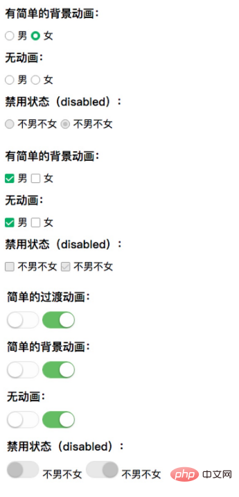
Let’s take a look at the HTML structure:
html Code:
<label class="bui-radios-label bui-radios-anim">
<input type="radio" name="sex"/><i class="bui-radios"></i> 男
</label>
This The structure has a label label, which contains input elements and i elements. The basic principle is: first use visibility: hidden; opacity: 0; to "hide" the input element, and use the characteristics of the label tag to select or uncheck the input element when clicked. The i element combines pseudo-classes (:before or :after) to simulate the appearance of radio and checkbox.
Finally take a look at the CSS code:
css code:
/* radio */
label.bui-radios-label input {
position: absolute;
opacity: 0;
visibility: hidden;
}
label.bui-radios-label .bui-radios {
display: inline-block;
position: relative;
width: 13px;
height: 13px;
background: #FFFFFF;
border: 1px solid #979797;
border-radius: 50%;
vertical-align: -2px;
}
label.bui-radios-label input:checked + .bui-radios:after {
position: absolute;
content: "";
width: 7px;
height: 7px;
background-color: #fff;
border-radius: 50%;
top: 3px;
left: 3px;
}
label.bui-radios-label input:checked + .bui-radios {
background: #00B066;
border: 1px solid #00B066;
}
label.bui-radios-label input:disabled + .bui-radios {
background-color: #e8e8e8;
border: solid 1px #979797;
}
label.bui-radios-label input:disabled:checked + .bui-radios:after {
background-color: #c1c1c1;
}
label.bui-radios-label.bui-radios-anim .bui-radios {
-webkit-transition: background-color ease-out .3s;
transition: background-color ease-out .3s;
}There are a few points to note here:
1. The tick in the checkbox Using iconfont, of course you can change the image, or use pseudo-classes (:before or:after) to simulate.
2. Added some simple transition effects or background animations.
3. A particularly important point is: use the characteristics of the label tag. For students who are not good at HTML, please first understand the characteristics of the label tag.
The above is a complete introduction to how to use CSS3 to beautify the radio, checkbox and switch button. If you want to know more about CSS3 tutorial, please pay attention to PHP Chinese website.
The above is the detailed content of How to use CSS3 to beautify radio, checkbox and switch buttons. For more information, please follow other related articles on the PHP Chinese website!

Hot AI Tools

Undresser.AI Undress
AI-powered app for creating realistic nude photos

AI Clothes Remover
Online AI tool for removing clothes from photos.

Undress AI Tool
Undress images for free

Clothoff.io
AI clothes remover

AI Hentai Generator
Generate AI Hentai for free.

Hot Article

Hot Tools

Notepad++7.3.1
Easy-to-use and free code editor

SublimeText3 Chinese version
Chinese version, very easy to use

Zend Studio 13.0.1
Powerful PHP integrated development environment

Dreamweaver CS6
Visual web development tools

SublimeText3 Mac version
God-level code editing software (SublimeText3)

Hot Topics
 Demystifying Screen Readers: Accessible Forms & Best Practices
Mar 08, 2025 am 09:45 AM
This is the 3rd post in a small series we did on form accessibility. If you missed the second post, check out "Managing User Focus with :focus-visible". In
 Create a JavaScript Contact Form With the Smart Forms Framework
Mar 07, 2025 am 11:33 AM
This tutorial demonstrates creating professional-looking JavaScript forms using the Smart Forms framework (note: no longer available). While the framework itself is unavailable, the principles and techniques remain relevant for other form builders.
 Adding Box Shadows to WordPress Blocks and Elements
Mar 09, 2025 pm 12:53 PM
The CSS box-shadow and outline properties gained theme.json support in WordPress 6.1. Let's look at a few examples of how it works in real themes, and what options we have to apply these styles to WordPress blocks and elements.
 Comparing the 5 Best PHP Form Builders (And 3 Free Scripts)
Mar 04, 2025 am 10:22 AM
This article explores the top PHP form builder scripts available on Envato Market, comparing their features, flexibility, and design. Before diving into specific options, let's understand what a PHP form builder is and why you'd use one. A PHP form
 Working With GraphQL Caching
Mar 19, 2025 am 09:36 AM
If you’ve recently started working with GraphQL, or reviewed its pros and cons, you’ve no doubt heard things like “GraphQL doesn’t support caching” or
 Making Your First Custom Svelte Transition
Mar 15, 2025 am 11:08 AM
The Svelte transition API provides a way to animate components when they enter or leave the document, including custom Svelte transitions.
 Show, Don't Tell
Mar 16, 2025 am 11:49 AM
How much time do you spend designing the content presentation for your websites? When you write a new blog post or create a new page, are you thinking about
 Classy and Cool Custom CSS Scrollbars: A Showcase
Mar 10, 2025 am 11:37 AM
In this article we will be diving into the world of scrollbars. I know, it doesn’t sound too glamorous, but trust me, a well-designed page goes hand-in-hand


