How to cut elements in css? How to use the clip attribute
We can use the css clip attribute to cut the area of the element, leaving only a part of the element visible. The remaining visible element is called the clipping area. This article will introduce to you how the CSS clip attribute cuts elements. It has certain reference value. Friends in need can refer to it. I hope it will be helpful to you.

In CSS, the clip attribute can only work on elements with the absolute positioning: "position:absolute" or fixed positioning: "position:fixed" attribute set. It has no effect on elements with relative positioning: "position:relative" or static positioning: "position:static" attributes set.
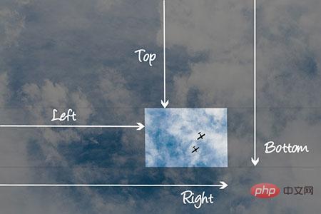
When using clip, we can specify an inward offset to specify the area of the edge of the element to be clipped.
The clip property only accepts one shape function, the rect() function, as a value. Let's take a look at the basic syntax of the rect() function:
rect(< top >,< right >,< bottom >,< left >);
We can see that the rect() function takes four parameters, which are offset inward from the top and left borders of the element. Offset.
The top and bottom values both define offsets from the top border, while the left and right values both define offsets from the left border.

Show clipping property offset
The cropping area, or the part of an element that remains visible after clipping the element, is defined by the offset of the rect() function, rect() The rectangular shape that the function can create, as shown above. The clipping region of an
element will clip away any aspect of the element outside the clipping region (e.g., content, children, background, borders, text decorations, outlines, etc.). Clipped content will not cause overflow.
Usage of clip attribute
Basic syntax:
clip: auto | rect() | inherit;
rect() function syntax:
rect(<top>, <right>, <bottom>, <left>)
Instructions:
1. auto: The element is not clipped.
2. inherit: The element inherits its clip value from its parent.
3. rect(): Specify the rectangular clipping area. That is, it specifies that the visible area of the element after clipping it is rectangular.
rect() function has four parameters. The parameters can be comma-separated or space-separated.
rect(< top >,< right >,< bottom >,< left >)/ *标准语法* /
/* 要么 */
rect(< top >  < right >  < bottom >  < left >)/ *向后兼容语法* /
rect() function also accepts the keyword auto as an offset. The value auto indicates that the given edge of the clipping area will be the same as the edge of the element's bounding box.
The parameters of the rect() function: top, right, bottom and left offset also accept negative length values.
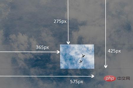
Example: The part of the element is kept vertically between "40px" and "150px", and horizontally between "80px" and "260px"
img {
   clip:rect(275px,575px,425px,365px);
}Rendering:

Example showing visible area after clipped element
The older space-delimited syntax is supported in Internet Explorer 4 to 7, so to ensure that clipping works in these browsers Valid in the browser, we can write both methods:
img {
    clip:rect(40px 260px 150px 80px); / * IE 4到7 * /
    clip:rect(40px,260px,150px,80px); / * IE8 +和其他浏览器* /
}Example of clip attribute:
html code:
<div class="container">
  <p>
   在四个图像上悬停,以查看它们的剪辑区域展开。
  </p>
  <div class="element element-1">
    <img src="/static/imghw/default1.png"  data-src="images/cat-4.jpg"  class="lazy"   alt="">
  </div>
  <div class="element element-2">
    <img src="/static/imghw/default1.png"  data-src="images/cat-4.jpg"  class="lazy"   alt="">
  </div>
  <div class="element element-3">
    <img src="/static/imghw/default1.png"  data-src="images/cat-3.jpg"  class="lazy"   alt="">
  </div>
  <div class="element element-4">
    <img src="/static/imghw/default1.png"  data-src="https://img.php.cn//upload/image/246/361/261/1543393763686924.gif"  class="lazy"   alt="">
  </div>
</div>css code:
.container {
  margin: 40px auto;
  width: 300px;
  position: relative;
}

.element {
  width: 300px;
  height: 300px;
  z-index: 0;
  position: absolute;
  -webkit-transition: clip .4s ease-in-out, z-index .2s linear .4s;
  transition: clip .4s ease-in-out, z-index .2s linear .4s;
}

img {
  max-width: 100%;
}

.element-1 {
  background-color: #2c3e50;
  clip: rect(0px, 150px, 150px, 0px);
}

.element-2 {
  background-color: #f39c12;
  clip: rect(0px, 300px, 150px, 150px);
}

.element-3 {
  background-color: #16a085;
  clip: rect(150px, 150px, 300px, 0px);
}

.element-4 {
  background-color: #8e44ad;
  clip: rect(150px, 300px, 300px, 150px);
}

.element:hover {
  z-index: 1;
  -webkit-transition: clip .4s ease-in-out .2s, z-index .2s linear;
  transition: clip .4s ease-in-out .2s, z-index .2s linear;
  clip: rect(0px, 300px, 300px, 0px);
}Rendering:

##Browser support
Summary: The above is the entire content of this article, I hope it will be helpful to everyone's study.
The above is the detailed content of How to cut elements in css? How to use the clip attribute. For more information, please follow other related articles on the PHP Chinese website!

Hot AI Tools

Undresser.AI Undress
AI-powered app for creating realistic nude photos

AI Clothes Remover
Online AI tool for removing clothes from photos.

Undress AI Tool
Undress images for free

Clothoff.io
AI clothes remover

Video Face Swap
Swap faces in any video effortlessly with our completely free AI face swap tool!

Hot Article

Hot Tools

Notepad++7.3.1
Easy-to-use and free code editor

SublimeText3 Chinese version
Chinese version, very easy to use

Zend Studio 13.0.1
Powerful PHP integrated development environment

Dreamweaver CS6
Visual web development tools

SublimeText3 Mac version
God-level code editing software (SublimeText3)

Hot Topics
 1390
1390
 52
52
 How to use bootstrap in vue
Apr 07, 2025 pm 11:33 PM
Using Bootstrap in Vue.js is divided into five steps: Install Bootstrap. Import Bootstrap in main.js. Use the Bootstrap component directly in the template. Optional: Custom style. Optional: Use plug-ins.
 The Roles of HTML, CSS, and JavaScript: Core Responsibilities
Apr 08, 2025 pm 07:05 PM
HTML defines the web structure, CSS is responsible for style and layout, and JavaScript gives dynamic interaction. The three perform their duties in web development and jointly build a colorful website.
 How to write split lines on bootstrap
Apr 07, 2025 pm 03:12 PM
There are two ways to create a Bootstrap split line: using the tag, which creates a horizontal split line. Use the CSS border property to create custom style split lines.
 Understanding HTML, CSS, and JavaScript: A Beginner's Guide
Apr 12, 2025 am 12:02 AM
WebdevelopmentreliesonHTML,CSS,andJavaScript:1)HTMLstructurescontent,2)CSSstylesit,and3)JavaScriptaddsinteractivity,formingthebasisofmodernwebexperiences.
 How to use bootstrap button
Apr 07, 2025 pm 03:09 PM
How to use the Bootstrap button? Introduce Bootstrap CSS to create button elements and add Bootstrap button class to add button text
 How to resize bootstrap
Apr 07, 2025 pm 03:18 PM
To adjust the size of elements in Bootstrap, you can use the dimension class, which includes: adjusting width: .col-, .w-, .mw-adjust height: .h-, .min-h-, .max-h-
 How to set up the framework for bootstrap
Apr 07, 2025 pm 03:27 PM
To set up the Bootstrap framework, you need to follow these steps: 1. Reference the Bootstrap file via CDN; 2. Download and host the file on your own server; 3. Include the Bootstrap file in HTML; 4. Compile Sass/Less as needed; 5. Import a custom file (optional). Once setup is complete, you can use Bootstrap's grid systems, components, and styles to create responsive websites and applications.
 How to insert pictures on bootstrap
Apr 07, 2025 pm 03:30 PM
There are several ways to insert images in Bootstrap: insert images directly, using the HTML img tag. With the Bootstrap image component, you can provide responsive images and more styles. Set the image size, use the img-fluid class to make the image adaptable. Set the border, using the img-bordered class. Set the rounded corners and use the img-rounded class. Set the shadow, use the shadow class. Resize and position the image, using CSS style. Using the background image, use the background-image CSS property.


