 Web Front-end
 CSS Tutorial
 In grid layout, the width of the grid is specified as the ratio of the area and the width of the entire page.
In grid layout, the width of the grid is specified as the ratio of the area and the width of the entire page.
In Grid Layout, you can specify the width of the grid as a ratio of the display area or the width of the entire page, but if you specify the width of the grid as a ratio, you need to use fr as the unit. Let’s look at the specific content below.
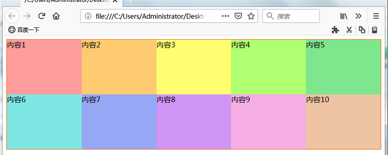
Let’s not say much, let’s look directly at the specific examples
The code is as follows:
Write the following HTML file
SimpleGridFr.css
.Container {
    display: grid;
    grid-template-columns: 1fr 1fr 1fr 1fr 1fr;
    grid-template-rows: 120px 120px;
    border: solid #ff6a00 1px;
    }
.GridItem1 {
    grid-column: 1 / 2;
    grid-row: 1 / 2;
    background-color: #ff9c9c;
    }
.GridItem2 {
    grid-column: 2 / 3;
    grid-row: 1 / 2;
    background-color: #ffcb70;
    }
.GridItem3 {
    grid-column: 3 / 4;
    grid-row: 1 / 2;
    background-color: #fffd70;
    }
.GridItem4 {
    grid-column: 4 / 5;
    grid-row: 1 / 2;
    background-color: #b0ff70;
    }
.GridItem5 {
    grid-column: 5 / 6;
    grid-row: 1 / 2;
    background-color: #7ee68d;
    }
.GridItem6 {
    grid-column: 1 / 2;
    grid-row: 2 / 3;
    background-color: #7ee6e2;
    }
.GridItem7 {
    grid-column: 2 / 3;
    grid-row: 2 / 3;
    background-color: #95a7f5
    }
.GridItem8 {
    grid-column: 3 / 4;
    grid-row: 2 / 3;
    background-color: #d095f5;
    }
.GridItem9 {
    grid-column: 4 / 5;
    grid-row: 2 / 3;
    background-color: #f5aee4;
    }
.GridItem10 {
    grid-column: 5 / 6;
    grid-row: 2 / 3;
    background-color: #edc3a4;
}SimpleGridFr.html
<!DOCTYPE html>
<html>
<head>
<meta charset="utf-8"/>
<title></title>
<link rel="stylesheet" href="SimpleGridFr.css"/>
</head>
<body>
    <div class="Container">
      <div class="GridItem1">項目1</div>
      <div class="GridItem2">項目2</div>
      <div class="GridItem3">項目3</div>
      <div class="GridItem4">項目4</div>
      <div class="GridItem5">項目5</div>
      <div class="GridItem6">項目6</div>
      <div class="GridItem7">項目7</div>
      <div class="GridItem8">項目8</div>
      <div class="GridItem9">項目9</div>
      <div class="GridItem10">項目10</div>
    </div>
  </body>
</html>Description:
In this example, the CSS description of the Container class is as follows shown. We set the grid columns (horizontally) to 5 columns and the rows (vertical) to 2 rows. The value of
grid-template-columns is set to 1fr, and with this setting, the width of the grid is displayed proportionally. In this example, since there are five settings for 1fr, the width of 1fr is displayed as 1/5 of the width of the display area (the entire page).
.Container {
    display: grid;
    grid-template-columns: 1fr 1fr 1fr 1fr 1fr;
    grid-template-rows: 120px 120px;
    border: solid #ff6a00 1px;
}Assign the div boxes of "GridItem 1" ~ "Griditem 10" of the HTML page to each cell of the grid.
Display results
Run the above HTML page. The effect shown below will be displayed. Five grid widths are displayed at equal intervals.
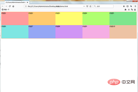
Reducing the window width reduces the width of the unit frame of each grid.
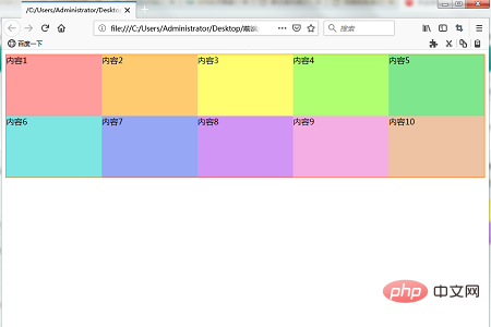
Reducing the window further, the width of the unit frame of each grid will continue to shrink
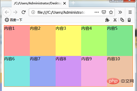
Finally, let’s Change some values in the following code to see what happens
Confirm that when a value other than 1 fr is specified in the grid-tempat-COumns attribute, change the settings of the Continer class to the following.
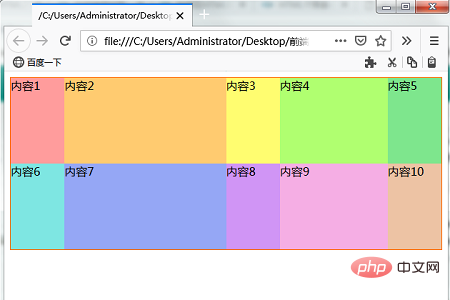
In the following description, the first column, the third column, and the fifth column are 1 fr, the second column is 3fr, and the fourth column is 2fr. Since the overall total is 8 fr, the width of the cells in columns 1, 3, and 5 is one-eighth the width of the display area (window width). Likewise the second column is 3/8ths wide and the fourth column is 1/4ths (2/8ths) wide.
.Container {
    display: grid;
    grid-template-columns: 1fr 3fr 1fr 2fr 1fr;
    grid-template-rows: 120px 120px;
    border: solid #ff6a00 1px;
}Display the changed HTML page. The effect shown below will be displayed.
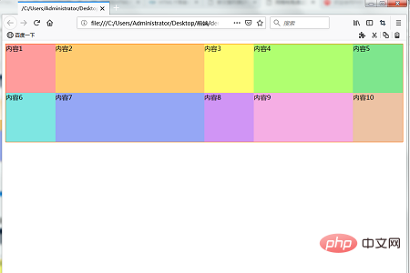
Reduce the window width. As the width of the window shrinks the width of the grid shrinks. The width is reduced while maintaining the grid cell width ratio.
The above is the detailed content of In grid layout, the width of the grid is specified as the ratio of the area and the width of the entire page.. For more information, please follow other related articles on the PHP Chinese website!

Hot AI Tools

Undresser.AI Undress
AI-powered app for creating realistic nude photos

AI Clothes Remover
Online AI tool for removing clothes from photos.

Undress AI Tool
Undress images for free

Clothoff.io
AI clothes remover

AI Hentai Generator
Generate AI Hentai for free.

Hot Article

Hot Tools

Notepad++7.3.1
Easy-to-use and free code editor

SublimeText3 Chinese version
Chinese version, very easy to use

Zend Studio 13.0.1
Powerful PHP integrated development environment

Dreamweaver CS6
Visual web development tools

SublimeText3 Mac version
God-level code editing software (SublimeText3)

Hot Topics
 1371
1371
 52
52
 How to implement irregular grid layout through CSS Flex layout
Sep 28, 2023 pm 09:49 PM
How to implement irregular grid layout through CSSFlex elastic layout. In web design, it is often necessary to use grid layout to achieve page segmentation and layout. Usually grid layout is regular, and each grid is the same size. Sometimes we may need to implement some irregular grid layout. CSSFlex elastic layout is a powerful layout method that can easily implement various grid layouts, including irregular grid layouts. Below we will introduce how to use CSSFlex elastic layout to achieve different
 CSS Layout Guide: Best Practices for Implementing Grid Layout
Oct 26, 2023 am 10:00 AM
CSS Layout Guide: Best Practices for Implementing Grid Layout Introduction: In modern web design, grid layout has become a very popular layout method. It can help us better organize the page structure and make it more hierarchical and readable. This article will introduce the best practices of grid layout and specific code examples to help you better implement grid layout. 1. What is grid layout? Grid layout refers to dividing the page into multiple columns and rows through a grid, so that the elements of the page can be easily arranged according to certain rules. grid layout
 How to create a basic grid layout page using HTML
Oct 21, 2023 am 10:37 AM
How to use HTML to create a basic grid layout page Grid layout is a common and practical page layout method. It can divide the page into multiple areas in the form of a grid, and can flexibly adjust the size and position of the areas. . In this article, we will introduce how to use HTML to create a basic grid layout page, and provide specific code examples for reference. First, we need to set a container element in the HTML file, which will serve as the root element of the grid layout, which can be a div or secti
 How to create a responsive image grid layout using HTML and CSS
Oct 27, 2023 am 10:26 AM
How to Create a Responsive Image Grid Layout Using HTML and CSS In today’s Internet age, images occupy an important part of web content. In order to display various types of images, we need an effective and beautiful grid layout. In this article, we will learn how to create a responsive image grid layout using HTML and CSS. First, we will create a basic structure using HTML. Here is sample code: <!DOCTYPEhtml><html>
 CSS Grid Layout: Create complex web page layouts using grid layout
Nov 18, 2023 am 10:35 AM
CSS Grid Layout: Creating complex web page layouts using grid layout requires specific code examples In modern web design, web page layout plays a vital role. In order to create complex web layouts, designers and developers need to use excellent tools and techniques. Among them, CSS grid layout is a powerful and flexible method that can help us create complex web page layouts easily. This article will introduce the use of CSS grid layout in detail and provide some practical code examples. CSS grid layout is a new layout mode,
 How to use Vue to implement grid layout effects
Sep 22, 2023 am 10:24 AM
How to use Vue to implement grid layout effects requires specific code examples. In modern web development, layout is a very important part. Grid layout is a common layout method that can make web pages present a beautiful arrangement. As a popular JavaScript framework, Vue provides a convenient way to implement grid layout effects. This article will introduce how to use Vue to implement grid layout effects and provide code examples. 1. Install Vue and related dependent libraries. Before starting, we need to install Vue and
 How to implement a grid list layout using HTML and CSS
Oct 20, 2023 pm 05:45 PM
How to use HTML and CSS to implement grid list layout In modern web design, grid list layout has become a very common layout pattern. It can help us create beautiful web pages easily and let the content be clearly arranged in the web page. This article will introduce how to use HTML and CSS to implement grid list layout, and provide specific code examples. First, we need to use HTML to build the infrastructure of the web page. Here's a simple example: <!DOCTYPEhtml><
 Implementation method of grid layout developed in PHP in WeChat mini program
Jun 01, 2023 am 08:48 AM
In recent years, WeChat mini programs have become one of the important tools for mobile terminal development, and PHP, as a language commonly used for Web back-end development, has gradually become an indispensable part of mini program development. Among them, grid layout is a commonly used layout method in mini programs. This article will introduce the implementation method of using PHP to develop grid layout for WeChat mini programs. 1. Understand Grid Layout Grid Layout (GridLayout) is a layout method based on rows and columns, which can achieve the alignment of various elements such as pictures, text, charts, etc.


