

How to achieve repeated linear gradient effect in CSS3

How to achieve the repeating linear gradient effect in css3: first create an HTML sample file; then create a div in the body; finally use the "repeating-linear-gradient()" function in css3 to achieve the repeating gradient effect That’s it.

The operating environment of this article: Windows7 system, HTML5&&CSS3 version, Dell G3 computer.
#For front-end learning friends, the gradient effect is certainly no stranger. Everyone should know that there are linear gradients and radial gradients in CSS3. And in the previous article, we have also introduced to you the effect of CSS3 to achieve linear gradient and CSS3 to achieve the effect of radial gradient. Friends who need it can refer to it first.
This section mainly introduces to you css3 method to achieve repeated linear gradient effect.
The repeating linear gradient effect may sound unfamiliar to some friends, but it is also a common gradient effect in our daily lives.
Code examples are as follows:
<!DOCTYPE>
<html>
<meta charset="utf-8">
<head>
    <title>CSS3创建重复线性渐变效果</title>
    <style type="text/css">
        .container{
            text-align:center;
            padding:20px 0;
            width:960px;
            margin: 0 auto;
        }

        .container div{
            width:200px;
            height:150px;
            display:inline-block;
            margin:2px;
            color:#ec8007;
            vertical-align: top;
            line-height: 230px;
            font-size: 20px;
        }
        .repeating-linear{
            background:repeating-linear-gradient(-45deg, #4b6c9c, #5ac4ed 5px, #fff 5px, #fff 10px);
        }
    </style>
</head>
<body>
<div class="container">
 <div class="repeating-linear">重复线性渐变</div>
</div>
</body>
</html>Recommended reference study: "CSS3 Tutorial"
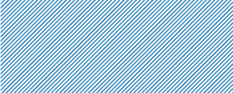
The repeated linear effect is as follows Picture:

As shown in the picture, the linear gradient effect of blue and white strip intervals. Repeat the gradient from -45 degrees linear gradient (which is 45 degrees in the lower right corner), from #4b6c9c to #5ac4ed and white to white.
The repeating-linear-gradient() function in css3 is used to create a repeating linear gradient "image".
Syntax:
background: repeating-linear-gradient(angle | to side-or-corner, color-stop1, color-stop2, ...);

Note: Internet Explorer 9 and earlier versions of IE browsers do not support gradients.
This article is an introduction to the method of achieving repeated linear gradient effects in CSS3. It is very simple. I hope it will be helpful to friends in need!
The above is the detailed content of How to achieve repeated linear gradient effect in CSS3. For more information, please follow other related articles on the PHP Chinese website!

Hot AI Tools

Undresser.AI Undress
AI-powered app for creating realistic nude photos

AI Clothes Remover
Online AI tool for removing clothes from photos.

Undress AI Tool
Undress images for free

Clothoff.io
AI clothes remover

Video Face Swap
Swap faces in any video effortlessly with our completely free AI face swap tool!

Hot Article
Hot Tools

Notepad++7.3.1
Easy-to-use and free code editor

SublimeText3 Chinese version
Chinese version, very easy to use

Zend Studio 13.0.1
Powerful PHP integrated development environment

Dreamweaver CS6
Visual web development tools

SublimeText3 Mac version
God-level code editing software (SublimeText3)
Hot Topics
 1386
1386
 52
52

 Building an Ethereum app using Redwood.js and Fauna
Mar 28, 2025 am 09:18 AM
Building an Ethereum app using Redwood.js and Fauna
Mar 28, 2025 am 09:18 AM
With the recent climb of Bitcoin’s price over 20k $USD, and to it recently breaking 30k, I thought it’s worth taking a deep dive back into creating Ethereum
 Vue 3
Apr 02, 2025 pm 06:32 PM
Vue 3
Apr 02, 2025 pm 06:32 PM
It's out! Congrats to the Vue team for getting it done, I know it was a massive effort and a long time coming. All new docs, as well.
 Can you get valid CSS property values from the browser?
Apr 02, 2025 pm 06:17 PM
Can you get valid CSS property values from the browser?
Apr 02, 2025 pm 06:17 PM
I had someone write in with this very legit question. Lea just blogged about how you can get valid CSS properties themselves from the browser. That's like this.
 A bit on ci/cd
Apr 02, 2025 pm 06:21 PM
A bit on ci/cd
Apr 02, 2025 pm 06:21 PM
I'd say "website" fits better than "mobile app" but I like this framing from Max Lynch:
 Using Markdown and Localization in the WordPress Block Editor
Apr 02, 2025 am 04:27 AM
Using Markdown and Localization in the WordPress Block Editor
Apr 02, 2025 am 04:27 AM
If we need to show documentation to the user directly in the WordPress editor, what is the best way to do it?
 Comparing Browsers for Responsive Design
Apr 02, 2025 pm 06:25 PM
Comparing Browsers for Responsive Design
Apr 02, 2025 pm 06:25 PM
There are a number of these desktop apps where the goal is showing your site at different dimensions all at the same time. So you can, for example, be writing
 Stacked Cards with Sticky Positioning and a Dash of Sass
Apr 03, 2025 am 10:30 AM
Stacked Cards with Sticky Positioning and a Dash of Sass
Apr 03, 2025 am 10:30 AM
The other day, I spotted this particularly lovely bit from Corey Ginnivan’s website where a collection of cards stack on top of one another as you scroll.
 Let's use (X, X, X, X) for talking about specificity
Mar 24, 2025 am 10:37 AM
Let's use (X, X, X, X) for talking about specificity
Mar 24, 2025 am 10:37 AM
I was just chatting with Eric Meyer the other day and I remembered an Eric Meyer story from my formative years. I wrote a blog post about CSS specificity, and
