How to add image to border in css? css set border image
Today I will introduce to you how to use CSS to add an image to the border of an element. CSS can add an image to the border of an element by setting the border-image attribute or its related attributes. Let’s take a look at the specific content of this article.

A brief introduction to the border-image attribute
In css we can set border-image attribute to define the image to use for the border, instead of using the border-style attribute to give the border style; and use the image as an additional background layer for the element.
Note: border-image attribute is an abbreviation attribute, which can be divided into:
border-image-source attribute, border-image-slice attribute, border-image -width attribute, border-image-outset attribute, and border-image-repeat attribute.
When you want to set an image border on an element, the border-image attribute is set in several steps.
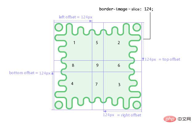
First, use the border-image-slice attribute to cut the image specified in the border-image-source attribute into nine images, namely four corner images, four edge images and one Middle image:

# The border image is cut into nine images. The size of each image is determined by the value given by the border-image-slice attribute. They don't have to be equal in size.
Then, follow the following steps to scale, position and splice the nine obtained images into their corresponding boundary image areas:
1. According to Scale the image using the value specified by the border-image-width property.
The top and bottom edge images are scaled vertically to fit the corresponding specified width offset.
The right and lower left corners are scaled vertically to fit the corresponding specified right and left width offsets.
Scale diagonal images to fit the specified width on the edge where they belong.
Also, the width of the middle image is scaled by the same factor as the top image, unless that factor is zero or infinity, in which case the bottom scale factor is replaced, if not, the width is not scaled . Scales the height of the middle image by the same factor as the left image unless its height is zero or infinity, in which case the right image's scaling factor is substituted, if not, the height is not scaled.
2. Scale the image according to the value specified using the border-image-repeat attribute.
If the first keyword of the border-image-repeat attribute is stretch, the top and bottom edge images and the middle image are stretched to fit the width of the border image area. Their height does not change.
If the first keyword is round, the top, middle, and bottom images are resized in width so that the full amount of them fits exactly in the middle of the bounding image area.
If the first keyword is repeat or space, the top, middle and bottom images are no longer scaled, so their height will only be scaled from the first step above.
If the second keyword is stretch, round, repeat, or space, the same scaling is applied to the corresponding left, center, and right images, thereby affecting the height of the images; except for the first step, they are not scaled width.
3. Now the images are scaled and they are positioned. Positioning images is also related to the border-image-repeat attribute.
If the first keyword is repeat, the top, middle and bottom images are centered horizontally in their respective areas. Otherwise, the images are placed at the left edge of the respective portion of the bounding image area.
If the second keyword is repeat, the left, center and right images are vertically centered in their respective areas. Otherwise, the images are placed at the top edge of the respective portion of the bounding image area.
4. After scaling and positioning the images, tile (repeat) them as many times as necessary to fill their respective areas, based on the value of the border-image-repeat property.
If the value is repeat, the images are repeated to fill as much of their respective areas as possible. If the value is space, any partial tiles are discarded and extra space is allocated before, after, and between tiles.
All images are drawn at the same stacking level as normal borders: immediately in front of the background layer; therefore, the border image will always be on top of any background image.
We can use the border-image-outset attribute to extend the border image beyond the border area of the element.
Usage of border-image attribute
Basic syntax:
1 |
|
Initial: none 100 % / 1 / 0 stretch , which is the concatenation of the initial value of the longhand attribute
Applies to: all elements, except when the value of the border-collapse attribute of the inner table element is collapse.
Instructions:
1. border-image-source: Specify the image to be used for the border
Example:
1 2 3 |
|
2、border-image-slice:用于将要用作边框图像的图像“切片”成九个部分:四个角,四个边和一个中心部。
例如,以下图像已被切成9个部分。顶部,右侧,底部和左侧偏移具有相等的124px值。
1 |
|

3、border-image-width:用于缩放border-image-slice值创建的九个部分的边框图像切片。
4、border-image-outset:用于指定边框图像区域扩展到元素边框区域之外的量
5、border-image-repeat:指定用作边界图像的图像的切片如何缩放和平铺(重复)。
css使用border-image属性设置图像边框的示例:
示例一:
需要用到图片:

html代码:
1 2 3 4 5 6 |
|
css代码:
1 2 3 4 5 6 7 8 9 10 11 12 13 14 15 16 17 18 |
|
效果图:

示例二:
需要用到的图片:

HTML代码:
1 2 3 4 5 6 |
|
css代码:
1 2 3 4 5 6 |
|
效果图:

总结:以上就是本篇文章的全部内容,希望能对大家的学习有所帮助。
The above is the detailed content of How to add image to border in css? css set border image. For more information, please follow other related articles on the PHP Chinese website!

Hot AI Tools

Undresser.AI Undress
AI-powered app for creating realistic nude photos

AI Clothes Remover
Online AI tool for removing clothes from photos.

Undress AI Tool
Undress images for free

Clothoff.io
AI clothes remover

Video Face Swap
Swap faces in any video effortlessly with our completely free AI face swap tool!

Hot Article

Hot Tools

Notepad++7.3.1
Easy-to-use and free code editor

SublimeText3 Chinese version
Chinese version, very easy to use

Zend Studio 13.0.1
Powerful PHP integrated development environment

Dreamweaver CS6
Visual web development tools

SublimeText3 Mac version
God-level code editing software (SublimeText3)

Hot Topics
 1393
1393
 52
52
 1205
1205
 24
24
 How to achieve wave effect with pure CSS3? (code example)
Jun 28, 2022 pm 01:39 PM
How to achieve wave effect with pure CSS3? This article will introduce to you how to use SVG and CSS animation to create wave effects. I hope it will be helpful to you!
 Use CSS skillfully to realize various strange-shaped buttons (with code)
Jul 19, 2022 am 11:28 AM
This article will show you how to use CSS to easily realize various weird-shaped buttons that appear frequently. I hope it will be helpful to you!
 How to hide elements in css without taking up space
Jun 01, 2022 pm 07:15 PM
Two methods: 1. Using the display attribute, just add the "display:none;" style to the element. 2. Use the position and top attributes to set the absolute positioning of the element to hide the element. Just add the "position:absolute;top:-9999px;" style to the element.
 How to implement lace borders in css3
Sep 16, 2022 pm 07:11 PM
In CSS, you can use the border-image attribute to achieve a lace border. The border-image attribute can use images to create borders, that is, add a background image to the border. You only need to specify the background image as a lace style; the syntax "border-image: url (image path) offsets the image border width inward. Whether outset is repeated;".
 How to enlarge the image by clicking the mouse in css3
Apr 25, 2022 pm 04:52 PM
Implementation method: 1. Use the ":active" selector to select the state of the mouse click on the picture; 2. Use the transform attribute and scale() function to achieve the picture magnification effect, the syntax "img:active {transform: scale(x-axis magnification, y Axis magnification);}".
 It turns out that text carousel and image carousel can also be realized using pure CSS!
Jun 10, 2022 pm 01:00 PM
How to create text carousel and image carousel? The first thing everyone thinks of is whether to use js. In fact, text carousel and image carousel can also be realized using pure CSS. Let’s take a look at the implementation method. I hope it will be helpful to everyone!
 How to set animation rotation speed in css3
Apr 28, 2022 pm 04:32 PM
In CSS3, you can use the "animation-timing-function" attribute to set the animation rotation speed. This attribute is used to specify how the animation will complete a cycle and set the speed curve of the animation. The syntax is "element {animation-timing-function: speed attribute value;}".
 Does css3 animation effect have deformation?
Apr 28, 2022 pm 02:20 PM
The animation effect in css3 has deformation; you can use "animation: animation attribute @keyframes ..{..{transform: transformation attribute}}" to achieve deformation animation effect. The animation attribute is used to set the animation style, and the transform attribute is used to set the deformation style. .


