 Web Front-end
 CSS Tutorial
 Introduction to the method of creating multiple grid cells (combined cells) in a grid layout
Introduction to the method of creating multiple grid cells (combined cells) in a grid layout
If you use grid layout to create cells that span multiple grids, you can specify the starting and ending boundary ranges of the cells in grid-column and grid-row. Let’s take a look at the specific content.

Let’s first take a look at the format of grid-column and grid-row
grid-column :(水平方向起始位置的边界线)/(水平方向单元格结束位置的边界线)
grid-row :(垂直单元格起始位置的边界线)/(单元格在垂直方向上的结束位置的边界线)
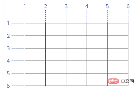
The boundary line distribution is as follows. The horizontal direction is the leftmost side of the grid. The boundary line on the left side of the grid frame is number 1, and the numbers increase one by one to the right. The vertical direction is the top of the grid, the border line above the grid frame is number 1, and the numbers increase toward the bottom.

An example
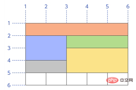
Using grid layout, create a layout like the one shown below.

Explanation:
The orange cell above is grid-column:1/6; grid-row: 1/2;
The blue cell on the left is grid-column:1/3; grid-row:2/4;
The correct green cell is grid-column:3/ 6; grid-row:2/3;
The gray cell in the lower left is grid-column:1/3; grid-row:4/5;
The yellow cell in the lower right The grid is grid-column:3/6; grid-row:3/5;
The white cells below are
grid-column:1/2; grid-row:5/ 6;
grid-column:2/3; grid-row:5/6;
grid-column:3/4; grid-row:5/6;
grid-column:4/5; grid-row:5/6;
grid-column:5/6; grid-row:5/6;
The above layout is as follows Write to the grid cell's class.
The code is as follows
Write the following HTML and CSS.
SimpleGrid.html
<!DOCTYPE html><html><head>
    <meta charset="utf-8" />
    <link rel="stylesheet" href="GridMerge.css" />
    <title></title>
</head>
<body>
  <div class="Container">
    <div class="GridItem1">内容1</div>
    <div class="GridItem2">内容2</div>
    <div class="GridItem3">内容3</div>
    <div class="GridItem4">内容4</div>
    <div class="GridItem5">内容5</div>
    <div class="GridItem6">内容6</div>
    <div class="GridItem7">内容7</div>
    <div class="GridItem8">内容8</div>
    <div class="GridItem9">内容9</div>
    <div class="GridItem10">内容10</div>
  </div>
  </body>
</html>SimpleGrid.css
.Container {
    display: grid;
    grid-template-columns: 160px 160px 160px 160px 160px;
    grid-template-rows: 120px 120px 120px 120px 120px;
    border: solid #ff6a00 1px;
}
.GridItem1 {
    grid-column: 1 / 6;
    grid-row: 1 / 2;
    background-color: #ff9c9c;
    }
.GridItem2 {
    grid-column: 1 / 3;
    grid-row: 2 / 4;
    background-color: #ffcb70;
    }
.GridItem3 {
    grid-column: 1 / 3;
    grid-row: 4 / 5;
    background-color: #7ee68d;
    }
.GridItem4 {
    grid-column: 3 / 6;
    grid-row: 2 / 3;
    background-color: #7ee6e2;
    }
.GridItem5 {
    grid-column: 3 / 6;
    grid-row: 3 / 5;
    background-color: #95a7f5;
    }
.GridItem6 {
    grid-column: 1 / 2;
    grid-row: 5 / 6;
    background-color: #d095f5;
    }
.GridItem7 {
    grid-column: 2 / 3;
    grid-row: 5 / 6;
    background-color: #e1bbfa;
    }
.GridItem8 {
    grid-column: 3 / 4;
    grid-row: 5 / 6;
    background-color: #d2b1e4;
    }
.GridItem9 {
    grid-column: 4 / 5;
    grid-row: 5 / 6;
    background-color: #dcd2e1;
    }
.GridItem10 {
    grid-column: 5 / 6;
    grid-row: 5 / 6;
    background-color: #eee8f1;
}Running results
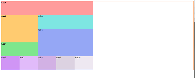
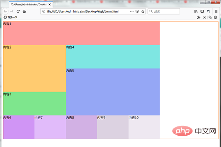
Use a web browser to display the above HTML file. The effect shown below will be displayed. Our layout contains cells that span multiple grids.

The above is the entire content of this article. For more exciting content about grid layout, you can go to the CSS video tutorial## on the php Chinese website. #Column for further study! ! !
The above is the detailed content of Introduction to the method of creating multiple grid cells (combined cells) in a grid layout. For more information, please follow other related articles on the PHP Chinese website!

Hot AI Tools

Undresser.AI Undress
AI-powered app for creating realistic nude photos

AI Clothes Remover
Online AI tool for removing clothes from photos.

Undress AI Tool
Undress images for free

Clothoff.io
AI clothes remover

AI Hentai Generator
Generate AI Hentai for free.

Hot Article

Hot Tools

Notepad++7.3.1
Easy-to-use and free code editor

SublimeText3 Chinese version
Chinese version, very easy to use

Zend Studio 13.0.1
Powerful PHP integrated development environment

Dreamweaver CS6
Visual web development tools

SublimeText3 Mac version
God-level code editing software (SublimeText3)

Hot Topics
 How to implement irregular grid layout through CSS Flex layout
Sep 28, 2023 pm 09:49 PM
How to implement irregular grid layout through CSSFlex elastic layout. In web design, it is often necessary to use grid layout to achieve page segmentation and layout. Usually grid layout is regular, and each grid is the same size. Sometimes we may need to implement some irregular grid layout. CSSFlex elastic layout is a powerful layout method that can easily implement various grid layouts, including irregular grid layouts. Below we will introduce how to use CSSFlex elastic layout to achieve different
 CSS Layout Guide: Best Practices for Implementing Grid Layout
Oct 26, 2023 am 10:00 AM
CSS Layout Guide: Best Practices for Implementing Grid Layout Introduction: In modern web design, grid layout has become a very popular layout method. It can help us better organize the page structure and make it more hierarchical and readable. This article will introduce the best practices of grid layout and specific code examples to help you better implement grid layout. 1. What is grid layout? Grid layout refers to dividing the page into multiple columns and rows through a grid, so that the elements of the page can be easily arranged according to certain rules. grid layout
 How to create a basic grid layout page using HTML
Oct 21, 2023 am 10:37 AM
How to use HTML to create a basic grid layout page Grid layout is a common and practical page layout method. It can divide the page into multiple areas in the form of a grid, and can flexibly adjust the size and position of the areas. . In this article, we will introduce how to use HTML to create a basic grid layout page, and provide specific code examples for reference. First, we need to set a container element in the HTML file, which will serve as the root element of the grid layout, which can be a div or secti
 How to create a responsive image grid layout using HTML and CSS
Oct 27, 2023 am 10:26 AM
How to Create a Responsive Image Grid Layout Using HTML and CSS In today’s Internet age, images occupy an important part of web content. In order to display various types of images, we need an effective and beautiful grid layout. In this article, we will learn how to create a responsive image grid layout using HTML and CSS. First, we will create a basic structure using HTML. Here is sample code: <!DOCTYPEhtml><html>
 CSS Grid Layout: Create complex web page layouts using grid layout
Nov 18, 2023 am 10:35 AM
CSS Grid Layout: Creating complex web page layouts using grid layout requires specific code examples In modern web design, web page layout plays a vital role. In order to create complex web layouts, designers and developers need to use excellent tools and techniques. Among them, CSS grid layout is a powerful and flexible method that can help us create complex web page layouts easily. This article will introduce the use of CSS grid layout in detail and provide some practical code examples. CSS grid layout is a new layout mode,
 How to implement a grid list layout using HTML and CSS
Oct 20, 2023 pm 05:45 PM
How to use HTML and CSS to implement grid list layout In modern web design, grid list layout has become a very common layout pattern. It can help us create beautiful web pages easily and let the content be clearly arranged in the web page. This article will introduce how to use HTML and CSS to implement grid list layout, and provide specific code examples. First, we need to use HTML to build the infrastructure of the web page. Here's a simple example: <!DOCTYPEhtml><
 How to use Vue to implement grid layout effects
Sep 22, 2023 am 10:24 AM
How to use Vue to implement grid layout effects requires specific code examples. In modern web development, layout is a very important part. Grid layout is a common layout method that can make web pages present a beautiful arrangement. As a popular JavaScript framework, Vue provides a convenient way to implement grid layout effects. This article will introduce how to use Vue to implement grid layout effects and provide code examples. 1. Install Vue and related dependent libraries. Before starting, we need to install Vue and
 Implementation method of grid layout developed in PHP in WeChat mini program
Jun 01, 2023 am 08:48 AM
In recent years, WeChat mini programs have become one of the important tools for mobile terminal development, and PHP, as a language commonly used for Web back-end development, has gradually become an indispensable part of mini program development. Among them, grid layout is a commonly used layout method in mini programs. This article will introduce the implementation method of using PHP to develop grid layout for WeChat mini programs. 1. Understand Grid Layout Grid Layout (GridLayout) is a layout method based on rows and columns, which can achieve the alignment of various elements such as pictures, text, charts, etc.


