

How to make a button using CSS

Today’s article will introduce you to four button implementation methods, including ordinary square buttons, rounded buttons, three-dimensional buttons and buttons with simple animations. Let’s take a look at the specific content.

Let’s take a look at the implementation method of ordinary square button
The button code is as follows
HTML code
<!DOCTYPE html>
<html>
<head>
  <meta charset="utf-8">
  <title></title>
</head>
<body>
<button>普通方形How to make a button using CSS</button>
</body>
</html>
Implementation method of rounded button
The code is as follows
HTML code
<button class="kadomaru">圆角How to make a button using CSS</button>
CSS code
.kadomaru {
  width:100px;
  font-size:12px;
  color:#FFFFFF;
  text-align:center;
  display:block;
  padding:10px 0 10px;
  background:#6BCBF6;
  border-radius: 20px;
}How to implement the three-dimensional button
The code is as follows
HTML code
<button class="shadow">立体How to make a button using CSS</button>
CSS Code
.shadow {
  width:100px;
  font-size:12px;
  color:#FFFFFF;
  text-align:center;
  display:block;
  padding:10px 0 10px;
  background:#6BCBF6;
  border-radius:5px;
  box-shadow:1px 1px #1A6EA0;
}Use box-shadow to specify the shadow size and shadow color to create a three-dimensional feeling.
The button effects achieved by the above three methods are as follows

The last one is a button implementation with simple animation. Let’s look at a specific example.
The code is as follows
HTML code
<div class="animation">
  <div class="effect"></div>
  <a href="#"> Touch me </a>
CSS code
.animation {
  width:100px;
  height:50px;
  text-align:center;
  border:2px solid #BBBBBB;
  float:left;
  cursor:pointer;
  position:relative;
  box-sizing:border-box;
  overflow:hidden;
  margin:0 0 40px 0;
}
.animation a {
  font-family:arial;
  font-size:12px;
  color:#BBBBBB;
  text-decoration:none;
  line-height:50px;
  transition:all .10s ease;
  z-index:2;
  position:relative;
}
.effect {
  width:140px;
  height:50px;
  top:-2px;
  left:-140px;
  background:#BBBBBB;
  position:absolute;
  transition:all .5s ease;
  z-index:1;
}
.animation:hover .effect {
  left:0;
}
.animation:hover a {
  color:#FFFFFF;
}To introduce an example of customization, change the left attribute of .effect to right attribute, and change the left attribute of .animation:hover .effect to the right attribute to turn it into a rightward animation.
When the above code is executed, the following effect is displayed on the browser:

Put the mouse on the button, and there will be a rightward animation, showing the effect. As follows

This article has ended here. For information on how to make buttons in CSS, you can go to CSS video tutorial orCSS3 video tutorial column for further study! ! !
The above is the detailed content of How to make a button using CSS. For more information, please follow other related articles on the PHP Chinese website!

Hot AI Tools

Undresser.AI Undress
AI-powered app for creating realistic nude photos

AI Clothes Remover
Online AI tool for removing clothes from photos.

Undress AI Tool
Undress images for free

Clothoff.io
AI clothes remover

AI Hentai Generator
Generate AI Hentai for free.

Hot Article
Hot Tools

Notepad++7.3.1
Easy-to-use and free code editor

SublimeText3 Chinese version
Chinese version, very easy to use

Zend Studio 13.0.1
Powerful PHP integrated development environment

Dreamweaver CS6
Visual web development tools

SublimeText3 Mac version
God-level code editing software (SublimeText3)
Hot Topics
 1378
1378
 52
52

 How to fix Microsoft Teams white screen
Apr 17, 2023 pm 05:07 PM
How to fix Microsoft Teams white screen
Apr 17, 2023 pm 05:07 PM
Restart Microsoft Teams If you get a blank screen after launching Teams, a good place to start is to restart the app itself. To close and restart Microsoft Teams: Right-click the Teams icon in the notification area of the taskbar and click Exit from the menu. Restart Microsoft Teams from the Start menu or desktop shortcut and see if it works. Close Microsoft Teams from Task Manager If a basic restart of the Teams process doesn't work, go into Task Manager and end the task. To close Teams from Task Manager, do the following
 What is the Windows Security Button? All you need to know
Apr 13, 2023 pm 10:22 PM
What is the Windows Security Button? All you need to know
Apr 13, 2023 pm 10:22 PM
What is the Windows Security Button? As the name suggests, Windows Security Button is a security feature that allows you to securely access the login menu and log in to your device using a password. In this case, smartphones are definitely ahead. But Windows portable devices, such as tablets, have begun adding a Windows Security button that's more than just a way to keep unwanted users out. It also provides additional login menu options. Although if you try to find the Windows Security button on your desktop PC or laptop, you might be disappointed. why is that? Tablets vs. PCs The Windows security button is a physical button that exists on tablets
 5 Ways to Disable Delivery Optimization Service in Windows
May 17, 2023 am 09:31 AM
5 Ways to Disable Delivery Optimization Service in Windows
May 17, 2023 am 09:31 AM
There are many reasons why you might want to disable the Delivery Optimization service on your Windows computer. However, our readers complained about not knowing the correct steps to follow. This guide discusses how to disable the Delivery Optimization service in a few steps. To learn more about services, you may want to check out our How to open services.msc guide for more information. What does Delivery Optimization Service do? Delivery Optimization Service is an HTTP downloader with cloud hosting solution. It allows Windows devices to download Windows updates, upgrades, applications and other large package files from alternative sources. Additionally, it helps reduce bandwidth consumption by allowing multiple devices in a deployment to download these packages. In addition, Windo
 How to restart, force restart, and shut down iPad Mini 6
Apr 29, 2023 pm 12:19 PM
How to restart, force restart, and shut down iPad Mini 6
Apr 29, 2023 pm 12:19 PM
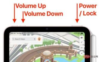
How to Force Restart iPad Mini 6 Force restarting iPad Mini 6 is done with a series of button presses, and it works like this: Press and release for Volume Up Press and release for Volume Down Press and release the Power/Lock button until you see Apple logo, indicating that the iPad Mini has been force restarted. That’s it. You have force restarted the iPad Mini 6! Force restart is usually used for troubleshooting reasons, such as the iPad Mini freezing, apps freezing, or some other general misbehavior. One thing to note about the procedure for force restarting the 6th generation iPad Mini is that for all other devices that have ultra-thin bezels and use
 After rewriting:
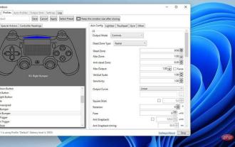
How to Fix PS5 Controller Not Recognized on Windows 11
May 09, 2023 pm 10:16 PM
After rewriting:
How to Fix PS5 Controller Not Recognized on Windows 11
May 09, 2023 pm 10:16 PM
<h3>What should I know about connecting my PS5 controller? </h3><p>As good as the DualSense controller is, there have been reports of the controller not connecting or not being detected. The easiest way to solve this problem is to connect the controller to your PC using an appropriate USB cable. </p><p>Some games natively support DualSense. In these cases, you can simply plug in the controller. But this raises other questions, like what if you don't have a USB cable or don't want to use one
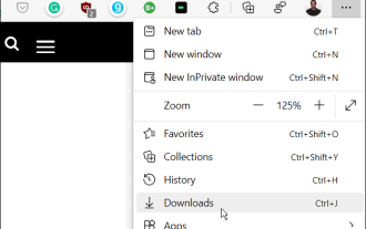 How to clear the download history of Microsoft Edge browser?
Apr 21, 2023 am 09:34 AM
How to clear the download history of Microsoft Edge browser?
Apr 21, 2023 am 09:34 AM
<ul><li><strong>Click to enter:</strong>ChatGPT tool plug-in navigation</li></ul><h2>Find and delete download history in Edge< /h2><p>Like other browsers, Edge has a<strong>Download
![Change the power button action on Windows 11 [5 Tips]](https://img.php.cn/upload/article/000/887/227/169600135086895.png?x-oss-process=image/resize,m_fill,h_207,w_330) Change the power button action on Windows 11 [5 Tips]
Sep 29, 2023 pm 11:29 PM
Change the power button action on Windows 11 [5 Tips]
Sep 29, 2023 pm 11:29 PM
The power button can do more than shut down your PC, although this is the default action for desktop users. If you want to change the power button action in Windows 11, it's easier than you think! Keep in mind that the physical power button is different from the button in the Start menu, and the changes below won't affect the operation of the latter. Additionally, you'll find slightly different power options depending on whether it's a desktop or laptop. Why should you change the power button action in Windows 11? If you put your computer to sleep more often than you shut it down, changing the way your hardware power button (that is, the physical power button on your PC) behaves will do the trick. The same idea applies to sleep mode or simply turning off the display. Change Windows 11
 How to use Vue to implement button countdown effects
Sep 21, 2023 pm 02:03 PM
How to use Vue to implement button countdown effects
Sep 21, 2023 pm 02:03 PM
How to use Vue to implement button countdown effects With the increasing popularity of web applications, we often need to use some dynamic effects to improve user experience when users interact with the page. Among them, the countdown effect of the button is a very common and practical effect. This article will introduce how to use the Vue framework to implement button countdown effects and give specific code examples. First, we need to create a Vue component that contains a button and countdown function. In Vue, a component is a reusable Vue instance, and a view will
