We can often see arrow symbols, so how can we use CSS to make arrow symbols without using images? This article will introduce to you how to create arrow symbols with CSS.

Without further ado, let’s go straight to the text~
How to make arrow icons with CSS
You can create arrows just using CSS without utilizing images
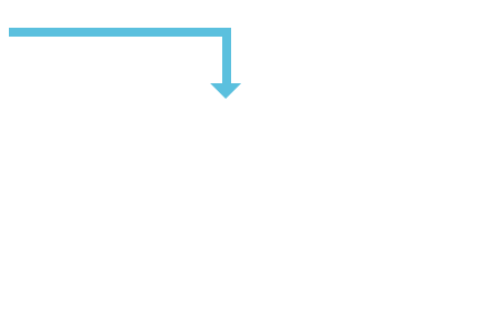
First, let's see how to implement an arrow. I will make an L-shaped arrow from the upper left corner to the lower right corner.
An arrow turning at a right angle.
The code is as follows
HTML code
<!DOCTYPE html>
<html>
  <head>
  <meta charset="utf-8">
    <title>CSS arrow</title>
    <link rel="stylesheet" type="text/css" href="sample.css">
   <meta http-equiv="Content-Type" content="text/html" charset="UTF-8">
  </head>
  <body>
   <div class="arrow"></div>
  </body>
</html>
CSS code
sample.css
.arrow{
  position: relative;
  width: 200px;
  height: 50px;
  border-top: 8px solid #5bc0de;
  border-right: 8px solid #5bc0de;
  box-sizing: border-box;
}
.arrow::after{
  content: "";
  position: absolute;
  bottom: -14px;
  right: -17px;
  border-top: 14px solid #5bc0de;
  border-left: 14px solid transparent;
  border-right: 14px solid transparent;
}Run result
Display the following effect on the browser

The HTML code for making several arrow symbols introduced next is the same as above. We mainly change the CSS code. Implement
triangular arrow
CSS code
.arrow{
  position: relative;
  display: inline-block;
  padding: 0 0 0 16px;
  color: #000;
  vertical-align: middle;
  text-decoration: none;
  font-size: 15px;
}

.arrow::before{
  position: absolute;
  top: 0;
  bottom: 0;
  left: 0;
  margin: auto;
  content: "";
  vertical-align: middle;
  box-sizing: border-box;
  width: 12px;
  height: 12px;
  border: 1px solid #ff0000;
  -webkit-border-radius: 25%;
  border-radius: 25%;
}

.arrow::after{
  position: absolute;
  top: 0;
  bottom: 0;
  left: 0;
  margin: auto;
  content: "";
  vertical-align: middle;
  left: 5px;
  box-sizing: border-box;
  width: 3px;
  height: 3px;
  border: 3px solid transparent;
  border-left: 3px solid #ff0000;
}The running effect is as follows
will display an icon with a red triangle

Arrow of "greater than sign"
CSS code
.arrow{
  position: relative;
  display: inline-block;
  padding-left: 20px;
}

.arrow::before{
  content: '';
  width: 6px;
  height: 6px;
  border: 0px;
  border-top: solid 2px #5bc0de;
  border-right: solid 2px #5bc0de;
  -ms-transform: rotate(45deg);
  -webkit-transform: rotate(45deg);
  transform: rotate(45deg);
  position: absolute;
  top: 50%;
  left: 0;
  margin-top: -4px;
}Run result
The running effect on the browser is as follows

This arrow symbol is often used on the web page
Production upward Arrow
CSS code
.arrow{
  width: 0px;
  border-color: #d9534f;
  border-style: solid;
  border-width: 30px;
  border-left-color: transparent;
  border-top-color: transparent;
  border-right-color: transparent;
}Running effect
The following effect is displayed on the browser

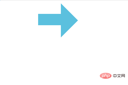
Finally let’s take a look at the traditional right arrow symbol
CSS code
.arrow {
  display:inline-block;
  height:40px;
  width:80px;
  background-color:#5bc0de;
  position:relative;
  top:40px;
}

.arrow:before {
  position:absolute;
  content:"";
  width:0;
  height:0;
  border:60px solid transparent;
  border-left:60px solid #5bc0de;
  left:80px;
  top:-37px;
}Running results
In The browser will display the effect as shown below

This article ends here. For more related exciting content, you can move to php Learn more in the CSS Video Tutorial column of the Chinese website! ! !
The above is the detailed content of How to make an arrow symbol using CSS. For more information, please follow other related articles on the PHP Chinese website!