Methods to customize the underline style: 1. Use border-bottom to implement text underline; 2. Set the underline by using a linear gradient in the background-image method.

The operating environment of this article: Windows7 system, HTML5&&CSS3 version, Dell G3 computer.
The underline is generally a black straight line in the text, so how to change the underline style? Next, in the article, we will introduce in detail how to customize the underline style. It has certain reference value and I hope it will be helpful to everyone.
text-decoration attribute
Specifies the decorations added to the text.
none: Represents standard text, no format.
underline: Represents the underline of the text.
overline: Represents a line on the text.
line-through: Represents a line that passes through the text, generally represents a strikethrough
blink: Represents blinking text.
Example:
<div style="text-decoration: underline;">PHP中文网</div>
<div style="text-decoration:line-through;">PHP中文网</div>
<div style="text-decoration:overline;">PHP中文网</div>
Rendering:

The underline defined by text-decoration cannot change the color, nor can it set its thickness. Therefore, we can use other methods to customize the underline
Customization of the underline:
(1) border- bottom method
When using border-bottom to realize text underline, you can change the color, thickness and style of the underline
But it should be noted that when the element is a block-level element, the underline is not only is the length of the text content, which will fill a line. In this case, you need to convert the block-level elements into line-level elements through display: inline. In this case, the length of the text will be the same as the length of the underline
Example: Make the underline pink 2px thick
<h1 style="display:inline;border-bottom:2px solid pink">PHP中文网</h1>
Rendering:

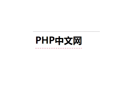
(2) background-image method
In the background-image method, the underline is set by using a linear gradient. Here you still have to remember that when the element is a block-level element Pay attention to changing it to a row-level element
Example:
h1{
			display: inline;
			background-image:linear-gradient(to right,pink 60%,transparent 10%);
			background-position: 0 100%;
			background-repeat: repeat-x;
			background-size: 8px 3px;
			padding-bottom: 10px;
}Rendering:

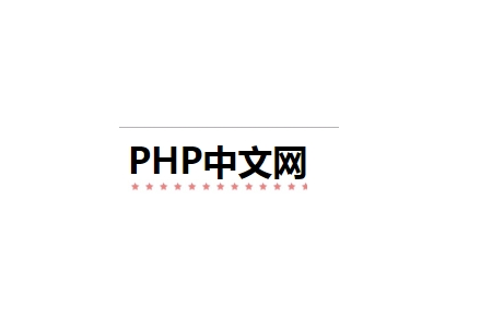
background-image method is OK Use pictures instead of underlines
h1{
			display: inline;
			background-image:url("images/xing.jpg");
			background-position: 0 100%;
			background-repeat: repeat-x;
			background-size:13px;
			padding-bottom: 10px;
} Effect picture:

Summary: The above is the entire content of this article, I hope it will be helpful to everyone .
【Recommended course: CSS Tutorial】
The above is the detailed content of How to customize the underline style. For more information, please follow other related articles on the PHP Chinese website!