

How to create buttons with different effects through CSS

A variety of button effects can be achieved through CSS. For example, the color gradient effect button can be set through the CSS gradient attribute, and the press effect button can be realized through box-shadow.
Today in this article I will share how to create several different styles of button effects, which are flat, border, gradient and shadow and press style buttons. Next, in the article, I will introduce in detail how to achieve the effect through CSS code.
HTML code
<div class="pm">
	<button>平面按钮</button>
</div>
Basic CSS style code
button{
display: inline-block;
margin: 0 10px 0 0;
padding: 15px 45px;
font-size:20px;
font-family:"Bitter",serif;
line-height: 20px;
appearance: none;
 box-shadow:none;
 border-radius: 0;
}(1) Flat style CSS button
The use of flat style buttons is very popular now and is in line with the ubiquitous flat design trend. , these flat style buttons look great. The following code is the button in a normal state
.pm button {
  color:#fff;
  background-color:#6496c8;
  border:none;
}Rendering:

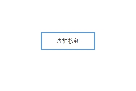
(2 )Border style CSS button
Border style buttons belong to the same category as flat buttons. The only difference is that we will be using a border instead of the background color used for the flat button. The following code is the normal state of the button
.pm button {
  color:#444;
 border:5px solid #6496c8;
  background-color: #fff;
}Rendering:
(3) Gradient and Shadow Style CSS Button
This gradient and shadow style button is more in line with the button effects we have seen in days gone by. If you like those with colorful colors then gradient/shadow style buttons are for you. The nice thing about creating this button is that its effects are all done in CSS, so it can be easily scaled up or down without worrying about losing resolution or having to create a new image. The following code is the button's normal state
.pm button {
  color:#fff;
  text-align: center;
  box-shadow:inset 0 0 0 1px #e91e637d;
  background: -webkit-linear-gradient(left, red , blue); /* Safari 5.1 - 6.0 */
  background: -o-linear-gradient(right, rgb(244,103,34), rgb(197,29,124));
  background: -moz-linear-gradient(right, rgb(244,103,34), rgb(197,29,124));
  background: linear-gradient(to right, rgb(244,103,34) , rgb(197,29,124));}
}Rendering:

(4 ) Press Styled CSS Buttons
These "press" style buttons combine some flat design and illusion to make the user feel like they actually pressed the button. When the user presses it, it appears to be stuck in the page. Its implementation requires the use of shadows to set it up to give it a 3D pop-up appearance. The following code is the button in a normal state
.pm button {
  color: #fff;
  background-color: #6496c8;
  border: none;
  border-radius: 15px;
  box-shadow: 0 10px #27496d;
}Rendering:

Summary: The above is the summary of this article That’s all. I hope this article can help everyone learn to use CSS to create button effects.
The above is the detailed content of How to create buttons with different effects through CSS. For more information, please follow other related articles on the PHP Chinese website!

Hot AI Tools

Undresser.AI Undress
AI-powered app for creating realistic nude photos

AI Clothes Remover
Online AI tool for removing clothes from photos.

Undress AI Tool
Undress images for free

Clothoff.io
AI clothes remover

AI Hentai Generator
Generate AI Hentai for free.

Hot Article
Hot Tools

Notepad++7.3.1
Easy-to-use and free code editor

SublimeText3 Chinese version
Chinese version, very easy to use

Zend Studio 13.0.1
Powerful PHP integrated development environment

Dreamweaver CS6
Visual web development tools

SublimeText3 Mac version
God-level code editing software (SublimeText3)
Hot Topics
 1386
1386
 52
52

 Working With GraphQL Caching
Mar 19, 2025 am 09:36 AM
Working With GraphQL Caching
Mar 19, 2025 am 09:36 AM
If you’ve recently started working with GraphQL, or reviewed its pros and cons, you’ve no doubt heard things like “GraphQL doesn’t support caching” or
 Building an Ethereum app using Redwood.js and Fauna
Mar 28, 2025 am 09:18 AM
Building an Ethereum app using Redwood.js and Fauna
Mar 28, 2025 am 09:18 AM
With the recent climb of Bitcoin’s price over 20k $USD, and to it recently breaking 30k, I thought it’s worth taking a deep dive back into creating Ethereum
 Vue 3
Apr 02, 2025 pm 06:32 PM
Vue 3
Apr 02, 2025 pm 06:32 PM
It's out! Congrats to the Vue team for getting it done, I know it was a massive effort and a long time coming. All new docs, as well.
 Can you get valid CSS property values from the browser?
Apr 02, 2025 pm 06:17 PM
Can you get valid CSS property values from the browser?
Apr 02, 2025 pm 06:17 PM
I had someone write in with this very legit question. Lea just blogged about how you can get valid CSS properties themselves from the browser. That's like this.
 A bit on ci/cd
Apr 02, 2025 pm 06:21 PM
A bit on ci/cd
Apr 02, 2025 pm 06:21 PM
I'd say "website" fits better than "mobile app" but I like this framing from Max Lynch:
 Comparing Browsers for Responsive Design
Apr 02, 2025 pm 06:25 PM
Comparing Browsers for Responsive Design
Apr 02, 2025 pm 06:25 PM
There are a number of these desktop apps where the goal is showing your site at different dimensions all at the same time. So you can, for example, be writing
 Using Markdown and Localization in the WordPress Block Editor
Apr 02, 2025 am 04:27 AM
Using Markdown and Localization in the WordPress Block Editor
Apr 02, 2025 am 04:27 AM
If we need to show documentation to the user directly in the WordPress editor, what is the best way to do it?
 Stacked Cards with Sticky Positioning and a Dash of Sass
Apr 03, 2025 am 10:30 AM
Stacked Cards with Sticky Positioning and a Dash of Sass
Apr 03, 2025 am 10:30 AM
The other day, I spotted this particularly lovely bit from Corey Ginnivan’s website where a collection of cards stack on top of one another as you scroll.
