
 Web Front-end
CSS Tutorial
What is the difference between flex, grid and float properties in CSS layout
Web Front-end
CSS Tutorial
What is the difference between flex, grid and float properties in CSS layout
What is the difference between flex, grid and float properties in CSS layout

In CSS layout, the difference between flex, grid and float attributes is that the flex attribute is suitable for small UI elements, and the grid attribute is suitable for designing the entire website. Layout and float attributes are suitable for setting images in larger text articles
Usually when we write pages, in order to implement various network layouts, we often use flex or grid and float attributes. Each layout technology has its advantages and disadvantages. Next, I will introduce the differences between the three in detail in this article. It has certain reference value and I hope it will be helpful to everyone.
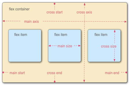
flex property
The Flex property contains a number of particularly useful sub-properties. For example, flex-grow and flex-shrink allow us to change the width and scale based on the user's view columns. justify-content can be used to set or retrieve the alignment of the flexbox element in the main axis (horizontal axis) direction. This is a useful tool for making smaller UI elements look their best on any device. But it also has shortcomings. For example, if you want to lay out larger elements on the page, you need to add margins to ensure that it looks the way we want. But this may take some time
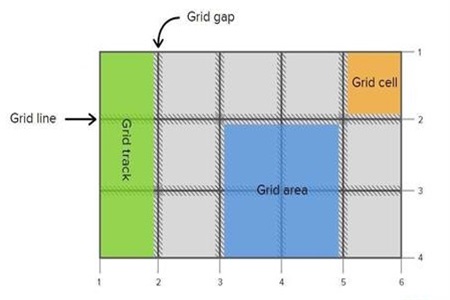
grid attribute
By using a grid, you can easily set up an entire layout design system for your website. Layouts can be nested within other layouts, and grids can allow extremely complex layouts to be created with precision. But it also has the disadvantage that it is not suitable for quickly centering or placing images in larger text articles. If you encounter these types of layouts it is best to deal with them through other methods.
float attribute
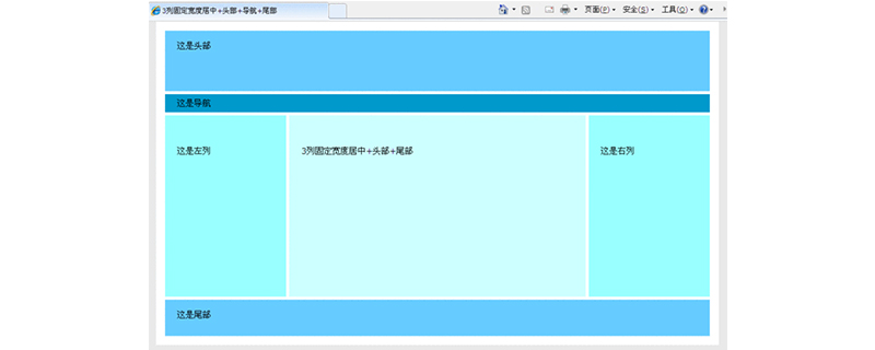
The float attribute is suitable for setting images in larger text articles. But it is not a good way to set the layout of the entire page. If not used properly, confusion is likely to occur. It doesn't have as many built-in properties as Grid or Flex, so you can't create complex layouts.

how to choose?
I think the best layout method is to use the least css code to achieve the most complex layout. Grid layout has an absolute advantage at this point, its syntax is efficient and meaningful. However, all layout methods have their shortcomings, so it is necessary to combine them when necessary. When we create a website, we can use grids to lay out the website, and floats to add images
Summary: The above is the entire content of this article. I hope that through this article, everyone will have a certain understanding of CSS layout. understanding.
The above is the detailed content of What is the difference between flex, grid and float properties in CSS layout. For more information, please follow other related articles on the PHP Chinese website!

Hot AI Tools

Undresser.AI Undress
AI-powered app for creating realistic nude photos

AI Clothes Remover
Online AI tool for removing clothes from photos.

Undress AI Tool
Undress images for free

Clothoff.io
AI clothes remover

AI Hentai Generator
Generate AI Hentai for free.

Hot Article
Hot Tools

Notepad++7.3.1
Easy-to-use and free code editor

SublimeText3 Chinese version
Chinese version, very easy to use

Zend Studio 13.0.1
Powerful PHP integrated development environment

Dreamweaver CS6
Visual web development tools

SublimeText3 Mac version
God-level code editing software (SublimeText3)
Hot Topics
 1377
1377
 52
52

 Making Your First Custom Svelte Transition
Mar 15, 2025 am 11:08 AM
Making Your First Custom Svelte Transition
Mar 15, 2025 am 11:08 AM
The Svelte transition API provides a way to animate components when they enter or leave the document, including custom Svelte transitions.
 Working With GraphQL Caching
Mar 19, 2025 am 09:36 AM
Working With GraphQL Caching
Mar 19, 2025 am 09:36 AM
If you’ve recently started working with GraphQL, or reviewed its pros and cons, you’ve no doubt heard things like “GraphQL doesn’t support caching” or
 Building an Ethereum app using Redwood.js and Fauna
Mar 28, 2025 am 09:18 AM
Building an Ethereum app using Redwood.js and Fauna
Mar 28, 2025 am 09:18 AM
With the recent climb of Bitcoin’s price over 20k $USD, and to it recently breaking 30k, I thought it’s worth taking a deep dive back into creating Ethereum
 Show, Don't Tell
Mar 16, 2025 am 11:49 AM
Show, Don't Tell
Mar 16, 2025 am 11:49 AM
How much time do you spend designing the content presentation for your websites? When you write a new blog post or create a new page, are you thinking about
 How do you use CSS to create text effects, such as text shadows and gradients?
Mar 14, 2025 am 11:10 AM
How do you use CSS to create text effects, such as text shadows and gradients?
Mar 14, 2025 am 11:10 AM
The article discusses using CSS for text effects like shadows and gradients, optimizing them for performance, and enhancing user experience. It also lists resources for beginners.(159 characters)
 Creating Your Own Bragdoc With Eleventy
Mar 18, 2025 am 11:23 AM
Creating Your Own Bragdoc With Eleventy
Mar 18, 2025 am 11:23 AM
No matter what stage you’re at as a developer, the tasks we complete—whether big or small—make a huge impact in our personal and professional growth.
 What the Heck Are npm Commands?
Mar 15, 2025 am 11:36 AM
What the Heck Are npm Commands?
Mar 15, 2025 am 11:36 AM
npm commands run various tasks for you, either as a one-off or a continuously running process for things like starting a server or compiling code.
 A bit on ci/cd
Apr 02, 2025 pm 06:21 PM
A bit on ci/cd
Apr 02, 2025 pm 06:21 PM
I'd say "website" fits better than "mobile app" but I like this framing from Max Lynch:
