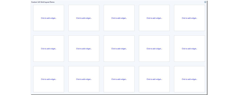
The grid-template attribute is mainly used to create a display grid, where grid-template-rows and grid-template-columns are used to define the rows and columns of the grid, and the grid-template-areas attribute is used to A new grid layout (grid layout) is introduced in CSS3 for specifying the named grid area

, which is mainly used to adapt to the development of display and design technology, especially for some Responsive design. Its emergence is mainly to establish a stable, predictable and semantically correct web page layout mode to replace the dynamic layout of web pages achieved by the unstable and cumbersome hybrid technology of table, flow and JS scripts in the past. What I will introduce in today’s article is the usage of the grid-template-* attribute in the grid attribute. It has certain reference value and I hope it will be helpful to everyone.
Explicit and Implicit GridTo understand grid-template-* properties, we first need to understand the meaning of explicit grid and implicit grid
Explicit grid is used to create explicit grid grid-template-* attribute (property) definition, where grid-template-rows, grid-template-columns and grid-template-areas together define an explicit grid
The implicit grid represents the network Grid containers generate implicit grid tracks by adding implicit grid lines to the grid. Together with the explicit grid, these lines form the implicit grid. In other words there are grid cells inside the grid container, any cells positioned and sized using the grid-template-* properties form part of the explicit grid, any grid cells positioned/sized using this property None form part of the implicit grid
Specific usage of grid-template-* attributesgrid-template-* attributes are used to create an explicit grid Grid, mainly used to define the position and size of grid cells
Features:grid-template-rows (grid template rows), grid template columns ( grid-template-columns), grid template areas (grid-template-areas)
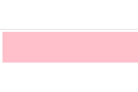
Example:Create a row with a height of 100px grid
.grid {
	display: grid;
	background-color: pink;
	grid-template-rows: 100px;
}Rendering:
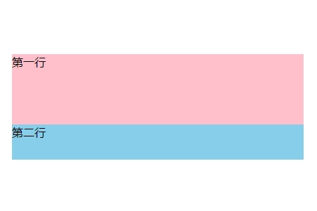
 If you want to set multiple lines, you only need to add another length value at the end, separated by spaces. One row
.grid {
	display: grid;
	background-color: pink;
	grid-template-rows: 100px 50px;
}
.grid2{
	background-color: skyblue;
}Rendering:
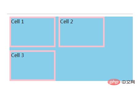
 grid-template-columns property is used to set the column properties of the grid container, which is actually equivalent to The width of the column. When we need to display several columns, we set a few values
.grid {
  display: grid;
  grid-gap: 10px; /* add spacing for better visibility */
  grid-auto-rows: 30px;
  grid-template-rows: 100px 100px ;
  grid-template-columns: 150px 150px;
  background-color: skyblue;

}
.cell{ border:5px solid pink;}Rendering:
 Summary: The above is the entire content of this article, I hope it will be helpful for everyone to learn grid layout.
The above is the detailed content of How to use grid-template-* properties in CSS grid layout. For more information, please follow other related articles on the PHP Chinese website!